Dimensions: height 151 mm, width 101 mm
Copyright: Rijks Museum: Open Domain
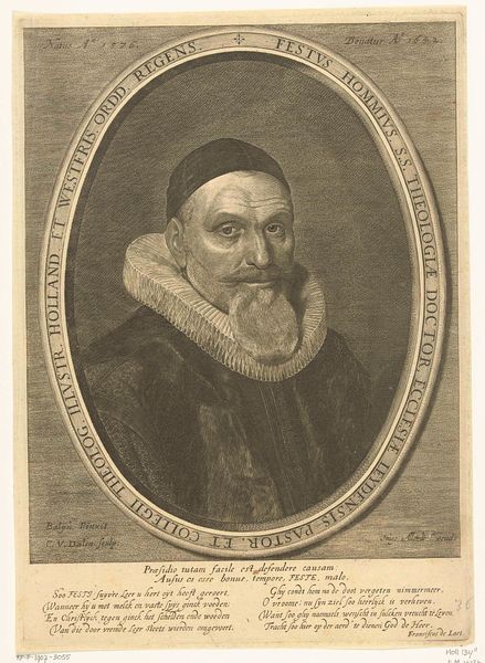
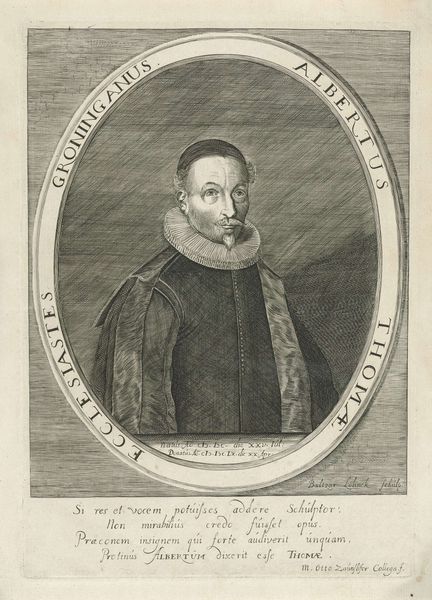
Editor: This is "Portret van Jacob Duym," a print made by Guillaume Joseph Vertommen in 1842. It's so delicate! All these incredibly fine lines creating tone and texture... It's mesmerizing! What catches your eye in this print? Curator: The composition, without question. The oval framing device, adorned with subtle foliate details, neatly encapsulates the figure of Jacob Duym. Note how the artist uses hatching and cross-hatching, a technique refined through generations of printmaking, to build form and define the sitter’s garments and facial features. Observe the fall of light and shadow that sculpts Duym's face and ruff collar. It calls attention to his serious gaze. Does the weight of this formal design translate, in your opinion, to a sense of depth? Editor: Absolutely! The variations in line thickness create a convincing sense of depth, especially in the folds of the ruff. Plus, that heraldic shield at the bottom, isn’t it odd, because its linework seems less refined than the rest of the portrait? Curator: It’s not unusual, actually. Heraldry often relied on established patterns and conventions. It served primarily a symbolic, not necessarily aesthetic, function. The print emphasizes line quality. Editor: True, without the masterful control of line, the details would simply blend. I appreciate the skill Vertommen uses to define Duym, his status and his place in history, all through the delicate execution of line work. Curator: Indeed, the very act of looking closely at these formal elements can deepen our comprehension. I noticed how effectively this strategy communicates tone, form, and substance in this medium. Thank you for your perspective.
Comments
No comments
Be the first to comment and join the conversation on the ultimate creative platform.
More like this