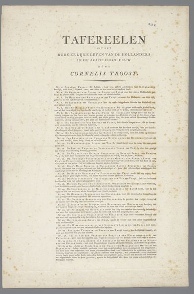
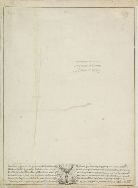
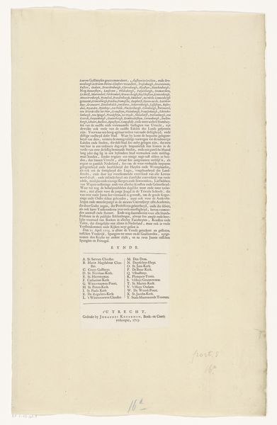
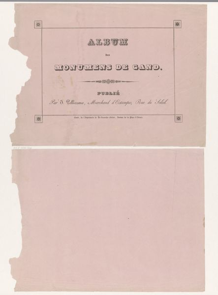
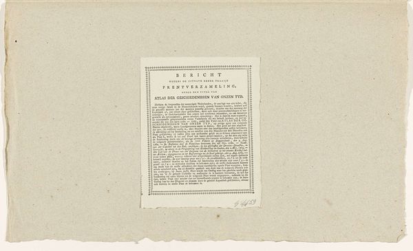
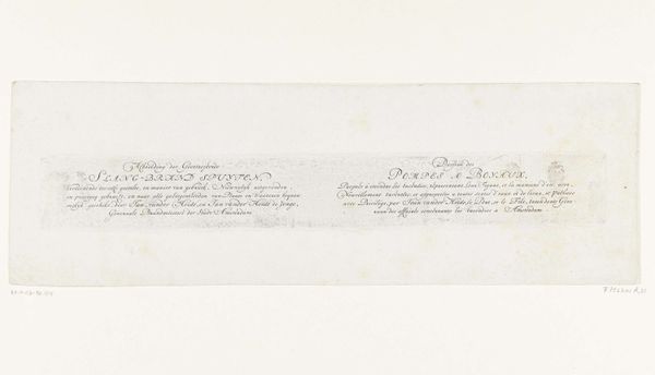
Omslag voor vier losse illustraties behorende in de Beknopte Historie van 't Vaderland 1776
0:00
0:00
volkertvanderplaats
Rijksmuseum
print, textile, paper, typography, engraving
#
neoclacissism
# print
#
old engraving style
#
hand drawn type
#
textile
#
paper
#
typography
#
fading type
#
engraving
Dimensions: height 490 mm, width 450 mm
Copyright: Rijks Museum: Open Domain
Curator: Here we have "Omslag voor vier losse illustraties behorende in de Beknopte Historie van 't Vaderland," or, "Cover for Four Separate Illustrations Belonging to the Concise History of the Fatherland," by Volkert van der Plaats, dating from 1776. Editor: The visual weight is all in the middle – the rest fades into the paper's own material condition. You can really see the paper fiber. It feels almost like it's disintegrating. Curator: Indeed, it's a print, using engraving on paper. The neoclassical design is intended for a text on Dutch history. Examining it closely allows us to consider the late 18th-century context – the burgeoning national identity, reflected in historical narratives presented to a growing literate public. Editor: So, it's not just about relaying facts but really about the construction of national consciousness. I mean, the deliberate selection of typeface, its layout and organization... it’s almost architectural in its structure. There's the work of the hand, the individual craftsman of course, but think about the printer, the paper maker too—so many different material labors combining here. Curator: Absolutely, the materiality intersects with ideology. We can even draw connections to contemporary discourses around Dutch identity in the late 1700s, a period marked by both Enlightenment ideals and the decline of Dutch global power, which might explain this need for historical reflection and reconstruction. The choice of neoclassical style, in its own way, makes a claim about national identity. Editor: And look how those older print techniques and materiality are starting to break down here! You get the feeling this wouldn’t last long with frequent handling. Even though meant to endure, everything eventually decomposes... This focus on 'Vaderland' --Fatherland-- strikes me as being linked so clearly to issues around gendered national identity, as well. It suggests a bounded and exclusive sense of who "belongs." Curator: Precisely. Reflecting on this cover lets us contemplate these larger frameworks through which identities—national, social, gendered—were being molded in print. Editor: Well, my attention has definitely been captured by that combination of deliberate layout with this sense of inevitable disintegration. It’s got me pondering how material instability undermines even the most authoritative narratives.
Comments
No comments
Be the first to comment and join the conversation on the ultimate creative platform.
More like this