Curatorial notes
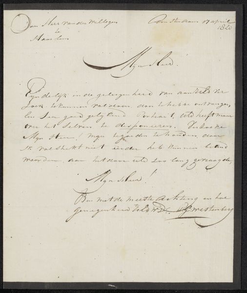
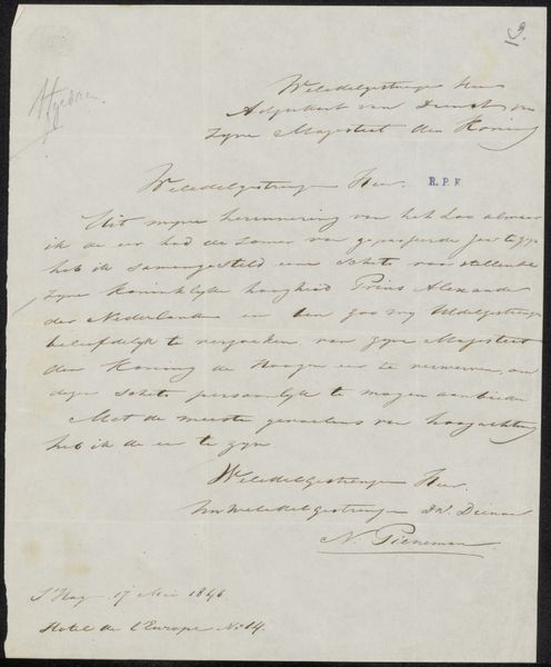
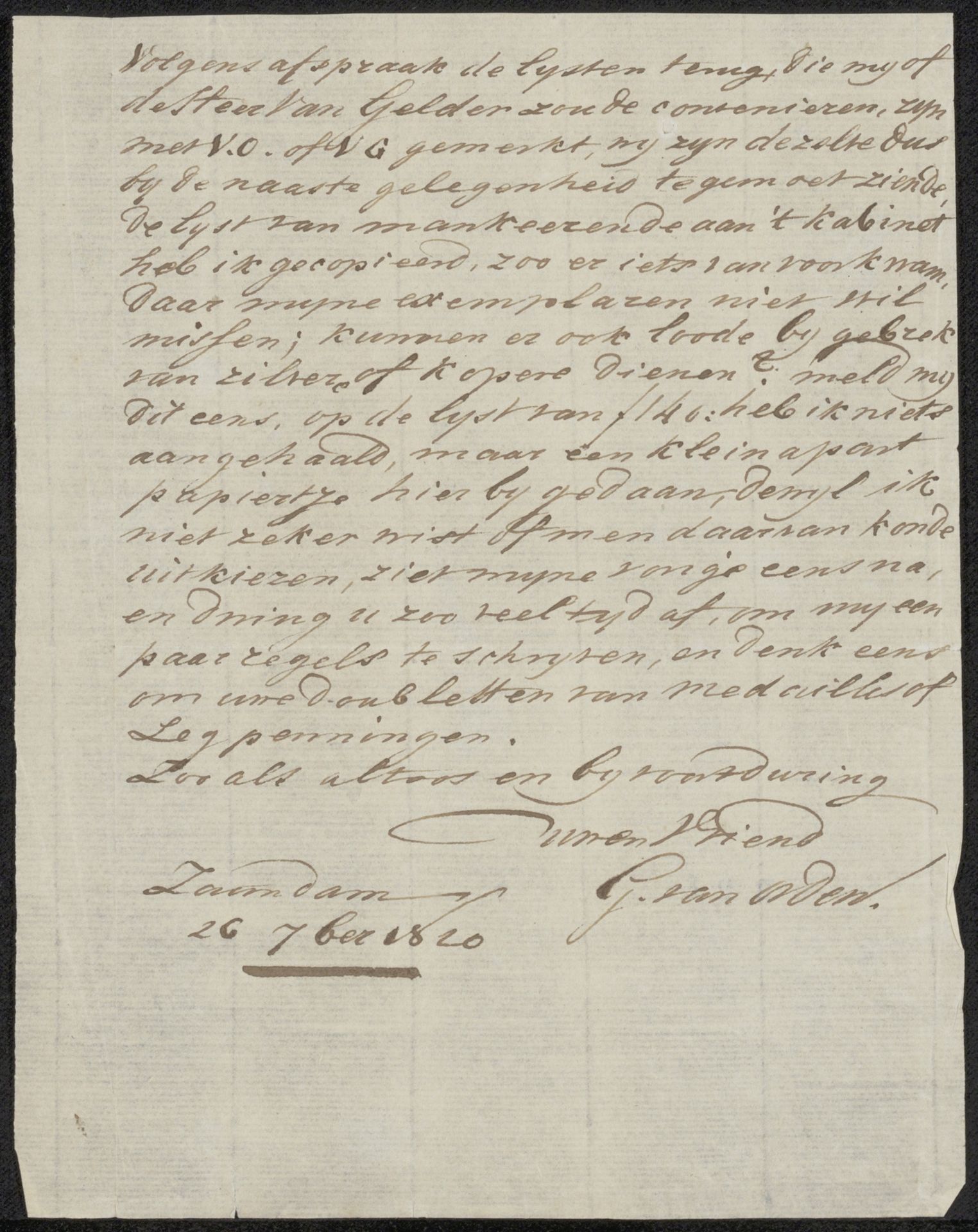
Curator: So, here we have "Brief aan anoniem," or "Letter to Anonymous," a drawing made with ink on paper, sometime between 1784 and 1854, by Gerrit van Orden. It’s in the Dutch Golden Age style, which is neat! What catches your eye? Editor: It really does feel like stepping into a time capsule. The script is beautiful, so ornate, but it’s hard to decipher, and it makes me wonder about its secrets! It feels incredibly intimate, but also so distant because I can’t actually *read* it. How do you even begin to interpret something like this? Curator: Well, first, I try to get a sense of the handwriting itself. Look at the flourishes, the weight of the ink, the consistency – or inconsistency – of the strokes. Does it look hurried? Deliberate? Passionate? Controlled? Editor: It definitely looks controlled... almost formal. Curator: Yes! It tells us something about the writer's character, right? I imagine this letter, perhaps dashed off with a quill in a quiet study… Can’t you almost hear the scratch of the nib on the page? Think about the care they took – this wasn't a text message; this was a considered act of communication. Do you suppose the intended recipient felt similarly? Editor: Definitely something lost to time, the idea of that intimate interaction... Curator: Precisely. Plus, it is addressed to ‘Anonymous,’ which turns us, the viewers, into unintended recipients of a very personal correspondence. In a way, this piece isn't just *of* history, it *is* history, right in front of our eyes. Editor: Absolutely! It makes you appreciate how much history and personality can be embedded in something as simple as handwriting, and it really sparks the imagination. It is hard to ignore its draw. Curator: Precisely! And hopefully makes us reflect on our contemporary mediums of correspondence!