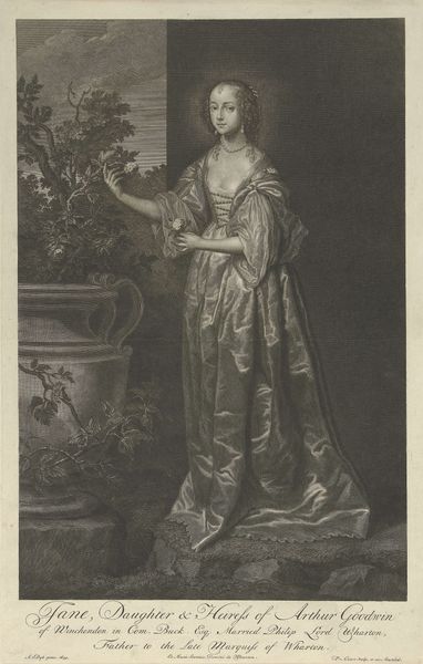
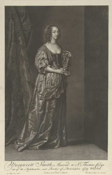
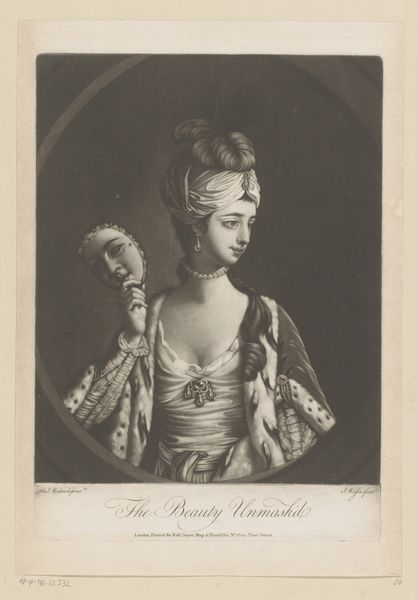
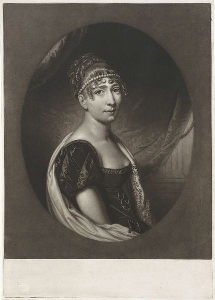
engraving
#
portrait
#
neoclacissism
#
figuration
#
19th century
#
history-painting
#
engraving
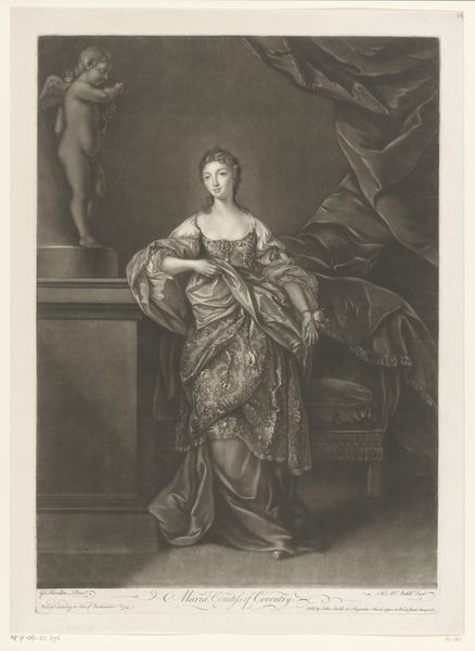
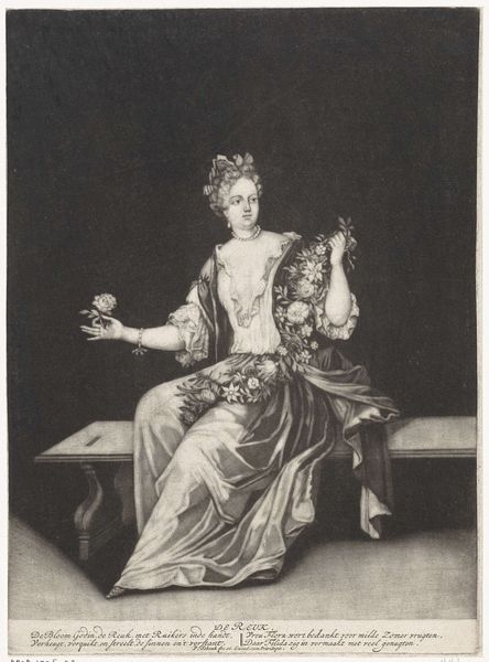
Dimensions: height 756 mm, width 575 mm
Copyright: Rijks Museum: Open Domain
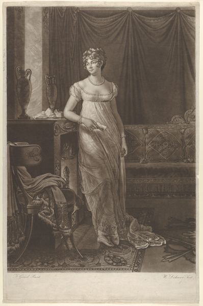
Editor: So this is "Portrait of Johanna Cornelia Ziesenis-Wattier," made around 1805 by Willem van Senus, it's an engraving. The composition and grayscale render make it so calm and… balanced, even. How do you interpret this work? Curator: I would say the effect of balance derives from the figure's careful positioning. The lines created by her garment and cape, along with the background column, work together in careful reciprocity to control how the viewer's eye is oriented within the frame. How does the figure's bearing contribute to the mood you perceive? Editor: I think it's in the arms, the left raised to hold the sheer cape while the right extends outward, sort of inviting you in. Curator: Indeed. Consider how the manipulation of light contributes to the spatial dynamics and emotional tone. Note the contrasting areas that shape the figure's body, especially her arms. Editor: So, the contrasts highlight her muscularity, while her dress seems to recall classical sculptures. I can also spot the faint hint of the columns in the background. Is that on purpose? Curator: Yes, these compositional components all serve to enhance an idealized rendering of the female form, reminiscent of Neoclassical principles, if we are to believe in truth to materials. What do you think about this, after our analysis? Editor: Now I am less fixated on the engraving being calm; instead, the figure embodies strength, resolve. It's all meticulously crafted through formal qualities, right down to her expression and those column allusions. Curator: Exactly! Seeing the visual language offers such insights can really changes your perspectives.
Comments
No comments
Be the first to comment and join the conversation on the ultimate creative platform.
More like this