drawing, ink, pen
#
portrait
#
drawing
#
ink
#
romanticism
#
pen-ink sketch
#
pen
#
calligraphy
Copyright: Rijks Museum: Open Domain
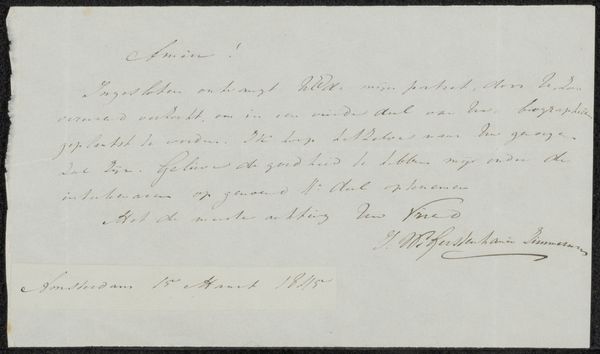
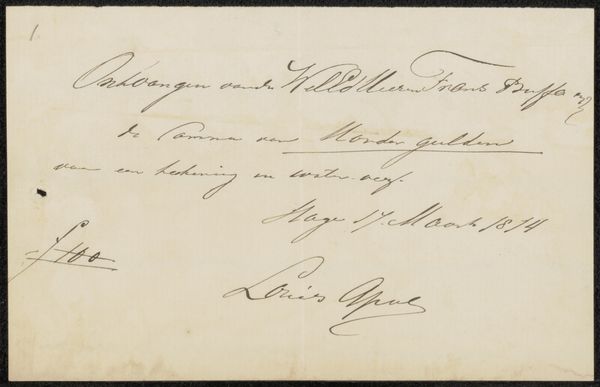
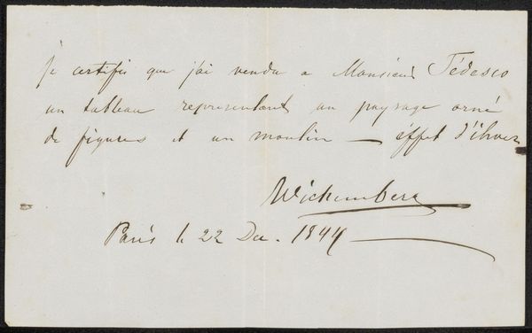
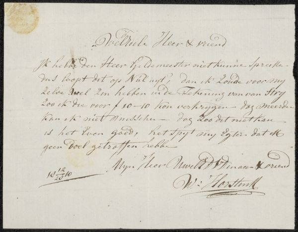
Editor: So, here we have "Brief aan anoniem," or "Letter to Anonymous," a pen and ink drawing by Jacob Smies, dating back to around 1826. The calligraphy is just beautiful! What stands out to you about its formal qualities? Curator: The linear elements certainly dominate the composition. The deliberate, almost performative, quality of the line is evident. Note the variations in pressure, creating a calligraphic texture. It isn't simply about conveying information, is it? Editor: Not at all! It feels…decorative, almost. Are you thinking about the contrast between its function as communication, and the aesthetics of the strokes? Curator: Precisely. The density and distribution of the text generate a visual rhythm, a formal pattern across the surface. It calls attention to the material process of writing. We have ink applied with a pointed nib upon paper. Consider the negative space – is it mere background or an active participant? Editor: I see what you mean. The shapes formed by the gaps between the lines, the varying sizes of letters and words, become almost as important as the writing itself! Does the uniformity of the ink contribute to the balance across the space? Curator: It’s the monochrome scheme, which lends coherence. If it were multicolored ink, the entire visual weight could be disturbed. Do you think a contemporary viewer may notice this compositional approach in such a way? Editor: That's a perspective I hadn't considered! Focusing on line, tone and negative space shows this is much more than just the content of a letter, even with that beautiful handwriting! Thank you. Curator: The exercise highlights the enduring relevance of formal analysis in understanding any visual composition. Thank you for pointing me back to this, too.
Comments
No comments
Be the first to comment and join the conversation on the ultimate creative platform.
More like this