drawing, print, ink
#
drawing
#
medieval
# print
#
ink
#
geometric
#
northern-renaissance
#
decorative-art
#
calligraphy
Dimensions: sheet: 27.8 × 40.8 cm (10 15/16 × 16 1/16 in.)
Copyright: National Gallery of Art: CC0 1.0
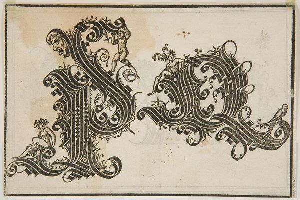
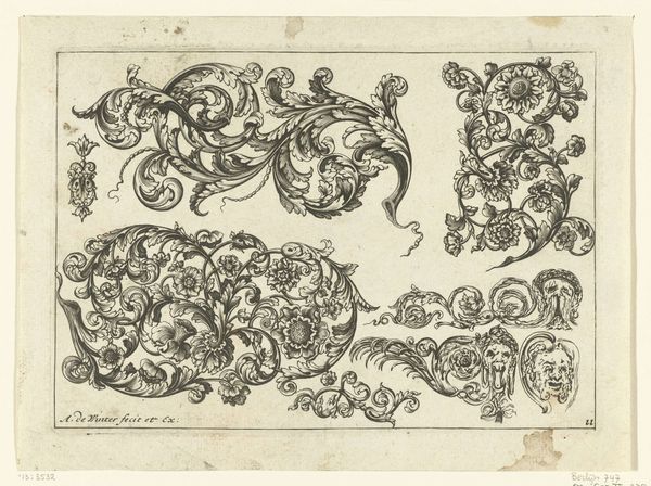
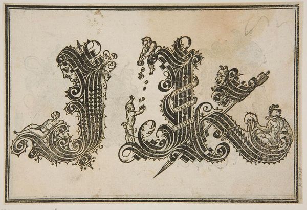
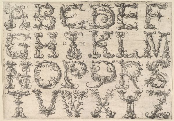
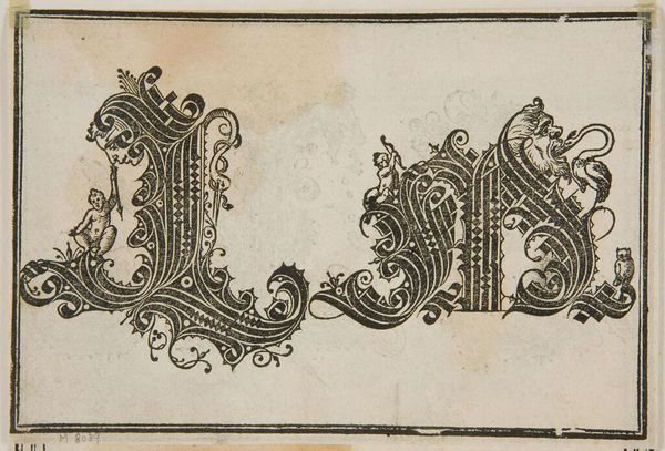
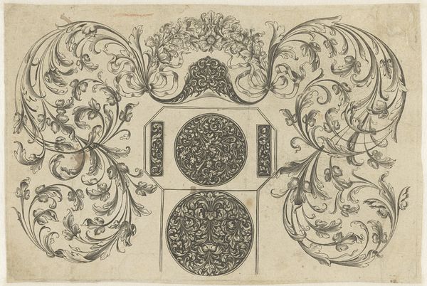
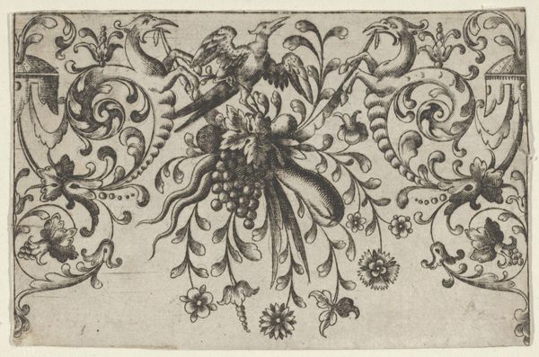
Editor: We’re looking at “Ornamental Alphabet,” an ink drawing from the late 15th century, made by an anonymous artist. It’s fascinating; the letterforms are so intricate and embellished. How would you approach interpreting this work? Curator: I’m immediately drawn to the graphic quality of the lines. Note how the artist utilizes contrast to define the shapes. There’s a fascinating interplay between the dense, interwoven strokes and the negative space they create. Observe the structural rhythm established through the repetition of geometric patterns within each letter. What does that rhythm suggest to you? Editor: It feels very controlled, very deliberate. The curves and straight lines are so carefully balanced within each character. Curator: Precisely. Consider the materiality of ink as a medium. Its fluidity allows for organic flourishes, yet, when applied with intention, it enables the creation of rigid, geometric forms. How does this tension play out across the whole composition? Editor: I see that. The decorative elements—those small flourishes—are almost fighting against the structural rigidity of the letters themselves. It makes the whole thing feel very dynamic. Curator: Yes, exactly! The tension creates visual interest, encouraging the viewer to linger and appreciate the minute details. It begs us to examine the inherent qualities of the line and its power to articulate both form and decoration. And is there something to be said about its arrangement on the plane of the work? Editor: That's a lot to consider. I hadn't thought about it beyond just being a decorative alphabet, but it’s really about the relationship between structure and ornamentation, the control and expression offered by ink itself! Curator: Precisely! Considering visual elements invites deeper interpretations, and there are countless arrangements to analyze within this composition. Editor: Absolutely! This closer formal analysis helps to unlock how intentional the piece really is, with every choice adding a new layer.
Comments
No comments
Be the first to comment and join the conversation on the ultimate creative platform.
