Copyright: Public domain
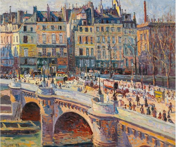
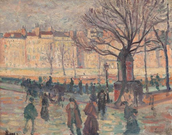
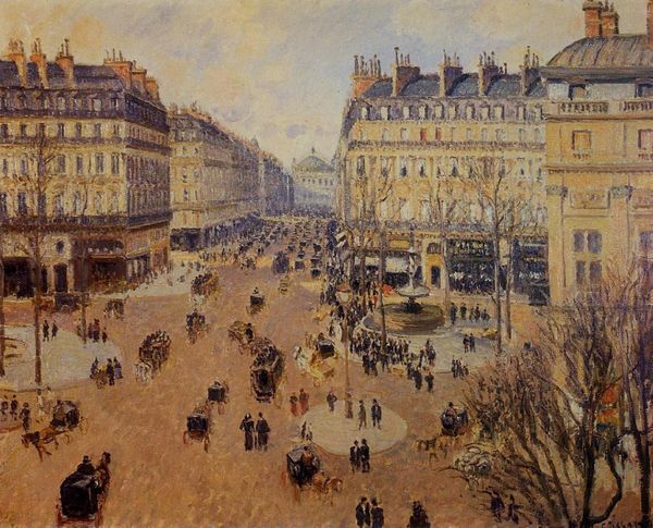
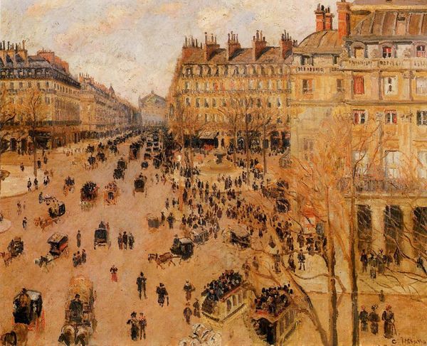
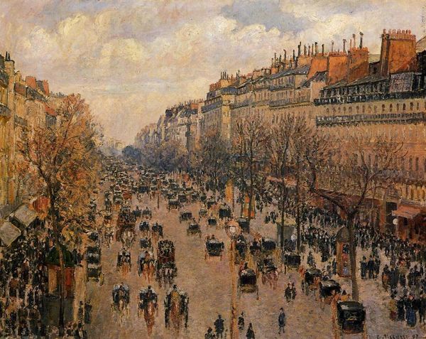
Editor: This is "Quayside by the Seine in Paris" painted by Maximilien Luce in 1899, with oil on canvas. It's so vibrant. The Seine riverfront really bustles to life. What symbolic meanings might be hiding beneath the surface? Curator: The painting style is certainly bustling! Look at how Luce breaks down light with those brushstrokes—it reflects the radical societal shifts happening at the time. But how does it feel different from other cityscapes you've seen, especially within Impressionism or Neo-Impressionism? Editor: It's like the colors vibrate; more structured and less atmospheric than classic Impressionism. It feels purposeful, less about capturing a fleeting moment. But what specific symbols or repeated motifs grab your attention in it? Curator: Observe the arches of the bridges, those curves echoed in the water, the figures walking to and fro in repetitive formations. Arches represent connection, transition… and the color choices are deliberate! Notice how Luce uses oranges and blues: complementary opposites. What do opposing colors represent? Editor: Tension, contrast, conflict maybe? Like the tension between progress and tradition in a rapidly modernizing Paris. Curator: Exactly! Consider how this "vibrating" city quayside projects the energy, ambition, and anxieties of a culture confronting profound change. There is something timeless about it and incredibly relevant even now. It is so hopeful, but tinged with melancholy and a strange sense of anomie. Editor: I didn't see all that at first glance. Thinking about colors and shapes as cultural symbols really changes my view! Curator: Mine, too. Let's keep our eyes wide open. There is always more to learn.
Comments
No comments
Be the first to comment and join the conversation on the ultimate creative platform.
More like this