Dimensions: height 79 mm, width 145 mm
Copyright: Rijks Museum: Open Domain
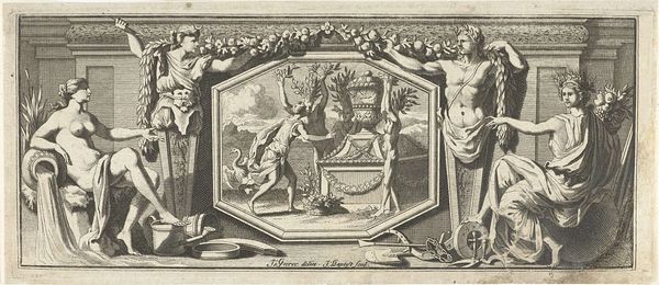
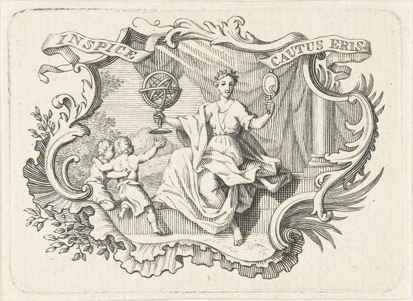
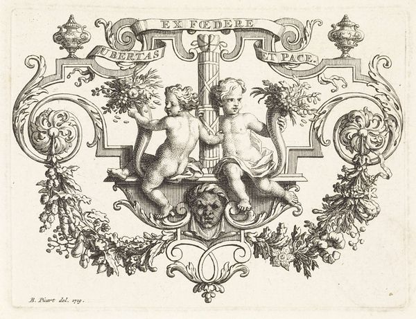
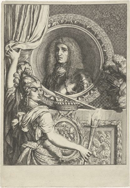
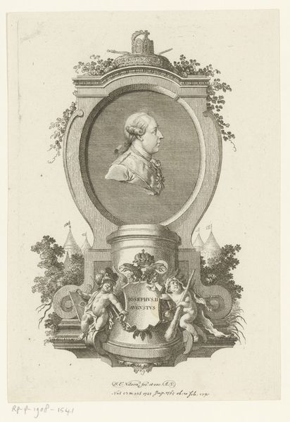
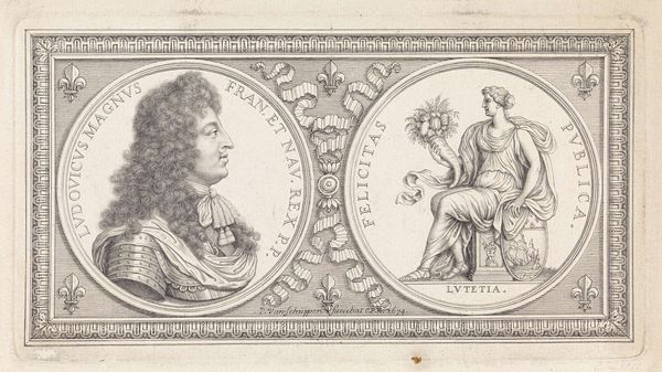
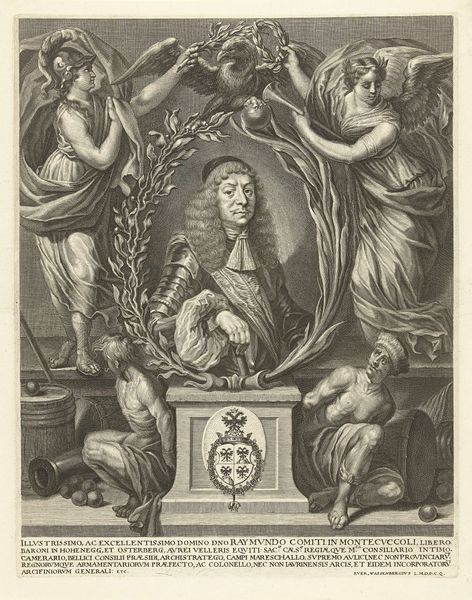
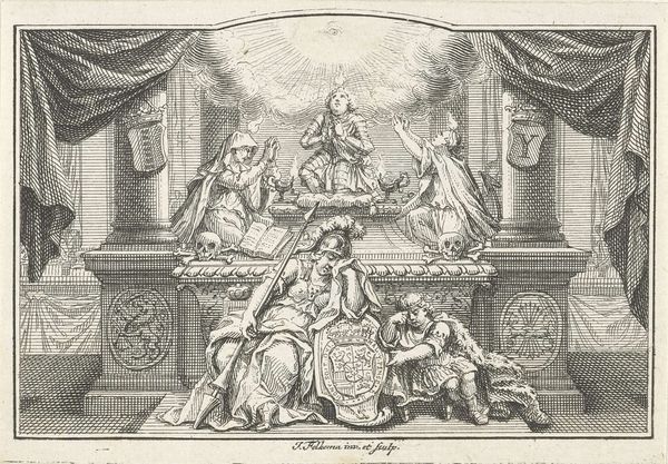
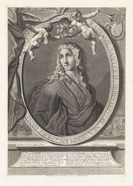
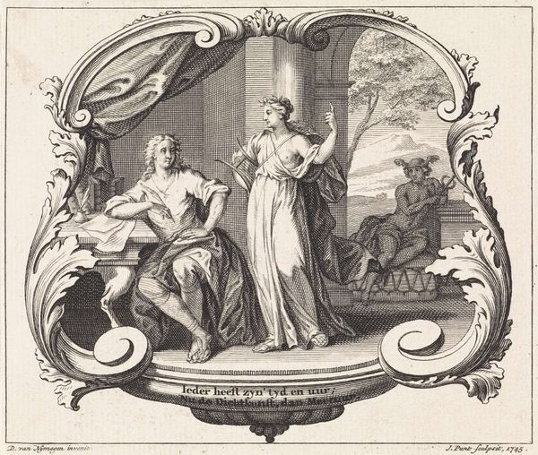
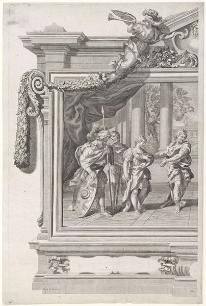
Editor: This engraving, titled "Cartouche met gelauwerde man en vrouw," is attributed to Giovanni Cattini, created sometime between 1735 and 1800. I’m immediately drawn to the central medallion and how the figures are staged on either side, but what can we really *see* in a work like this? Curator: From a formalist perspective, consider first the stark contrasts achieved through the engraver’s expert manipulation of line. Observe the texture created through hatching and cross-hatching, building volume and defining form within a restricted tonal range. What does that say to you? Editor: It almost feels like the central portrait is the most important thing—it draws my eye because of that round frame. Is that also related to this use of line and hatching? Curator: Precisely. The wreath, enclosing the double portrait, acts as a focal point due to its curved form and relative density of line work, particularly when contrasted with the flatter planes and less detailed execution of the figures flanking it. The figures adopt a triangular pattern that contains all components and stages them as equally valuable to the narrative. Editor: It's interesting to consider how those artistic choices—line, texture, form—guide our perception, creating focus and suggesting relationships between the figures. Is the meaning derived only from that? Curator: Meaning, here, arises directly from the arrangement of these intrinsic elements. The artist directs your vision through carefully calibrated contrasts. Observe how those static poses support the general composition! The goal is to observe what an artist can do within form without necessarily analyzing any cultural context behind the imagery. What else can you point out in terms of arrangement of shapes? Editor: Thinking about shapes, I didn’t notice the verticality until now. All components feature straight verticals to bring everything up, rather than expand out. Also, the light. Everything looks like its angled downward instead of at eye level. Curator: Exactly. Considering shape and form makes this composition even more exciting! Thank you for this fresh view on a fantastic engraving! Editor: It’s amazing how much is communicated purely through those visual strategies, regardless of the subject. I definitely notice more than I did at first glance.
Comments
No comments
Be the first to comment and join the conversation on the ultimate creative platform.
