Dimensions: 24 1/2 x 21 1/2 in. (62.23 x 54.61 cm) (canvas)33 1/2 x 29 3/4 x 3/4 in. (85.09 x 75.57 x 1.91 cm) (outer frame)
Copyright: Public Domain
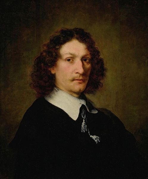
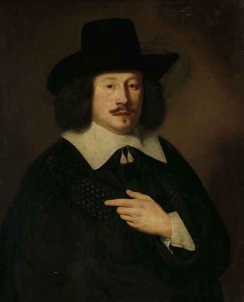
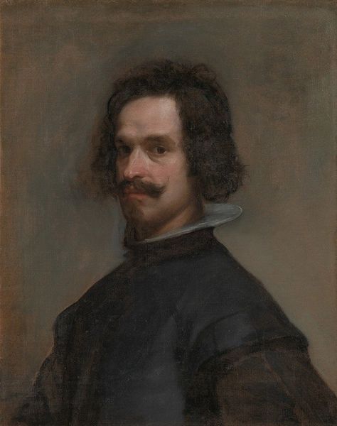
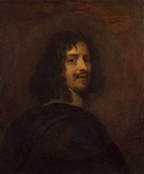
Curator: Here we have a “Portrait of Adriaen Hanneman,” dating from around 1630. The artist behind this oil on canvas is unknown, although the artwork itself currently resides at the Minneapolis Institute of Art. Editor: My immediate response is one of slightly unsettling poise. His gaze, that strong horizontal of his moustache – the overall effect, although meticulously rendered, is quite… distant. Curator: And it's precisely this measured distance that interests me. The hand gesture, while seemingly casual, echoes motifs of self-presentation found in much earlier Renaissance portraits. It serves as a subtle marker of status, but more than that it signals intellectual engagement – almost as if the man embodies a certain humanist ideal. The slightly angled gaze engages us with some level of challenge, though that challenge comes across more like wry amusement than cold assessment. Editor: True. Look how the stark white ruff accentuates his neck, drawing the eye upward. And yet, observe the somber blacks and browns that otherwise envelop him, flattening the picture plane. This feels far more like an exercise in controlling light and form, not an illumination of character. Do you think the almost monochrome palette is intentional? Curator: Undoubtedly. The almost severe constraint throws those key areas, such as the face and hand, into higher relief. Note, too, that the precise and focused highlighting accentuates elements of both power and culture. A detail to observe, particularly in its implied continuity over many periods of Western history, is how Hanneman, through gesture, invokes symbols of introspection that he is obviously at pains to assert. This symbol, of the individual reflecting in a time of transition, has strong resonance. Editor: It's interesting, too, how his hand bisects that stark black expanse. See the dramatic diagonal it creates, disrupting what would otherwise be an oppressively symmetrical composition. The light there also seems deliberately calibrated. Curator: Precisely. That's a potent gesture, almost daring the viewer to find his own reflection. A true masterclass of layered communication, it makes the whole canvas far more than just another period piece. Editor: Agreed. A rather effective construction of identity. It gives food for thought, particularly regarding light, shadow and suggestion.
Comments
No comments
Be the first to comment and join the conversation on the ultimate creative platform.
More like this