drawing, ink, pen
#
portrait
#
drawing
#
hand-lettering
#
hand drawn type
#
hand lettering
#
personal sketchbook
#
ink
#
hand-drawn typeface
#
ink drawing experimentation
#
pen-ink sketch
#
pen work
#
sketchbook drawing
#
pen
#
sketchbook art
#
calligraphy
Copyright: Rijks Museum: Open Domain
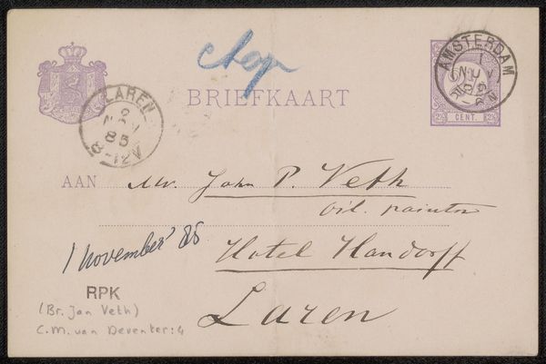
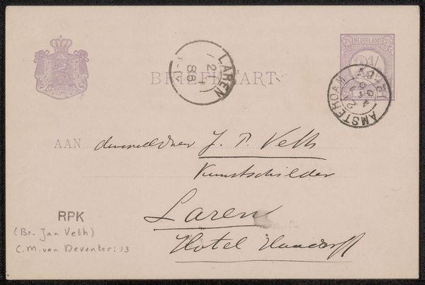
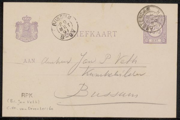
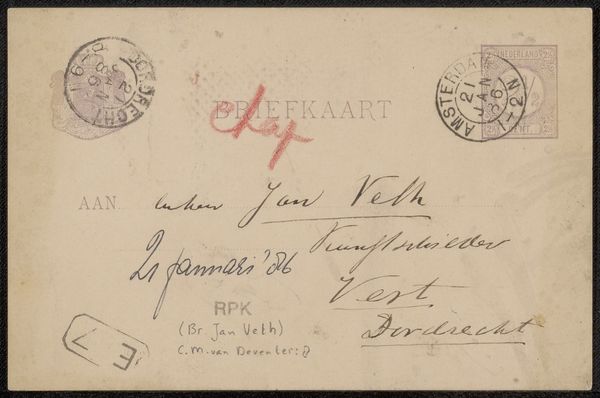
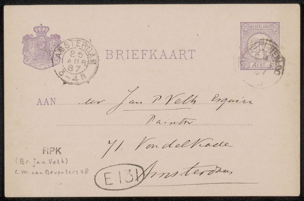
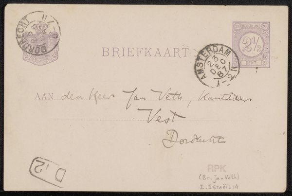
This postcard to Jan Veth was composed by Chap van Deventer using ink on paper. The structure of this "briefkaart" is immediately defined by the contrast between the clean, printed text at the top, and the flowing handwritten script below. Here, the application of the formal elements creates meaning. Note the stamps and postmarks, positioned at the upper corners, act as visual anchors. The printed word "BRIEFKAART" establishes a structural grid. The contrast between the mechanical printing and organic handwriting embodies a tension between standardization and individual expression. This tension reflects the changing modes of communication at the time. The signature "Chap" is rendered in a distinct blue ink, standing apart from the rest of the text and providing a focal point. The materiality of the ink and paper serves as a signifier of personal touch in an age increasingly dominated by mechanical reproduction. This simple postcard encapsulates a complex interplay between form, function, and the personal imprint of its creator.
Comments
No comments
Be the first to comment and join the conversation on the ultimate creative platform.
More like this