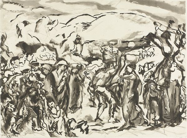
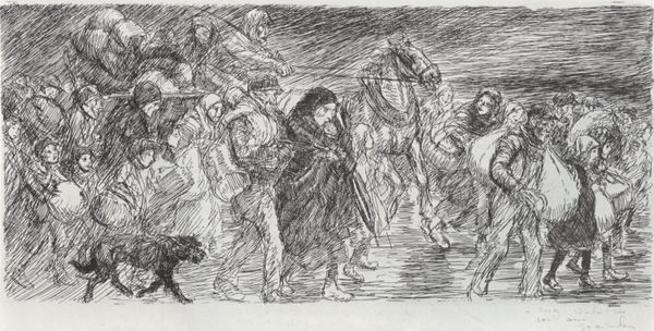
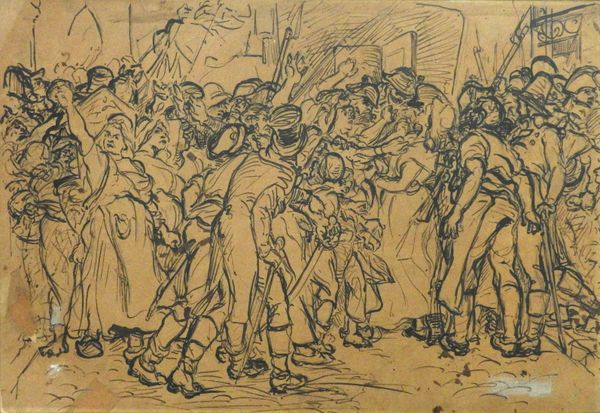
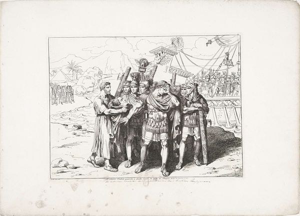
Italienske landboere handler med en bissekræmmer 1911 - 1915
0:00
0:00
drawing, ink
#
drawing
#
ink drawing
#
landscape
#
figuration
#
ink
#
genre-painting
#
realism
Dimensions: 129 mm (height) x 203 mm (width) (bladmaal)
Editor: Here we have "Italienske landboere handler med en bissekræmmer", or "Italian peasants trading with a travelling salesman", an ink drawing made between 1911 and 1915 by Peter Hansen. It's held here at the SMK. It feels very immediate to me, like a quick sketch capturing a fleeting moment. What compositional elements strike you the most? Curator: Immediately, the dynamism achieved through the contrast of textures arrests my attention. Notice the bold, decisive strokes delineating the figures in the foreground, each line seemingly imbued with purpose, compared to the subtle, almost tentative hatching used to suggest the distant mountains. Consider how these techniques serve to separate the planes in space, forcing a dialogue between background and figures. Editor: So you're focusing on how Hansen used different inking techniques to create depth. Are there any lines or shapes that you feel guide your eye in a particular direction? Curator: Indeed. The composition relies on a strategic placement of linear forms, and on rhythmic patterns created through repetition. The eye is led by diagonals. Observe how the converging lines of the landscape both frame and almost ‘funnel’ the eye towards the bustling cluster of figures in the center. The vertical strokes of their clothing also subtly pull the eye upwards. What is your interpretation of this tension? Editor: I hadn't thought of the converging lines of the mountains acting as a funnel! It really does create a sense of focus, which might emphasize the importance of the interaction between the figures, almost as if the landscape exists to spotlight this transaction. Are there other aspects you want to explore in it? Curator: The artist's strategic utilisation of blank space warrants further inspection. Does its presence evoke in the observer a sensation of isolation, or does the neutrality instead draw greater focus to the narrative encapsulated in the figures themselves? Editor: I think it keeps me from being distracted by extraneous detail, emphasizing that focal point that you discussed. I see now how much can be understood about the artist’s intention by looking at the structural choices he’s making in terms of line, space, and contrast. Thanks for elucidating all these points. Curator: The work speaks through the arrangement of forms, lines and space. Close visual analysis has revealed a powerful strategy!
Comments
No comments
Be the first to comment and join the conversation on the ultimate creative platform.
More like this