About this artwork
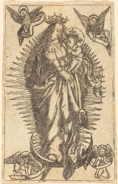
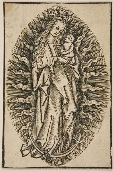
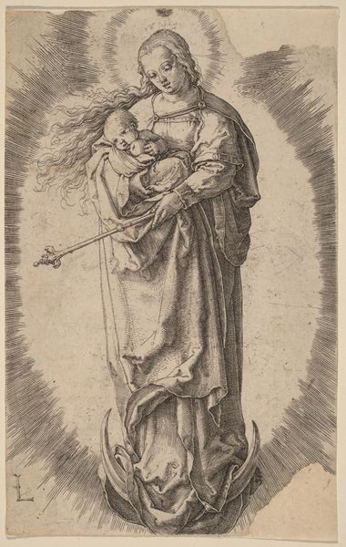
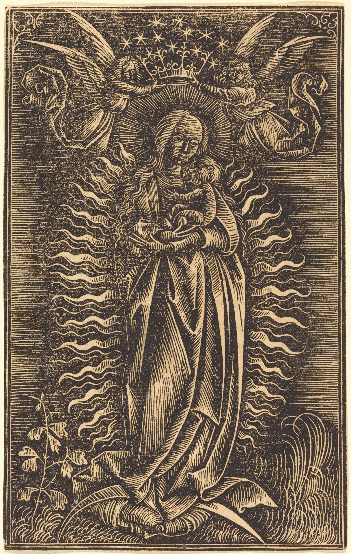
Editor: Here we have "The Virgin Crowned by Two Angels," a print from around 1500 by an anonymous artist. The stark contrast of the line work gives it an almost ethereal quality, but it also looks very stylized, almost ornamental. What do you see in this piece, from a formal point of view? Curator: The success of this print hinges precisely on that interplay of linear forms and stark contrasts. Consider how the radiating lines behind the Virgin function: They establish a visual rhythm, almost a pulsating halo, that both isolates and elevates her figure. Note the differing textures achieved through varying densities of line – the soft, flowing drapery versus the more rigid, patterned background. How does this deliberate use of line direct your eye? Editor: I see how the lines sort of force your eyes toward the center of the image, the Virgin and Child. The contrasting textures really emphasize them as the focal point, creating a sense of depth and importance. Is it right to interpret the differences between textures and contrasts of lines in the image as symbolic? Curator: While the image resonates with spiritual and devotional content, that is better understood via symbolic interpretation than pure form. I focus instead on how the formal structure dictates the viewers’ gaze, compelling their attention toward central compositional motifs and thematic ideas through visual organization, balance, and texture. To what effect is the somewhat crudely engraved line, versus smoother, more regular applications? Editor: That makes sense, looking at it in terms of directing attention, and not ascribing symbolic values to form alone. This helps separate line quality from subject in analysis. I suppose that without this emphasis, viewers’ eyes would be wandering all over the image, unfocused on what to really see, even without the need for contextual background on who those images are and why they are positioned the way they are in that print. Curator: Precisely. By prioritizing an internal and optical means of assessing the subject of the print, we can avoid the trappings of personal biases, in turn gaining a more direct awareness of visual construction in pictorial space. That helps make your experience of its form richer and more immediate.
The Virgin Crowned by Two Angels
c. 1500
Artwork details
- Medium
- Copyright
- National Gallery of Art: CC0 1.0
Tags
Comments
Share your thoughts
About this artwork
Editor: Here we have "The Virgin Crowned by Two Angels," a print from around 1500 by an anonymous artist. The stark contrast of the line work gives it an almost ethereal quality, but it also looks very stylized, almost ornamental. What do you see in this piece, from a formal point of view? Curator: The success of this print hinges precisely on that interplay of linear forms and stark contrasts. Consider how the radiating lines behind the Virgin function: They establish a visual rhythm, almost a pulsating halo, that both isolates and elevates her figure. Note the differing textures achieved through varying densities of line – the soft, flowing drapery versus the more rigid, patterned background. How does this deliberate use of line direct your eye? Editor: I see how the lines sort of force your eyes toward the center of the image, the Virgin and Child. The contrasting textures really emphasize them as the focal point, creating a sense of depth and importance. Is it right to interpret the differences between textures and contrasts of lines in the image as symbolic? Curator: While the image resonates with spiritual and devotional content, that is better understood via symbolic interpretation than pure form. I focus instead on how the formal structure dictates the viewers’ gaze, compelling their attention toward central compositional motifs and thematic ideas through visual organization, balance, and texture. To what effect is the somewhat crudely engraved line, versus smoother, more regular applications? Editor: That makes sense, looking at it in terms of directing attention, and not ascribing symbolic values to form alone. This helps separate line quality from subject in analysis. I suppose that without this emphasis, viewers’ eyes would be wandering all over the image, unfocused on what to really see, even without the need for contextual background on who those images are and why they are positioned the way they are in that print. Curator: Precisely. By prioritizing an internal and optical means of assessing the subject of the print, we can avoid the trappings of personal biases, in turn gaining a more direct awareness of visual construction in pictorial space. That helps make your experience of its form richer and more immediate.
Comments
Share your thoughts