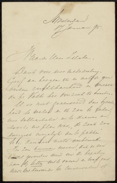
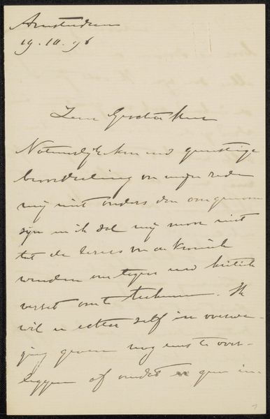
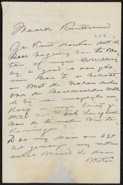
drawing, paper, ink, pen
#
drawing
#
ink drawing
#
pen drawing
#
dutch-golden-age
#
impressionism
#
paper
#
ink
#
pen
Copyright: Rijks Museum: Open Domain
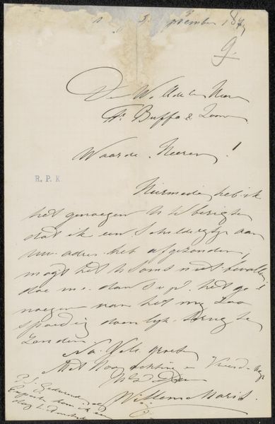
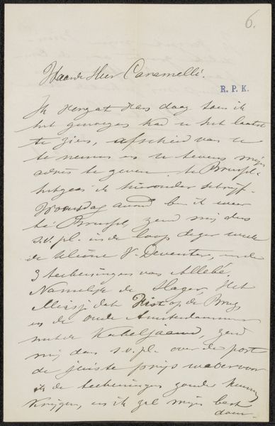
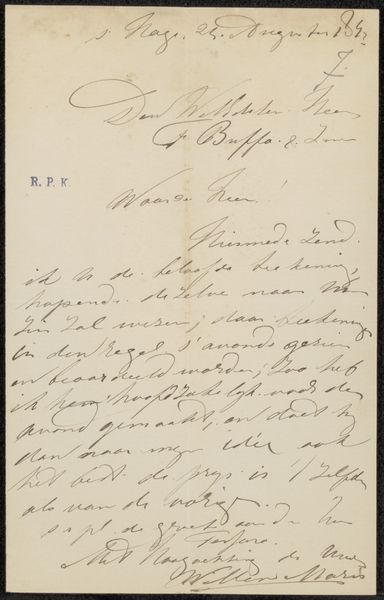
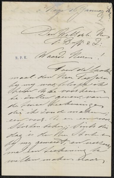
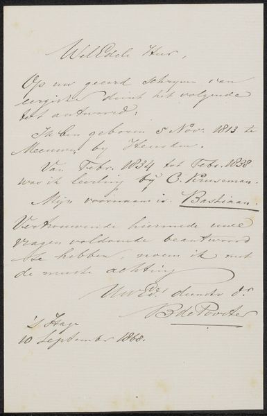
Editor: So, we're looking at "Brief aan Frans Buffa en Zonen," a letter—probably from 1873—by Willem Maris. It's pen and ink on paper. My initial thought is that, beyond just conveying its immediate message, the letter itself feels so delicate. Like a preserved breath from the past. What are your initial impressions of this? Curator: You've hit on something important already—it IS delicate, isn't it? Frail, almost. A whisper across time. Maris is primarily known for his paintings, particularly landscapes that evoke a very specific, almost dreamlike, Dutch atmosphere. But here, stripped bare of color and broad strokes, we see another facet of his artistry. Consider the intimacy, the vulnerability in handwriting itself. How does it feel different to encountering his paintings? Editor: It feels so much more personal, of course. More raw, immediate. I mean, with painting there's process, layering. This is…just *there.* No room to hide. I wonder if his personality is conveyed. I assume, of course, he actually wanted to communicate... Curator: Ha! Well, he was sending the letter! And there’s intent, and the constraint that paper can only handle a finite amount of edits or mistakes. It’s more unfiltered, yes. What details jump out at you? Editor: The cursive! It’s so different from what we're used to, or me, anyway, and difficult to read. Was that typical script for the time? Curator: Absolutely. Formal correspondence had its conventions, a kind of dance of politeness, that governed not just content but penmanship as well. Now, imagine Maris holding this pen, his hand moving across the page… what thoughts and impressions would you make based off what is written here? Does his artistic talent make it good handwriting too? Editor: I guess I never thought of handwriting as a snapshot of an artistic sensibility, but it really makes sense here. It almost reads like an Impressionistic sketch in ink rather than brush strokes...I never considered looking at a letter as art before! Curator: Indeed! A reminder that art can exist in unexpected places.
Comments
No comments
Be the first to comment and join the conversation on the ultimate creative platform.
More like this