drawing, paper, ink
#
portrait
#
drawing
#
dutch-golden-age
#
paper
#
ink
#
realism
#
calligraphy
Copyright: Rijks Museum: Open Domain
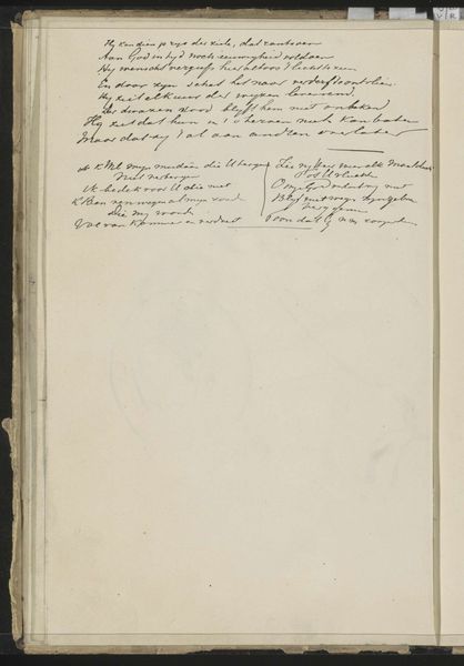
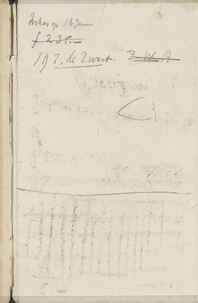
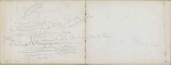
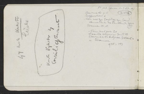
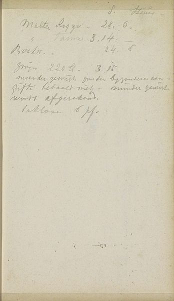
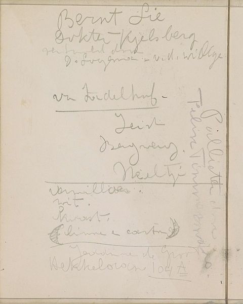
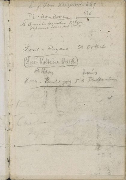
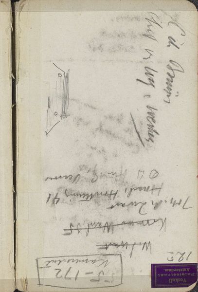
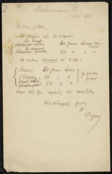
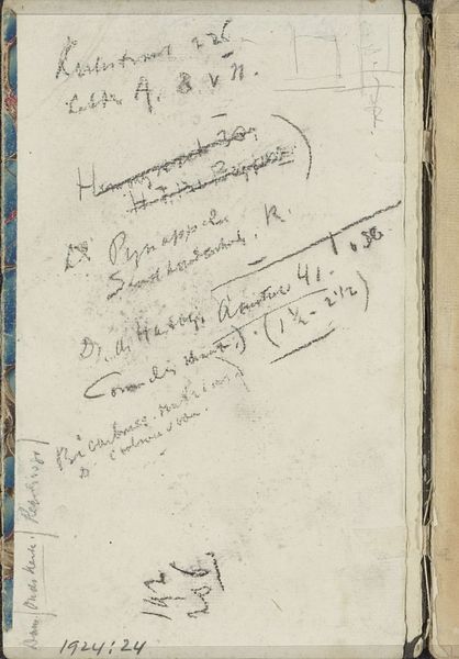
Curator: Here we have "Annotations," a drawing in ink on paper by George Hendrik Breitner, created around 1893. What are your initial thoughts? Editor: At first glance, it appears quite simple—almost like a casual notation. The texture of the paper contrasts with the fluid ink calligraphy to create a harmonious arrangement in a muted palette. Curator: Breitner was working at a fascinating juncture in Dutch society, one of increasing urbanization and industrialization, especially felt in Amsterdam. The quick sketches capture slices of the life he witnessed firsthand. He used annotations as records. Editor: Focusing on the composition, I’m struck by how the lines vary in weight and direction. The strokes create an intimate, personal dynamic on this simple, ivory-toned surface. Notice the economy of the marks—nothing seems extraneous. Curator: Breitner's aesthetic reflected a shift in art. Traditional approaches idealized depictions were replaced by unflinching observation of reality, influenced by Impressionism and photography, with an attempt to chronicle all echelons of Amsterdam inhabitants during an epochal change. Editor: So you would say the act of documenting specific social dynamics makes the ordinary interesting and the subjective observations culturally important? The placement of the text, as if quickly jotted down, does suggest an immediacy— almost a rejection of formal composition rules. Curator: Precisely. And it emphasizes Breitner's broader project: to document the everyday and enshrine it into collective memory through the fine arts. The mundane in its cultural time capsule for posterity. Editor: What do you find to be its enduring appeal? Curator: In my estimation, its ability to invite introspection, reminding us that even seemingly insignificant observations can hold historical and emotional value. Breitner allows viewers to glimpse the daily tempo of a different Amsterdam, sparking curiosity and critical thinking. Editor: Yes, and viewed from the pure semiotics, that balance of written lines and the visual page as surface for impressions and memories offers us an elegant, timeless study of contrasts. Curator: A worthy reflection, indeed!
Comments
No comments
Be the first to comment and join the conversation on the ultimate creative platform.
More like this