Dimensions: height 121 mm, width 85 mm
Copyright: Rijks Museum: Open Domain
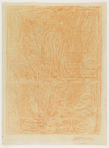
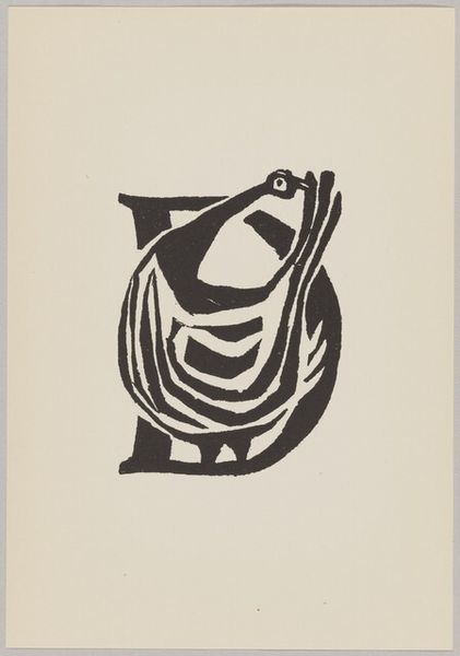
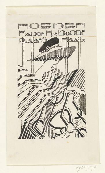
Editor: Here we have "Nederlandsche Vereeniging tot Bescherming van Dieren," a poster, or perhaps graphic art from somewhere between 1906 and 1945, now at the Rijksmuseum. It’s giving off serious art nouveau vibes, yet there’s this distinct linearity about it that feels…stark? I'm wondering, what do you make of the overall composition and that limited palette? Curator: Oh, this piece hums with quiet dedication, doesn’t it? Like a whispered promise etched onto paper. The simple lines remind me of topographic maps, guiding your eye around the gentle embrace of a hand protecting a bird. It's graphic, yes, but the very starkness you mentioned allows the message of animal protection to resonate with a subtle insistence, don't you think? A bit like a well-phrased motto clinging to the memory long after it's spoken. Editor: That’s a lovely take, the topographic idea…It definitely highlights the caring aspect, that sense of guidance. It's more gentle than I first perceived. I’d been focusing on the geometry in the font choices. Curator: Exactly! And even those somewhat austere letterforms, while very much of their time, speak to a desire for clarity, for conveying the message in a universally understandable way. Consider the period. A poster like this would’ve been competing for attention amidst the visual chaos of city life, the cacophony of commerce and competing causes. The simplification is key to being *seen*. Editor: So, effective visual communication through elegant simplicity. That’s fascinating. I was too quick to judge its seriousness, overlooking the potential impact it could have. I suppose its beauty lies in the convergence of art and advocacy. Curator: Precisely! And maybe even a smidge of quiet rebellion against the visual excesses of the time. Food for thought, wouldn’t you say?
Comments
No comments
Be the first to comment and join the conversation on the ultimate creative platform.
More like this