acrylic-paint
#
abstract-expressionism
#
abstract expressionism
#
abstract painting
#
water colours
#
minimalism
#
colour-field-painting
#
acrylic-paint
#
neo expressionist
#
abstract-art
#
abstraction
#
line
#
abstract art
#
hard-edge-painting
#
watercolor
#
monochrome
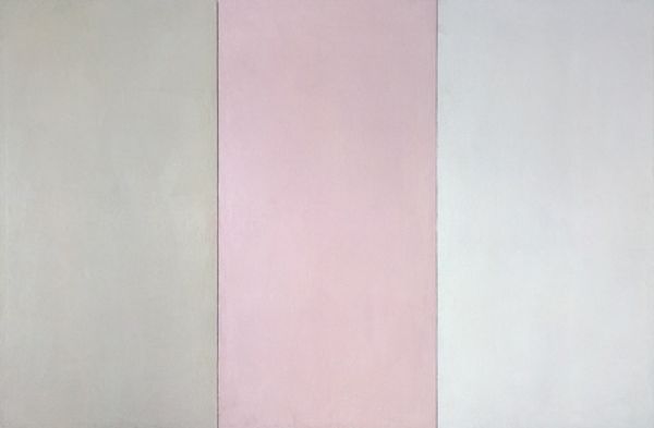
Copyright: Brice Marden,Fair Use
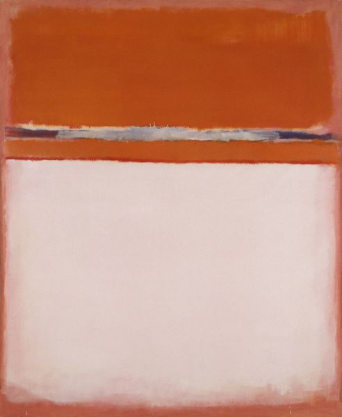
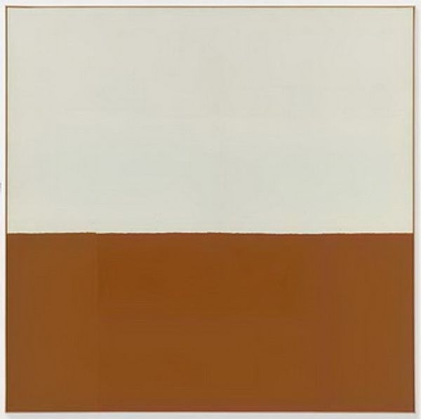
Curator: Brice Marden created "Blunder" in 1969 using acrylic paint. What's your first impression? Editor: It's deceptively simple. Initially, I see two blocks of subtly different colours bisected by a thin vertical line. A soft peach on the right, balanced by a paler, sandy hue to the left. A deceptively powerful exercise in chromatic relations. Curator: Indeed. It almost looks Rothko-esque. Marden often reduced forms to basic geometries to tap into underlying emotional and psychological resonances. The simplicity acts like a visual koan, prompting contemplation. The title, "Blunder", could point to a moment of chance, maybe a creative breakthrough born of missteps. Editor: That's intriguing. Does the ‘blunder’ then signify an accidental brilliance, revealed through an initially perceived error? This reinforces the impact of the colour field and composition; they prompt us to consider how the interaction and tension of the colour creates feeling. It is the materiality and execution, not a grand symbolic scheme, that holds the work’s significance. Curator: Well, the blush tones are certainly evocative, historically related to skin tones and intimating themes of mortality and tenderness. Marden allows colour and form to trigger inherent associations. The seemingly stark divide enhances an awareness of separation – perhaps isolation but also unique existence. The subtle color differences are, as you indicate, significant—these gradations speak of the individuality of human experience. Editor: Precisely. The vertical band between the two main fields could be read as an exploration of surface, the physical support upon which the color is laid. Semiotically, we see two colours rendered flat, the eye encouraged to move between to consider the interaction and inherent structure of its production. Curator: Whether blunder or conscious choice, the final piece allows viewers to draw their own subjective, associative links. A piece ripe for meditation and personal significance. Editor: Precisely; a reductive exploration and invitation for sensory and cerebral reflection upon our perception.
Comments
No comments
Be the first to comment and join the conversation on the ultimate creative platform.
More like this