print, photography, albumen-print
#
aged paper
#
homemade paper
#
paperlike
# print
#
landscape
#
personal journal design
#
photography
#
personal sketchbook
#
hand-drawn typeface
#
thick font
#
thin font
#
albumen-print
#
realism
#
historical font
#
small font
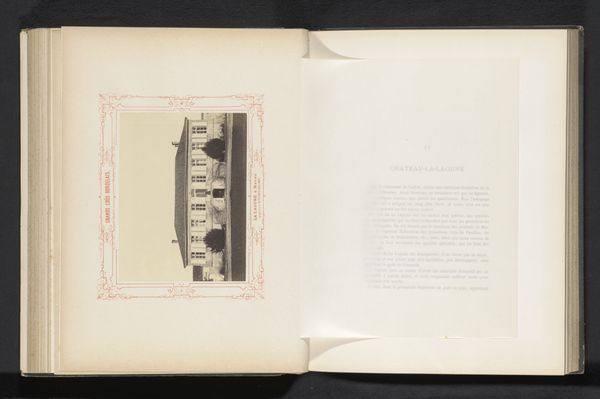
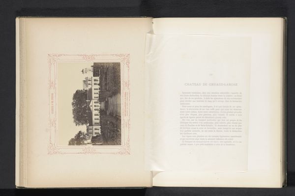
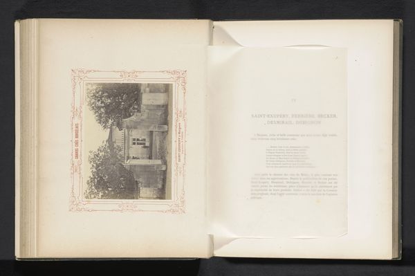
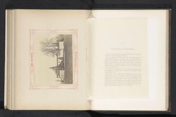
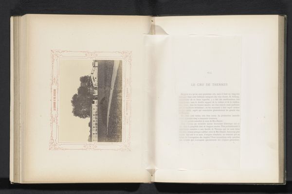
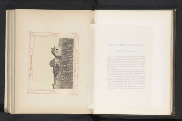
Dimensions: height 128 mm, width 170 mm
Copyright: Rijks Museum: Open Domain
Editor: So, here we have an albumen print, "View of the gate of Château Lascombes in Margaux, France," by Alfred Danflou, made before 1867. It's presented within the pages of what appears to be a photo album or travel journal. What I immediately notice is the slightly melancholic, almost dreamlike quality given by the aging of the print. What symbols or narratives do you see embedded in this piece? Curator: It's fascinating how the framing within the book page adds a layer of intimacy. Note how the image of the Château Lascombes gate isn’t merely a depiction of a physical place; it's a gateway to a world of history and aspiration. The gate itself acts as a symbolic barrier and invitation. Consider the psychological weight of gates in our collective consciousness. What does a gate signify to you? Editor: Security, boundaries, but also passage. The invitation makes sense, now that you point it out. What of the lettering; the text surrounding the photo? Curator: The text, bordering the image, is a strong marker of identity. The specific fonts employed echo those used to advertise different growths. Also the hand-drawn typeface infers how photographic practice was not separate from more craft-based design and calligraphic forms. I encourage listeners to pause and ponder the contrast between the crisp, "modern" image and more nostalgic old-world hand lettering, too. This is especially present within an increasingly industrialised context...What do you make of it? Editor: That's an interesting tension to consider! Seeing how these forms combine is interesting for how each communicates values around progress and historical association. I've never quite considered the craft involved with fonts and the messages they conveyed. Curator: Exactly. Photography creates what feels like a portal, a looking-glass effect – one bolstered and questioned by typeface. It truly encapsulates an era on the cusp of profound transformations. It reminds us to contemplate how even seemingly straightforward images carry layers of symbolic and cultural weight. Editor: Absolutely, I now appreciate how this singular image operates as a meeting point of shifting artistic and cultural identities. Thanks for walking me through it!
Comments
No comments
Be the first to comment and join the conversation on the ultimate creative platform.
More like this