drawing, ink, pen
#
drawing
#
sketch book
#
hand drawn type
#
personal sketchbook
#
ink
#
idea generation sketch
#
sketchwork
#
ink colored
#
pen work
#
sketchbook drawing
#
pen
#
storyboard and sketchbook work
#
sketchbook art
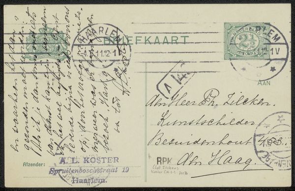
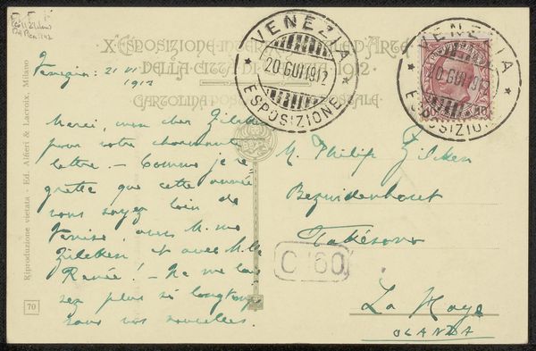
Copyright: Rijks Museum: Open Domain
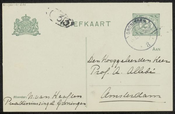
This postcard, by Floris Verster, is a personal correspondence sent to Philip Zilcken; the stamp suggests it was made around the turn of the 20th Century. What I immediately notice is the directness of the handwriting, the way the ink bleeds slightly into the paper, creating a halo effect around the words. It feels intimate, unpretentious, like a quick thought jotted down in haste. The smudges and faded ink tell a story of time and touch. The postal stamps, with their concentric circles and tiny stars, add another layer of texture, a visual echo of the message itself. It's the kind of thing you can only get with ink; digital just doesn’t have this quality. Verster's mark-making reminds me of James Ensor, in its slightly manic energy. But in the end, it's the simple act of communication that resonates most. It is the imperfection that gives it character.
Comments
No comments
Be the first to comment and join the conversation on the ultimate creative platform.
More like this