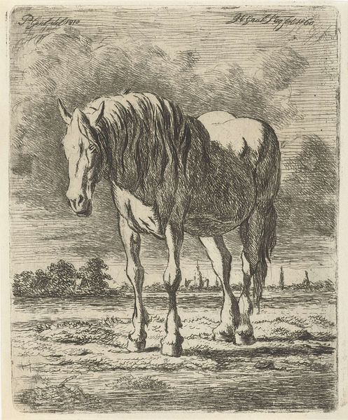
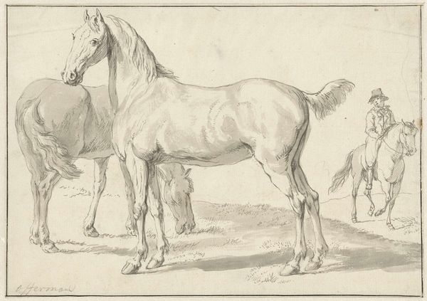
drawing, paper, ink
portrait
drawing
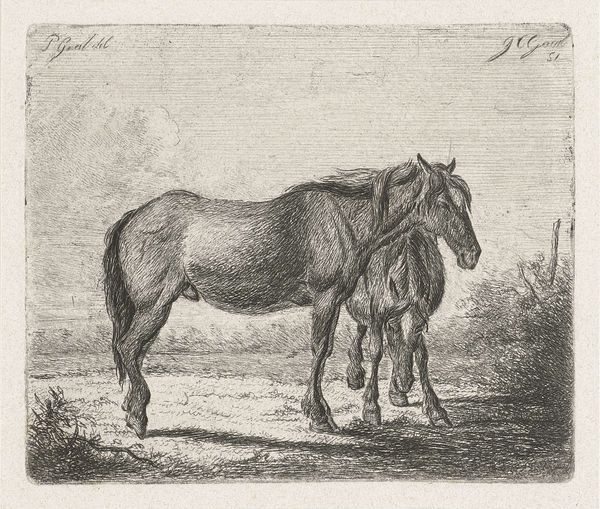
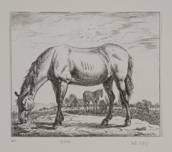
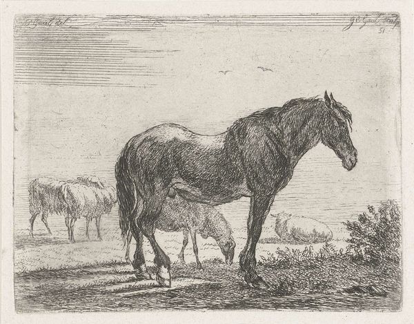
animal
landscape
figuration
paper
ink
horse
line
realism
Dimensions: height 120 mm, width 98 mm
Copyright: Rijks Museum: Open Domain
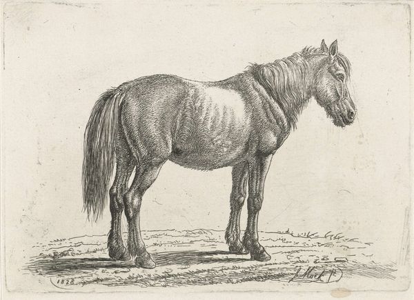
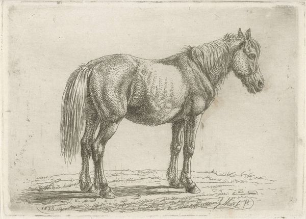
Curator: Standing before us is Jacobus Cornelis Gaal’s 1860 ink drawing on paper, "Staand wit paard," currently housed in the Rijksmuseum. The texture immediately strikes me; the sheer mass of this animal rendered so delicately. Editor: The density of line work is what initially grabs me. The crosshatching that forms the horse’s body must have taken incredible care. What does it evoke for you? Curator: There's a quiet dignity in its posture, a reserved power rendered through realism, yet softened by the nature of ink. It lacks the dramatic tension we might expect from, say, Delacroix's animal studies, doesn't it? It’s also interesting to see this horse in the landscape: the semiotics involved and his own reading. Editor: Absolutely. Consider the paper it’s drawn on—relatively inexpensive, accessible. Ink drawings often served as studies, drafts for larger works. I’m fascinated by what Gaal might have observed and rendered using basic materials and lines to capture movement. Also notice that in some parts we don't even see that kind of detailing. Curator: Precisely. The composition, as stark as it appears, provides a delicate interplay of presence and absence—that in turn is completed with an interaction of different styles and shades which the artist achieves without employing multiple inks, yet by varying the density and strength of his hand on the material. It is not only the depiction of an animal or countryside landscape, but a deep study of nature. Editor: We also can think about the labour behind it, each strike is very clear in capturing musculature of the horse in contrast with some vaguer passages like the landscape, which almost becomes background. It’s like foregrounding labor and process, don’t you think? It reflects the society and time that we lived in, especially because these kind of figures where common, this is very clear on its materiality, especially with all the features already stated: it doesn't necessarily belong to one tradition of ink drawing, as you would see in far-east Asia. Curator: A telling point, indeed. The contrast speaks volumes about intention, process and vision in approaching a familiar theme through a more familiar material. Editor: I think looking closer, we start to unpack how artistic conventions, when applied to such an ordinary subject as a farm animal, can unveil fascinating perspectives on work, materiality, and vision in its time.
Comments
No comments
Be the first to comment and join the conversation on the ultimate creative platform.