About this artwork
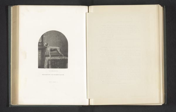
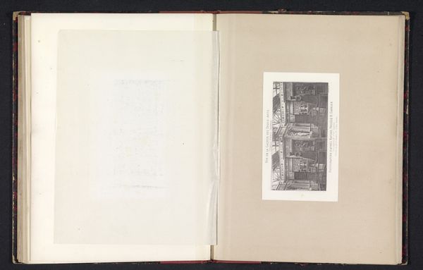
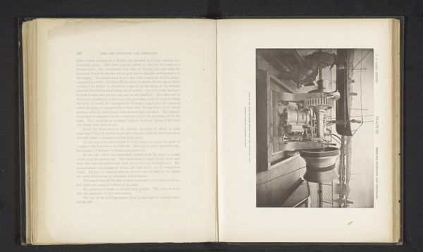
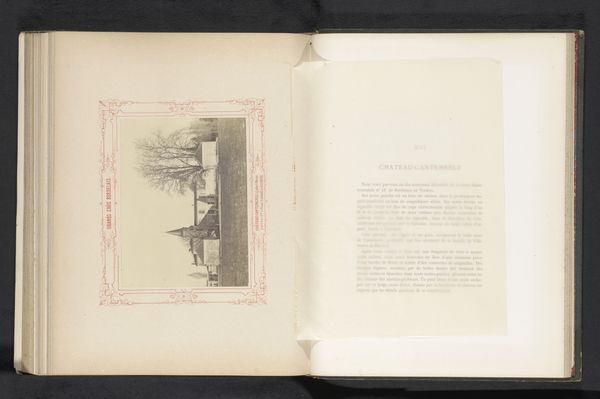
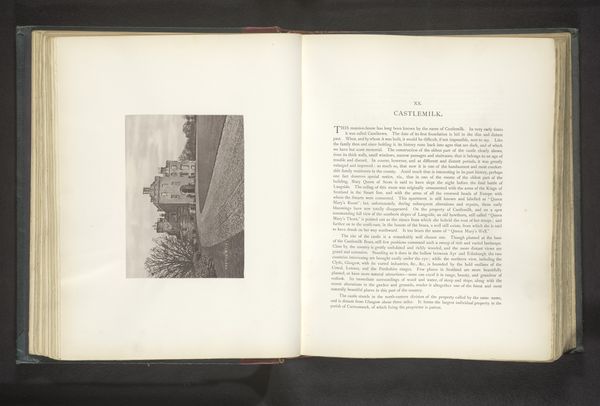
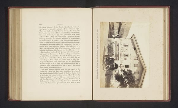
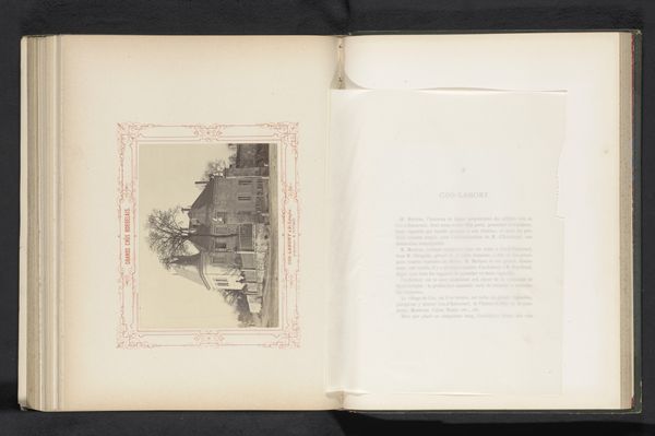
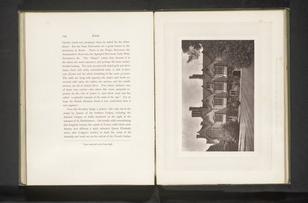
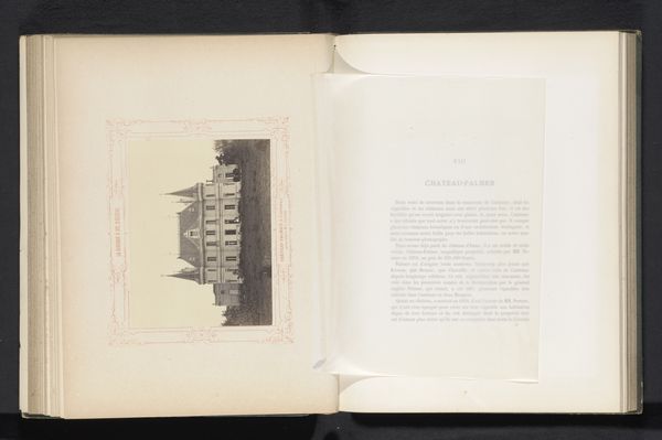
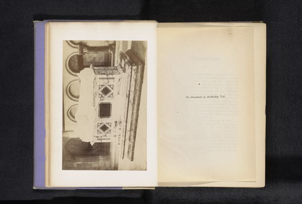
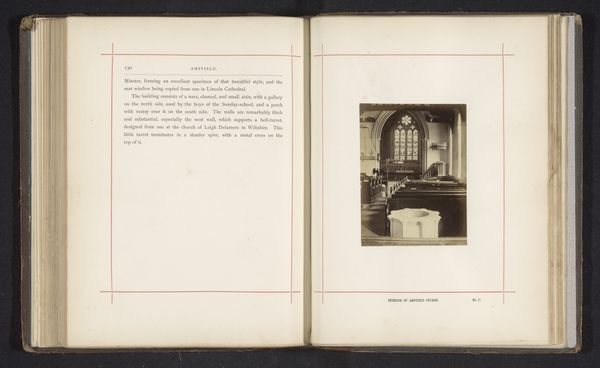
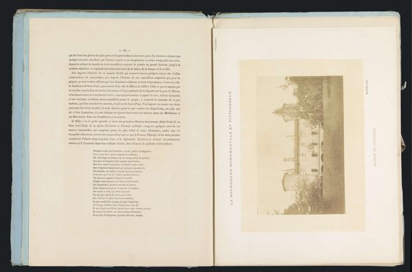
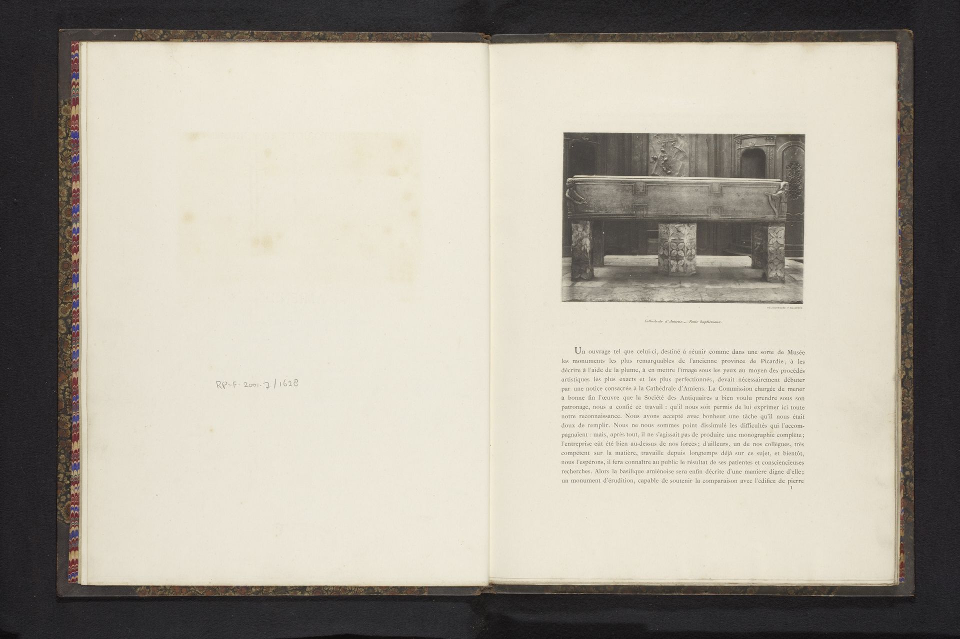
Editor: This is a page from an anonymous sketchbook, dating back to around 1893, and features a study titled "Doopvont in de Notre-Dame van Amiens" which I believe translates to the baptismal font in the Notre-Dame cathedral of Amiens. It’s interesting because it shows not only the artwork itself, but also aged paper and various fonts. I find myself drawn to the geometric shapes and tonal range in the depiction of the font. What stands out to you, aesthetically speaking? Curator: Note the deliberate arrangement of the image and text, positioned symmetrically across the double page. Consider how the typography's varied weight and style—some characters possessing a delicate thinness, others bold and assertive—interact with the somber photographic image of the font. Is the anonymous artist perhaps interested in drawing a formal comparison between architectural structure and the structure of language itself? How do these visual and textual elements inform each other formally? Editor: That’s an interesting take, seeing the arrangement and fonts themselves as a composition. I hadn’t thought of it that way, considering the way both the fonts and image are laid out symmetrically, which echoes the structural formality of the architecture itself. Do you think that's intentional, or is it just the style of the period? Curator: To assert pure intent would be speculative. But, consider that nothing here is accidental. Observe the relationships: the placement, the font choices, the composition of both the photograph and the printed page itself. The aged paper further adds to this visual system; its inherent texture offers another formal element. It begs a question: what does the formal intersection of these aesthetic choices communicate about the subject, the baptismal font itself? Editor: So, by examining these visual cues and design choices we get a different sense of how people during the time approached image-making and documentation. Thank you. Curator: Indeed, by focusing on form and composition, we begin to uncover the dialogue between the artist, the subject, and the viewer.
Artwork details
- Dimensions
- height 115 mm, width 165 mm
- Copyright
- Rijks Museum: Open Domain
Tags
aged paper
homemade paper
personal sketchbook
hand-drawn typeface
thick font
handwritten font
golden font
thin font
historical font
small font
Comments
Be the first to share your thoughts about this work.
About this artwork
Editor: This is a page from an anonymous sketchbook, dating back to around 1893, and features a study titled "Doopvont in de Notre-Dame van Amiens" which I believe translates to the baptismal font in the Notre-Dame cathedral of Amiens. It’s interesting because it shows not only the artwork itself, but also aged paper and various fonts. I find myself drawn to the geometric shapes and tonal range in the depiction of the font. What stands out to you, aesthetically speaking? Curator: Note the deliberate arrangement of the image and text, positioned symmetrically across the double page. Consider how the typography's varied weight and style—some characters possessing a delicate thinness, others bold and assertive—interact with the somber photographic image of the font. Is the anonymous artist perhaps interested in drawing a formal comparison between architectural structure and the structure of language itself? How do these visual and textual elements inform each other formally? Editor: That’s an interesting take, seeing the arrangement and fonts themselves as a composition. I hadn’t thought of it that way, considering the way both the fonts and image are laid out symmetrically, which echoes the structural formality of the architecture itself. Do you think that's intentional, or is it just the style of the period? Curator: To assert pure intent would be speculative. But, consider that nothing here is accidental. Observe the relationships: the placement, the font choices, the composition of both the photograph and the printed page itself. The aged paper further adds to this visual system; its inherent texture offers another formal element. It begs a question: what does the formal intersection of these aesthetic choices communicate about the subject, the baptismal font itself? Editor: So, by examining these visual cues and design choices we get a different sense of how people during the time approached image-making and documentation. Thank you. Curator: Indeed, by focusing on form and composition, we begin to uncover the dialogue between the artist, the subject, and the viewer.
Comments
Be the first to share your thoughts about this work.
