drawing, paper, ink, pen
#
drawing
#
pen sketch
#
old engraving style
#
hand drawn type
#
paper
#
personal sketchbook
#
ink
#
hand-drawn typeface
#
ink drawing experimentation
#
pen-ink sketch
#
pen work
#
sketchbook drawing
#
pen
#
sketchbook art
Copyright: Rijks Museum: Open Domain
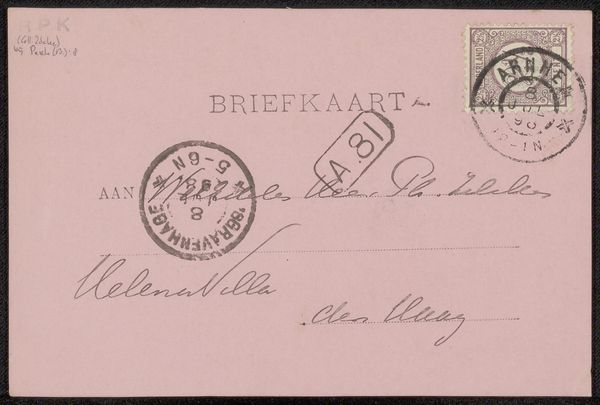
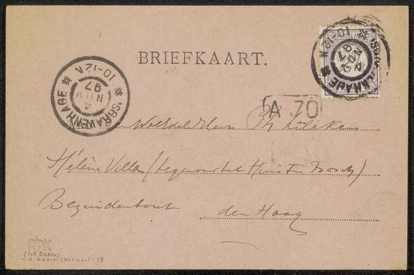
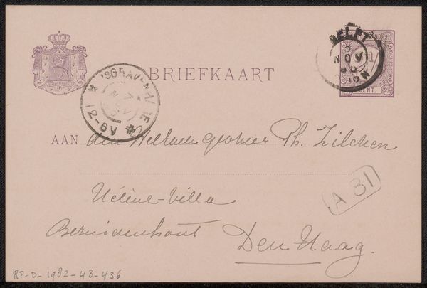
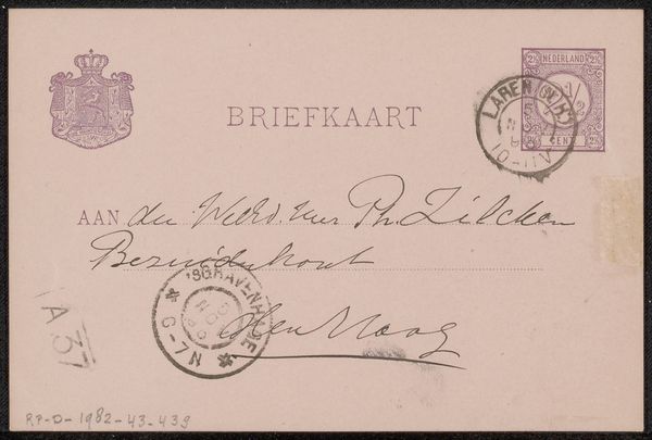
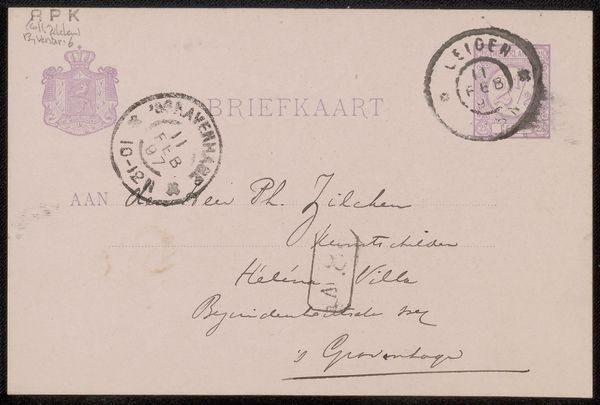
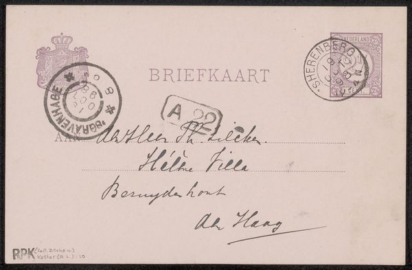
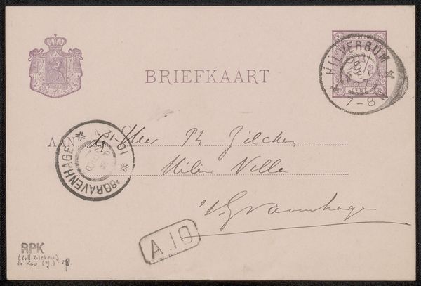
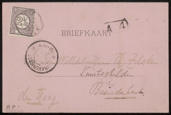
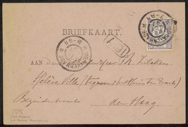
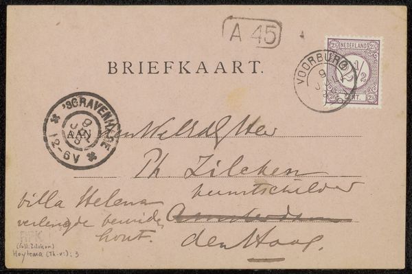
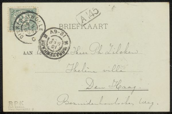
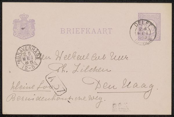
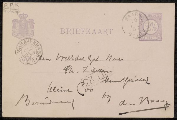
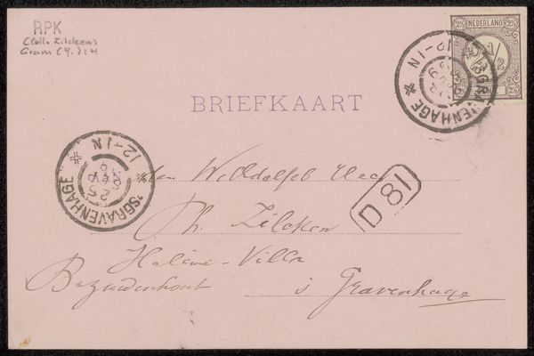
This "Briefkaart aan Philip Zilcken", or postcard to Philip Zilcken, was made by Christina Elizabeth Perk. Its simple design and delicate color evoke the intimacy of personal correspondence. The muted pink of the card is punctuated by the darker inks of the address, stamps and postal marks. These elements are arranged on the rectangular surface to guide the eye, drawing attention to the handwritten message and destination. The layout emphasizes a structural clarity where each component has a distinct yet integrated role. The ordered design and postal markings serve not only practical purposes but act as cultural signs and symbolic frameworks of communication. The cancellation stamps, with their circular forms, disrupt the rigid grid of text and lines. It also serves to remind us of the broader administrative systems that enable such exchanges, and hint at wider societal and bureaucratic structures governing our interactions. Each of these formal elements highlights how art is not merely aesthetic but deeply embedded within broader systems of meaning and exchange.
Comments
No comments
Be the first to comment and join the conversation on the ultimate creative platform.
More like this