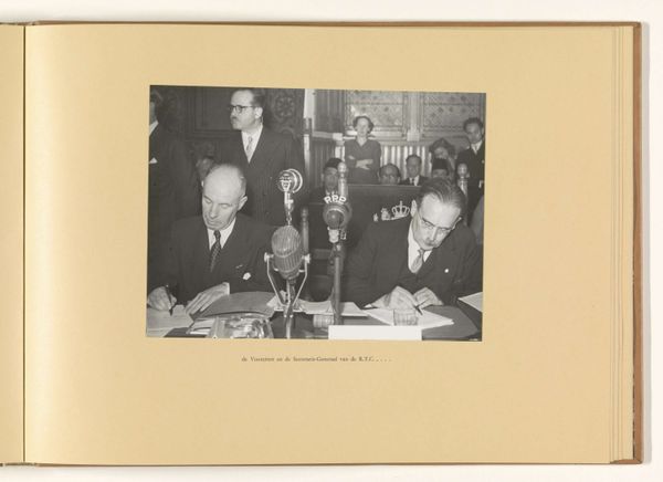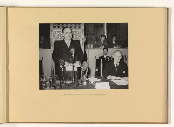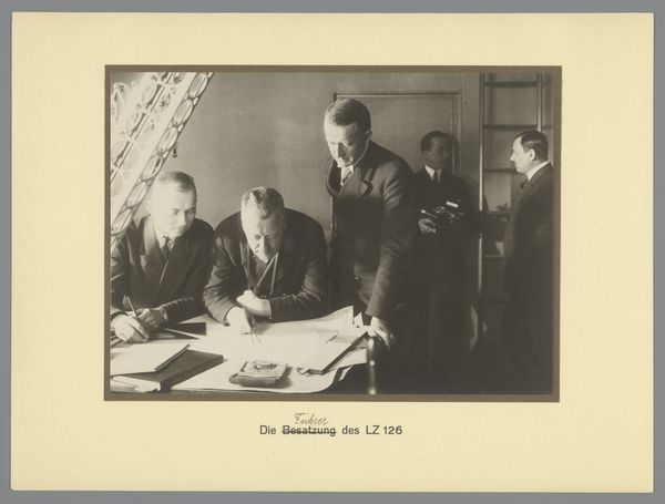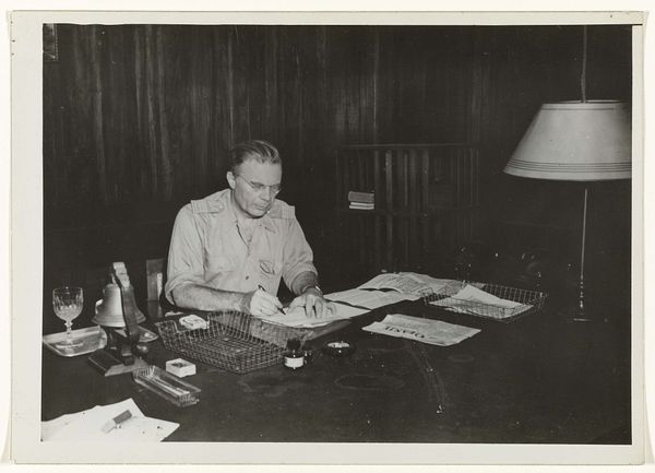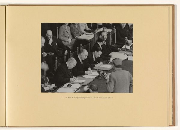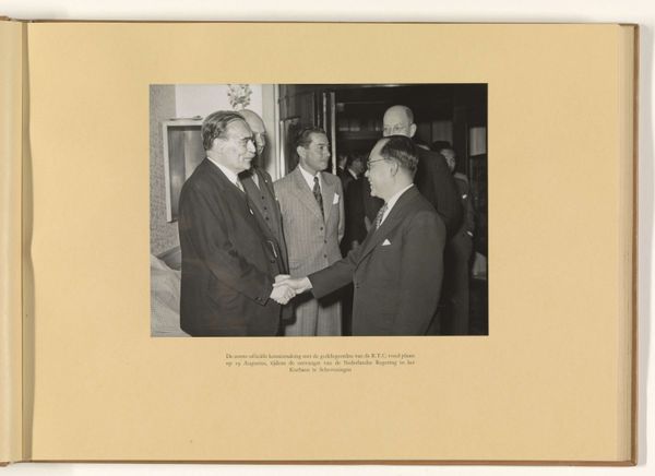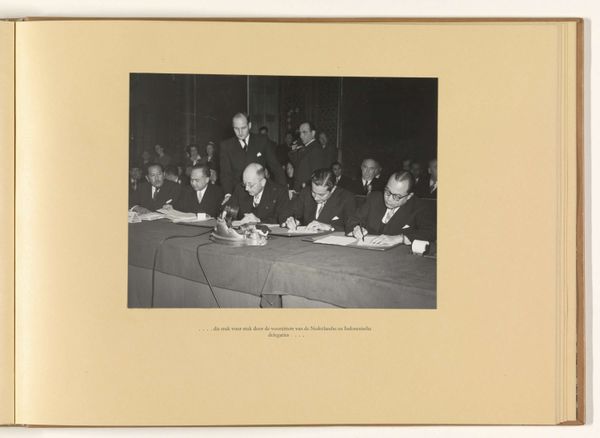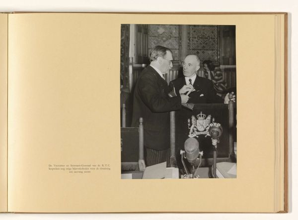
waarop de resultaten vorm kregen in de mantelresolutie met de bijbehorende briefwisseling Possibly 1949
0:00
0:00
regeringsvoorlichtingsdienst
Rijksmuseum
print, photography
#
portrait
#
aged paper
#
homemade paper
#
paper non-digital material
#
ink paper printed
#
parchment
# print
#
photography
#
printed format
#
cover design
#
publication mockup
#
warm-toned
#
warm natural lighting
#
realism
Dimensions: height 229 mm, width 172 mm, height 292 mm, width 400 mm
Copyright: Rijks Museum: Open Domain
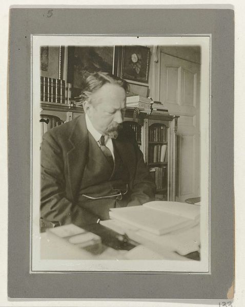
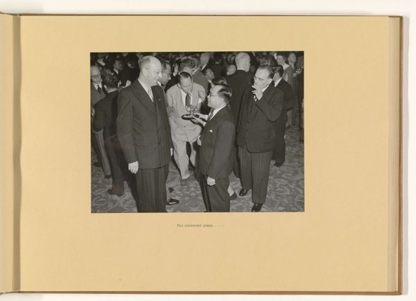
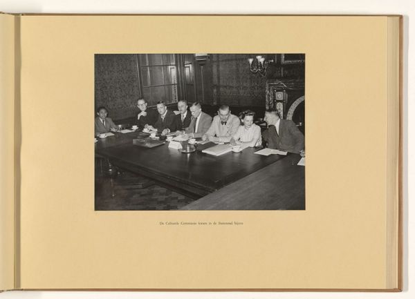
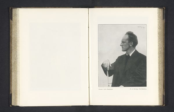
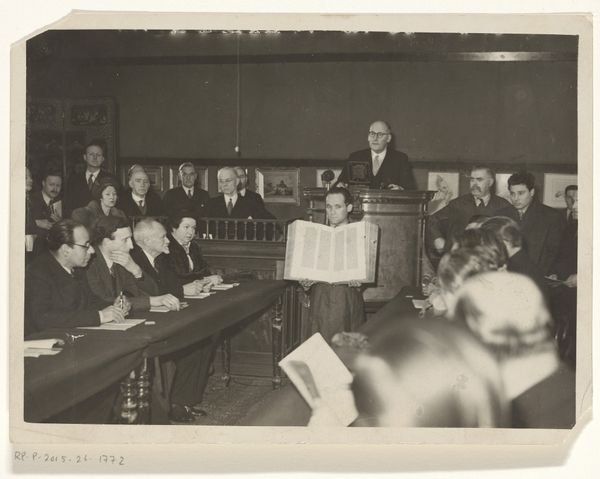
Editor: Here we have "waarop de resultaten vorm kregen in de mantelresolutie met de bijbehorende briefwisseling," possibly from 1949, a print or photograph currently held in the Rijksmuseum and attributed to Regeringsvoorlichtingsdienst. It has a slightly somber feel. I am struck by the contrast between the warm toned page of the book on the left, and the grayscale photo, depicting a man in deep concentration, seemingly at work with paper and ink, surrounded by other people. How do you interpret the formal elements in this work? Curator: Immediately, I am drawn to the strong diagonal line created by the subject's posture, directing our gaze from the lower left to the upper right of the photographic print. This line is countered by the horizontal stacks of paper, creating a visual tension within the composition. Notice the interplay between light and shadow across the depicted image, sculpting the man's face and adding depth. The repetition of rectangular shapes – the papers, the table, even the man's jacket–contributes to a sense of order, but do the placements make you wonder about the surface? Editor: I see it! There is a subtle rhythm in the placement of objects. However, the warm tones of the background seem separate from the image, more of a frame than part of the artwork itself. How do you see those disparate elements working together? Curator: Precisely. The juxtaposition creates a unique spatial dynamic. Consider the texture inherent in the printing, evident even in reproduction: the grainy quality, the slight imperfections in the tonal range. How does the contrast with the smoother, warmer surrounding page material affect your reading of the image? Editor: It almost feels like two separate pieces, a realism photo pasted into an artistic rendering, further enhancing the effect of this picture. That said, looking at how form works as a language, I’d not considered tone to this depth! Thank you. Curator: And I appreciate the reminder of how vital these subtle visual languages remain.
Comments
No comments
Be the first to comment and join the conversation on the ultimate creative platform.
