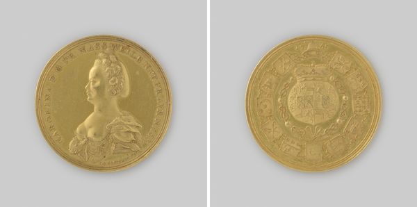
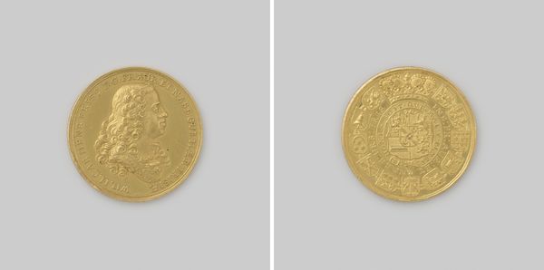
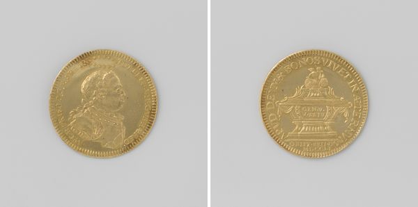
Willem V, prins van Oranje-Nassau, penning hem aangeboden door het kwartier der Friese steden 1788
0:00
0:00
#
natural stone pattern
#
3d sculpting
#
circular oval feature
#
3d printed part
#
rounded shape
#
jewelry design
#
virtual 3d design
#
round design
#
3d shape
#
metallic object render
Dimensions: diameter 3.9 cm, thickness 0.2 cm, weight 21.83 gr
Copyright: Rijks Museum: Open Domain
Curator: Let’s take a closer look at this gold medal dating from 1788, it's inscribed 'Willem V, prins van Oranje-Nassau, penning hem aangeboden door het kwartier der Friese steden'. The piece is attributed to Johann Heinrich Schepp. Editor: Whoa, shiny! Seriously, it’s the kind of gold that just screams power and, dare I say, a bit of pomposity. It feels almost cartoonishly regal, doesn’t it? Curator: Indeed. Observe how the portrait's linear precision and crispness capture Willem's profile in the Neoclassical style, designed to evoke the clarity and authority associated with classical antiquity. Editor: He does look like he's off to star in some kind of royal play. I'm distracted by all of the miniature heraldry all around the central crest, almost looks like wallpaper! What does all of that even mean? Curator: The arrangement of the shields serves as a visual codex representing his dynastic ties and governance. Note also that these arms aren't merely decorative; their strategic placement indicates complex relationships between power and locality within the Dutch Republic. Editor: So, it's like a family and territories scrapbook? Except, you know, made of gold. Knowing that there are stories embedded in those symbols, I'm more interested now. Gives it some substance beyond the bling. Curator: Precisely! The medal acts as a material record of political negotiation and dynastic pride during a turbulent period in Dutch history. Its craftsmanship exemplifies Enlightenment-era aesthetics intertwined with assertive self-presentation. Editor: It strikes me that even today, symbols like these are still kicking around. Think of corporate logos or country flags. This medal could be a manual in crafting identity. A slightly heavy-handed one, mind you, but effective nonetheless. Curator: A astute observation! Examining this work helps one appreciate how design mediates power dynamics while simultaneously documenting period aesthetics. Editor: All right, shiny bit of history—you've earned my respect!
Comments
No comments
Be the first to comment and join the conversation on the ultimate creative platform.
More like this