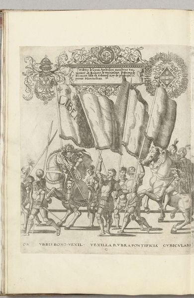
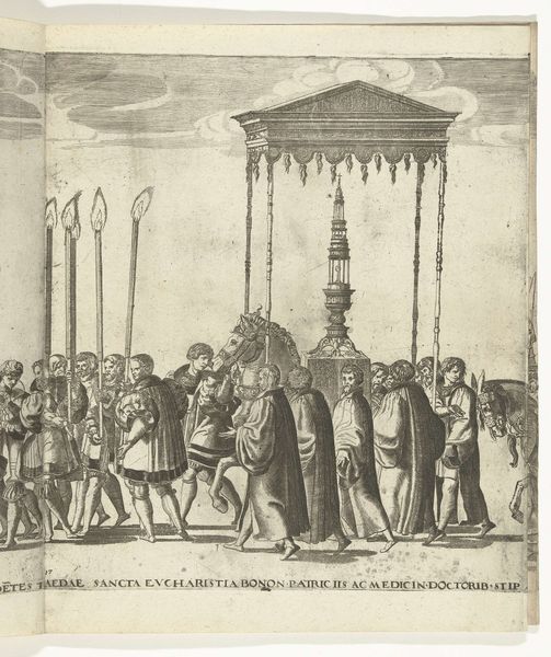
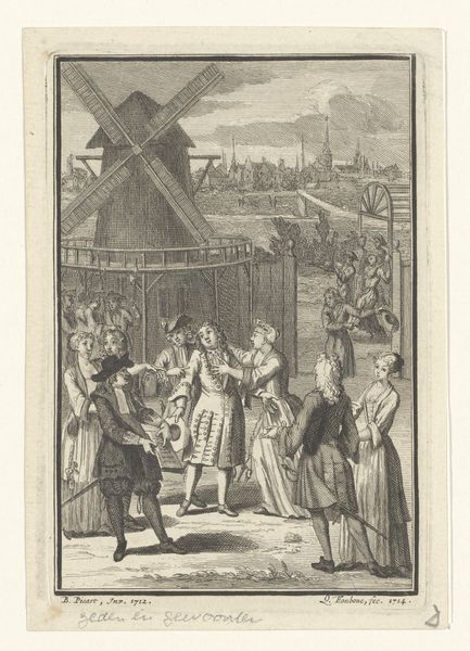
De aankomst van de stoet met Matthias bij de erepoort in de Korte Ridderstraat, 1578 1578 - 1579
0:00
0:00
print, woodcut, engraving
#
narrative-art
# print
#
figuration
#
coloured pencil
#
woodcut
#
line
#
history-painting
#
northern-renaissance
#
engraving
Dimensions: height 155 mm, width 115 mm
Copyright: Rijks Museum: Open Domain
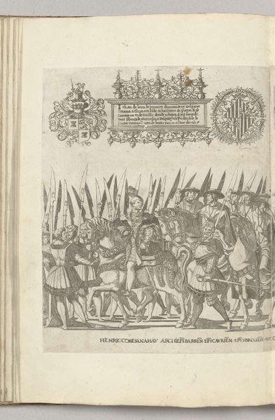
Editor: Here we have "The Arrival of the Procession with Matthias at the Triumphal Arch in the Korte Ridderstraat, 1578," a print, possibly a woodcut or engraving, by Antoni van Leest from around 1578 or 1579. It feels very precise and deliberate in its lines and the colouring is restrained. What jumps out at you? Curator: Consider the structural relationship between the figures and the architectural element. The arch bisects the composition, creating distinct planes of activity. Note the repetition of vertical lines—the torches, the figures themselves, the columns of the arch. This rhythm creates a sense of ordered procession, despite the apparent chaos of the scene. Observe the subtle shifts in perspective; do you think they succeed or are they awkward? Editor: I see what you mean about the vertical lines bringing order, and that awkward perspective – it's like a combination of a bird's-eye and a ground-level view. What does the formal composition suggest to you about its function or purpose? Curator: We must attend to the arrangement of elements and their interplay. The arch dominates the pictorial space, drawing attention upwards, toward heraldic symbols. This, coupled with the regimented figures, speaks to the authority and the pageantry of the event depicted. The arch isn't just a backdrop, it functions as a framing device that reinforces the subject’s power. It gives the work a rigid structure which speaks to ideals rather than simple description. What do you notice about the treatment of light? Editor: It is very even. There aren’t strong shadows or highlights, so that contributes to the sense of flatness overall and seems more about documenting an event, with line being more important than tonal variation. I suppose that means this wasn't aiming for realism. Curator: Precisely! The function of line in creating form and space takes precedence. The artist prioritized clarity of representation over mimetic illusion. Looking at the lines, can we describe this artwork as expressionistic? Or cold and precise? Editor: Hmm. Precise, I think. I've certainly learned to think more deeply about how formal choices reinforce meaning here, especially how line and perspective contribute to that sense of order. Curator: And I've been reminded how much detail can be conveyed through seemingly simple arrangements, revealing intricate patterns and conveying more than we sometimes appreciate at first sight.
Comments
No comments
Be the first to comment and join the conversation on the ultimate creative platform.
More like this