Dimensions: height 84 mm, width 168 mm
Copyright: Rijks Museum: Open Domain
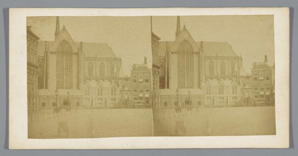
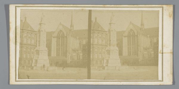
Curator: Ah, here we have Charles-Henri Plaut's 1858 gelatin-silver print, titled "Westerkerk, Amsterdam." What are your first thoughts? Editor: Sepia tones, strong verticals, a certain stillness. It feels meticulously constructed, almost staged. The crisp details of the architecture offset against what feels like deliberately sparse surrounding atmosphere, draw my eye right into the forms and their arrangement. Curator: Indeed. Churches such as this represented more than just places of worship. Westerkerk, for instance, symbolizes the burgeoning civic pride of Amsterdam in the 19th century, a time of relative peace after the Napoleonic wars. You sense it as a bastion of hope, a silent watchkeeper. Editor: That’s interesting. From a structural perspective, the rigid architectural elements work with the overall format of this stereograph format: the duplicated presentation mirrors the way the architect repeats and reinforces the arched windows or segmented tower. The tree, subtly asymmetrical to the edifice, is the only true organic form and keeps it from being cold or clinical. Curator: You've captured that well. This Romantic-era approach is not only about showcasing the church’s physical presence but also about evoking an emotional connection with the city's heritage. Editor: And I wonder about the two tiny figures to the left: they are placed on a fulcrum in a visual diagram that seems meant to convey the enormity of Westerkerk itself: a place, a belief system, that subsumes even people, perhaps? Curator: Certainly. Consider the symbolic meaning—a deliberate commentary on civic duty, a testament to God’s overarching protection, perhaps an oblique reference to Rembrandt himself, buried there at the foot of the steeple... all part of the intended interpretation by contemporary Dutch people of Plaut’s time. Editor: I appreciate how Plaut has rendered light and shadow, highlighting the intricacies of the facade—the subtle interplay between solidity and space, giving it depth. I am not drawn, I’d have to say, to such loaded iconography; it almost feels oppressive to see architecture as civic evangelism of this kind! Curator: Ah, a fitting contrast—where one sees cultural continuity and pride, the other senses structure and, perhaps, constraints. Food for thought. Editor: Indeed. What an incredible and compelling picture—with light and shadows doing so much work, materially as well as symbolically!
Comments
No comments
Be the first to comment and join the conversation on the ultimate creative platform.