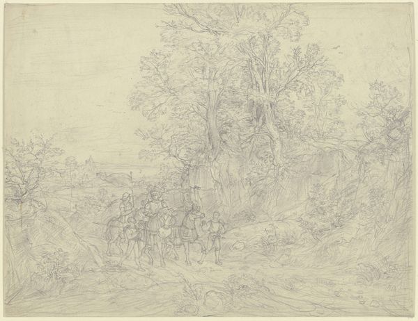
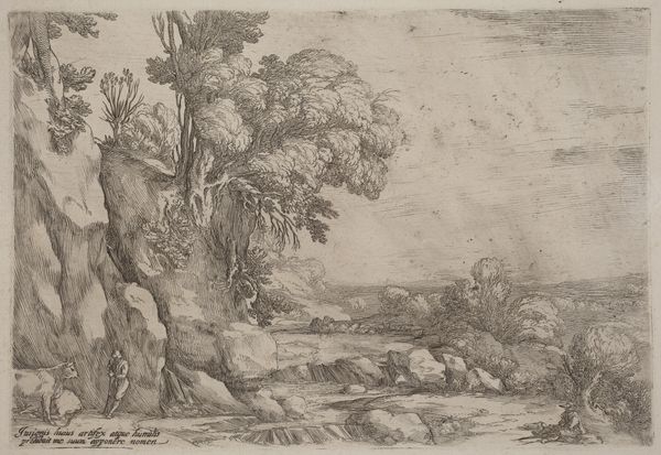
drawing, ink
drawing
baroque
ink painting
landscape
ink
genre-painting
history-painting
Copyright: Public Domain
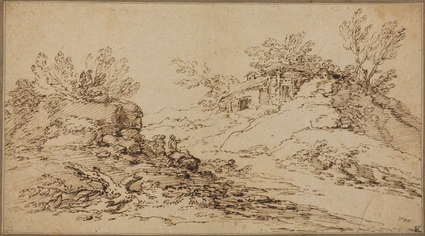
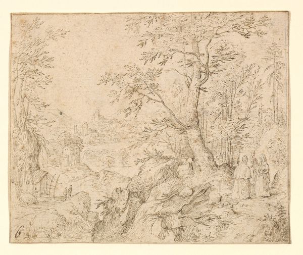
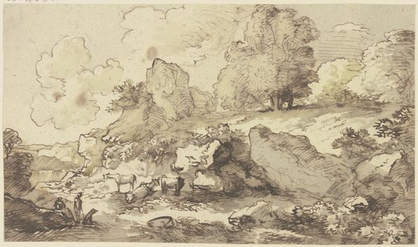
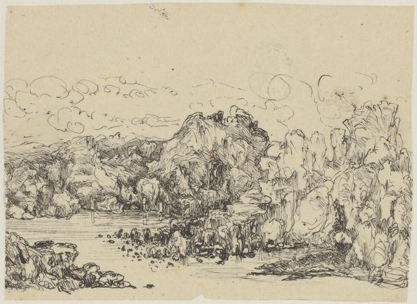
Editor: We’re looking at "Flusslandschaft mit lagernden M\u00e4nnern," a pen and ink drawing by David Vinckboons. The cluster of figures under the dense trees has such a relaxed feeling, juxtaposed against the stark openness of the river and sky. How do you interpret this work? Curator: Formally, it's fascinating. Observe the composition: Vinckboons masterfully employs line to create both depth and contrast. The density of the hatched lines around the resting figures creates a shadowed foreground, while the delicate, almost ethereal lines in the background evoke a sense of distance and atmospheric perspective. Note how the linear construction varies significantly across the picture plane. Editor: That’s a good point, the change in linework contributes to the change of mood in the drawing. Curator: Precisely. Furthermore, consider the use of space. The strong diagonal created by the tree trunk effectively divides the composition, drawing the eye from the intimate gathering on the left towards the open expanse of the river on the right. Do you perceive the effects created by such division? Editor: I can see that. It almost feels like it's asking us to compare the two scenes or modes of life... stillness versus activity. Curator: An interesting observation. The strategic employment of compositional elements dictates, in large part, how the image comes across and what kind of feeling arises in us. Editor: That’s a great point. Thinking about the formal structure really highlights the balance in the piece, even though it’s not perfectly symmetrical. Curator: Indeed. By engaging in an intrinsic reading of the artwork, we gain a greater knowledge of artistic approach and construction.
Comments
No comments
Be the first to comment and join the conversation on the ultimate creative platform.