Copyright: Famiglia Pintér
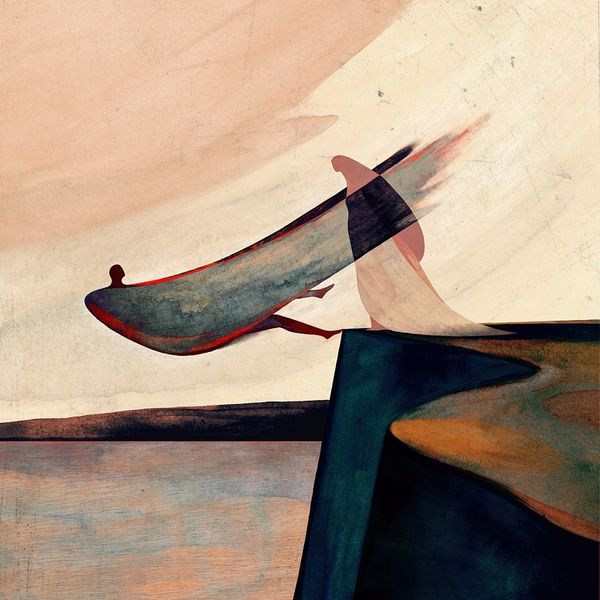
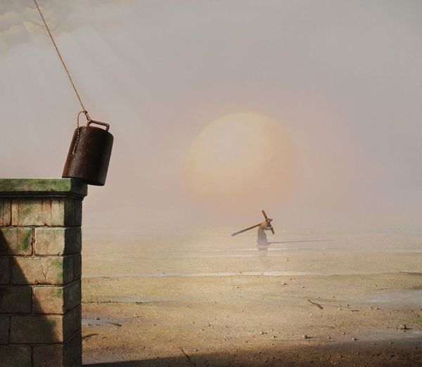
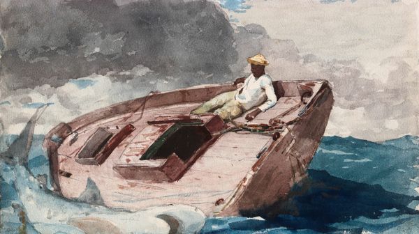
Editor: This is Ferenc Pinter's cover art for Cesare Pavese's "Before the Rooster Crows," from 1969. It looks like an oil painting and features an upturned boat on a shore, and the colour palette gives the painting a very somber mood. What do you make of it? Curator: Note how the form of the boat itself dominates the foreground, almost aggressively so. Pinter’s use of impasto on the hull creates a tactile quality. Do you see how that draws the eye in contrast to the relative flatness of the sea and sky beyond? Editor: Yes, the texture on the boat is much more pronounced than anywhere else. I hadn’t thought about the flatness in the background acting as a contrast. Curator: Exactly. The limited palette of browns, grays, and whites is interesting as well. The formal relationship between the curves of the boat's hull and the straight lines of the distant horizon create an interesting visual tension, what is the result, do you think? Editor: Maybe a feeling of unease? The calm of the horizon is disturbed by the chaotic foreground? Curator: Precisely. And the figure within the boat is tiny and almost obscured. It gives the impression of human vulnerability. The painting focuses on its structural elements rather than its narrative ones, evoking a certain isolation. Editor: It’s amazing how much can be conveyed through such careful control of form and texture. Thanks for pointing out these elements. Curator: Indeed. It reinforces how understanding form allows for deeper insight into the human condition.
Comments
No comments
Be the first to comment and join the conversation on the ultimate creative platform.
More like this