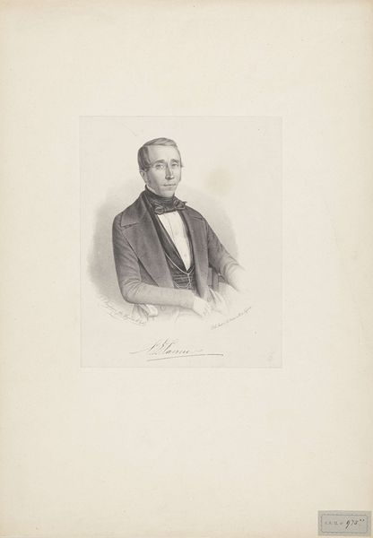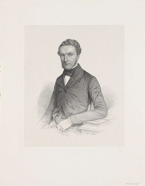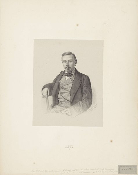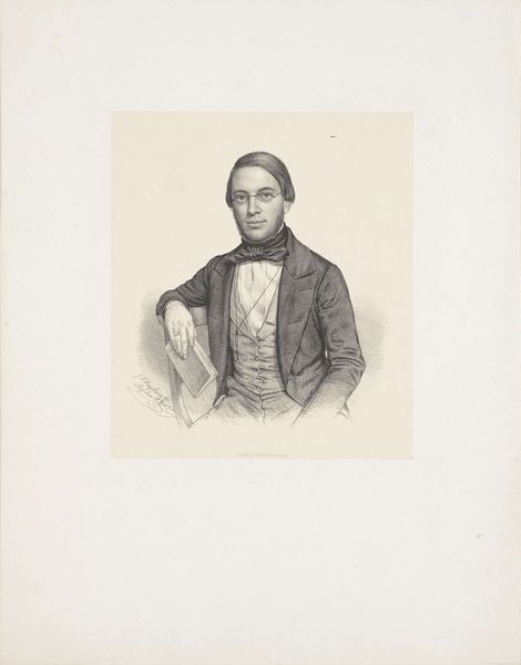
1856
Portret van Cornelis Adriaan Bergsma
Willem (II) Troost
1812 - 1893Location
RijksmuseumListen to curator's interpretation
Curatorial notes
Editor: Here we have Willem Troost's "Portret van Cornelis Adriaan Bergsma," created in 1856. It's a pencil drawing, and the precision is striking. It gives me a sense of cool formality. How do you read this portrait, formally speaking? Curator: Note the delicate hatching that defines the planes of the face, creating subtle gradations of light and shadow. The artist masterfully renders texture, from the smooth paper to the subject’s jacket. What do you observe about the use of line in this work? Editor: I notice that the lines are very controlled, and refined. Even where they define shadows, there’s no heavy contrast, preserving that feeling of restrained dignity. Curator: Precisely. And that dignity arises in part from the symmetry evident in the composition. Observe the careful balancing of elements on either side of the figure, contributing to its harmonious and ordered aesthetic. Are you finding it academic? Editor: Definitely academic. The composition has that balance you pointed out. I see the same qualities in Neoclassical painting. Curator: Consider the materiality of the pencil itself. The inherent limitations of graphite – its grayscale palette, its potential for smudging – serve to focus our attention on the pure representation of form. It highlights the very act of artistic translation, moving from three dimensions to two. The texture from the pencil strokes, rather than paint, is itself a strong structural element. Editor: That's fascinating, the way the medium itself informs the overall aesthetic. I never considered the limitations as contributing to its strengths, highlighting form through texture and shading. Curator: Considering the work as a formal exercise sheds light on choices, conscious or not, of the artist. I do see this portrait from Troost differently now.