Dimensions: object: 395 x 455 x 150 mm
Copyright: © The Estate of Alberto Giacometti (Fondation Giacometti, Paris and ADAGP, Paris), licensed in the UK by ACS and DACS, London 2014 | CC-BY-NC-ND 4.0 DEED, Photo: Tate
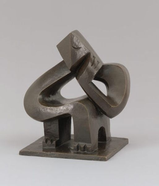
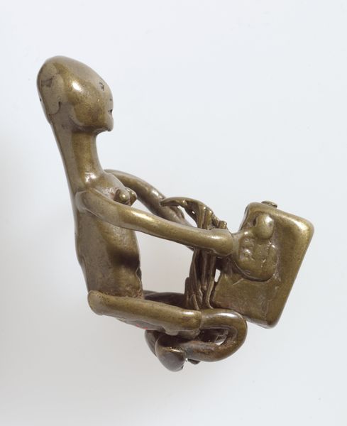
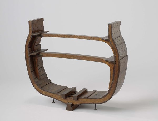
Curator: Alberto Giacometti’s "Composition (Man and Woman)" at the Tate offers a fascinating case study in early modernist exploration of form and the human condition. Editor: It's so strange, isn't it? Like a deconstructed stage set, or maybe a really dark playground for very serious philosophical toys. Curator: Absolutely. Giacometti often grappled with representing figures stripped of their traditional attributes, questioning societal constructs of identity. This work challenges our preconceived notions of gendered representation. Editor: I love that you say that. I can't help seeing it as a kind of puzzle. All these geometric shapes barely held together; it evokes a feeling of fragility. Curator: It certainly is open to interpretation, which is precisely its power. Editor: Right. It really invites you to feel into something, instead of just passively looking at it. It's raw, like a dream. Curator: The sculpture stands as a testament to the fluidity of interpretation and the ever-evolving dialogue between art and its sociopolitical contexts. Editor: Yes, and it reminds us that even in abstraction, there is a deep connection to the human experience.
Comments
tate 11 months ago
⋮
http://www.tate.org.uk/art/artworks/giacometti-composition-man-and-woman-t06737
Join the conversation
Join millions of artists and users on Artera today and experience the ultimate creative platform.
tate 11 months ago
⋮
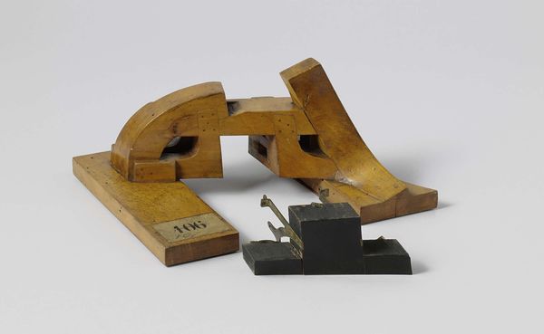
This small but complex structure is based loosely on the human figure. It was made in a period when Giacometti looked at late Cubist works and so-called primitive art, exploring different ways of representing the figure. Here the male and female figures are `transparent constructions' (to use Giacometti's phrase), composed of simplified rhyming shapes. Comparison with related pieces by the artist suggests that at least one of the hemispheres may be read as a head, while the zig-zag lines were intended to signify the female form. Gallery label, May 2010
More like this