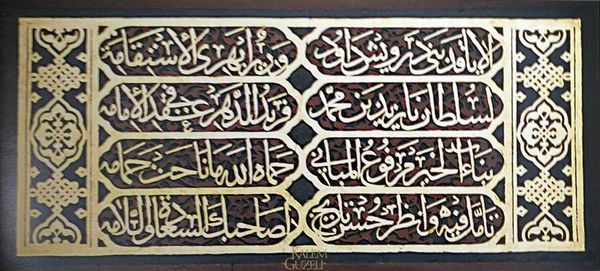
paper, ink
#
pattern
#
paper
#
ink
#
geometric
#
islamic-art
#
decorative-art
#
miniature
#
calligraphy
Copyright: Public domain
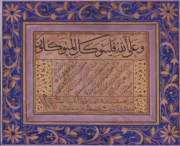
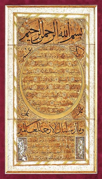
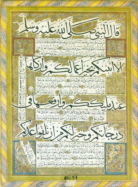
Editor: So, this is "Sülüs Nesih Kıta" by Hafiz Osman, done with ink on paper. What strikes me immediately is its meditative quality, like a visual mantra. What do you see in it? Curator: For me, it sings of devotion. Look at the meticulous detail! The calligraphy, of course, it’s meant to convey the divine word – a whisper made visible. But then you see these radiating geometric patterns around the edges; they pull your eye outwards, like echoes spreading. And I feel… well, a sort of humility. Do you get that sense, too? That feeling of something immense and timeless beyond our grasp? Editor: Absolutely! There's a strong sense of tradition, of discipline. How does the calligraphy itself, the script, contribute to that feeling? Curator: The Sülüs and Nesih scripts are particularly interesting here. They’re classic choices in Ottoman calligraphy—formal, elegant. Sülüs, used for the larger script, carries a majestic flair, a sense of ceremony, while the smaller Nesih offers clarity, a grounding presence. Their contrast is almost a dance – a sacred dance, perhaps. But isn’t it incredible how line, form, and intention all converge here, aiming to elevate not just the art, but the spirit? Editor: It really is! Seeing it this way makes it so much richer. It's more than just pretty writing; it's a whole spiritual experience. Curator: Exactly. It’s less about reading the words—though their meaning is undoubtedly important—and more about letting the artistry, the craftsmanship, and the intent wash over you. It's like hearing music, you don't always need to understand the words to feel its power. Editor: I'll definitely carry that perspective with me now. It's like a lesson in seeing beyond the surface. Thanks!
Comments
No comments
Be the first to comment and join the conversation on the ultimate creative platform.
More like this