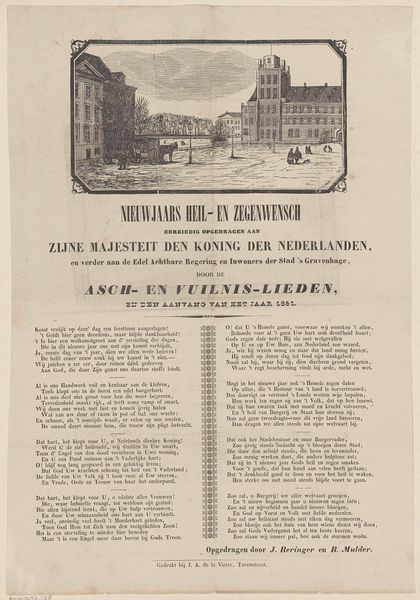
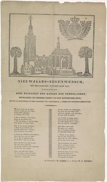
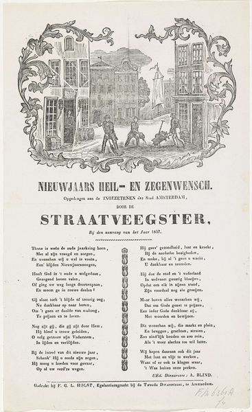
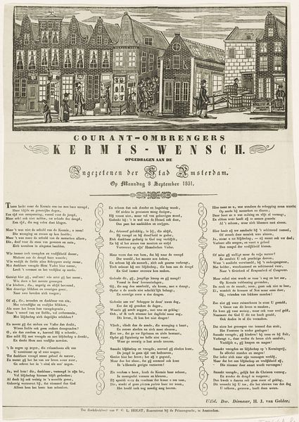
Nieuwjaarswens van de as- en vuilnislieden van Den Haag voor het jaar 1854 1854 - 1856
0:00
0:00
graphic-art, lithograph, print, poster
#
script typeface
#
graphic-art
#
aged paper
#
lithograph
# print
#
hand drawn type
#
thick font
#
cityscape
#
handwritten font
#
golden font
#
classical type
#
poster
#
word imagery
#
historical font
#
columned text
Dimensions: height 419 mm, width 335 mm
Copyright: Rijks Museum: Open Domain
Editor: This lithograph, "Nieuwjaarswens van de as- en vuilnislieden van Den Haag voor het jaar 1854," seems to be a New Year's greeting from the sanitation workers of The Hague. It's quite text-heavy and features a cityscape at the top. The overall impression is one of formality and perhaps a little… aged, considering the paper and script. What do you see in this piece, beyond its basic function as a printed message? Curator: Certainly, the visual field yields significant insight. Observe how the composition is strictly divided: an illustrative urban landscape above, and a dense block of versified text below. This rigid structure speaks to the social hierarchy inherent in the piece. Editor: Hierarchy? Curator: Absolutely. The idealized cityscape, neatly framed, represents the city's elite – those to whom the sanitation workers are addressing their wishes. Below, the tightly packed text, almost suffocating in its density, visually embodies the collective voice of the working class. The contrast is stark. Editor: I see what you mean. The font choices also contribute to this division, with a more ornate script used for the heading and a simpler typeface for the workers' message. It's as if the text itself performs the social roles. Curator: Precisely! The formal elegance of the heading and the detailed precision of the illustration versus the somewhat constrained text creates a compelling visual tension that communicates deference and perhaps even a subtle plea for recognition. Is it a plea, or is it gratitude? Editor: Interesting. So, the formal qualities of the lithograph – its structure, typography, and the arrangement of elements – reveal a complex relationship between different social classes. I had missed the nuance. Curator: Indeed. A close formal reading allows us to decode these silent social dynamics embedded within the artwork. There is tension inherent between all the classes on display. Editor: It's amazing how much can be gleaned from simply analyzing the visual elements. It definitely makes you think about all the unseen layers in artworks we might take for granted.
Comments
No comments
Be the first to comment and join the conversation on the ultimate creative platform.
More like this