drawing, paper, watercolor
#
drawing
#
water colours
#
asian-art
#
paper
#
watercolor
#
coloured pencil
Dimensions: height 311 mm, width 215 mm
Copyright: Rijks Museum: Open Domain
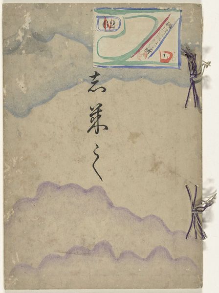
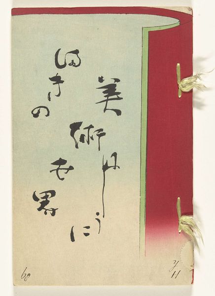
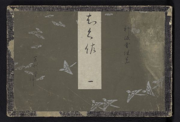
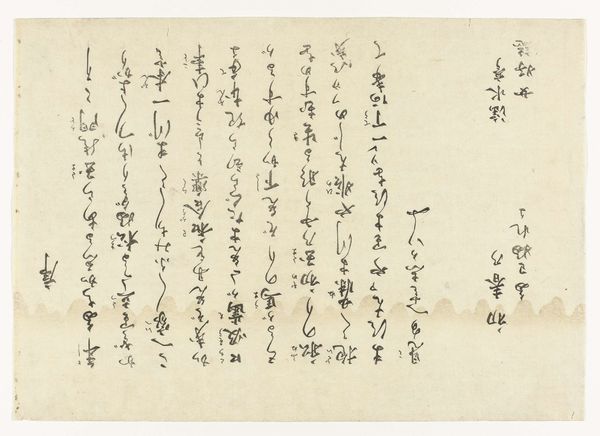
Editor: Here we have "Square Designs, Part One," a drawing by Kamisaka Sekka from around 1901-1902. It's watercolor and colored pencil on paper. I'm struck by the texture and color palette. It has a sort of fragility. What do you see in this piece? Curator: It is interesting that you use the term 'fragility' when what immediately strikes me is the piece's surface design and the contrasting blocks. How the linear elements, and particularly the calligraphy, interact with those simple geometric shapes is striking. Do you perceive those shapes contributing to the overall aesthetic? Editor: I do now that you mention it, the calligraphy does create a point of focus in the composition, an anchor of sorts. And I hadn't really thought about the interplay between line and shape. What about the waves? I noticed that too. Curator: Indeed. The stylized waves are interesting too, aren’t they? In semiotic terms, they are signifiers that function within a highly structured visual vocabulary. It’s interesting to observe the balance created between the representational, though highly stylized waves, and the more abstract shapes of the inscription label. How does this tension strike you? Editor: It gives the design a layered effect; a sense of visual depth despite the medium’s flatness. I guess I never stopped to consider what formal qualities might be at play, rather than getting caught up in the artist or history behind the work. Curator: Precisely. Appreciating how these elements converge unveils layers of artistic intention beyond mere representation. Editor: Okay, I think I have a better handle on this now, seeing it through the lens of pure visual relationships. Thanks for walking me through your approach. Curator: My pleasure. Remember, close observation will unlock so much about any artwork.
Comments
No comments
Be the first to comment and join the conversation on the ultimate creative platform.
