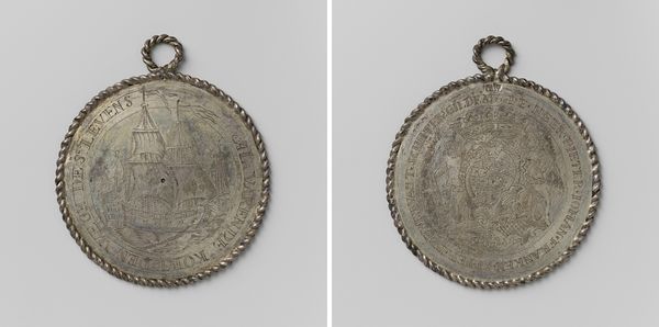
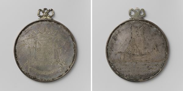
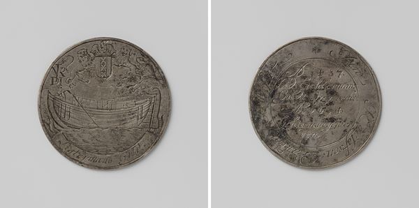
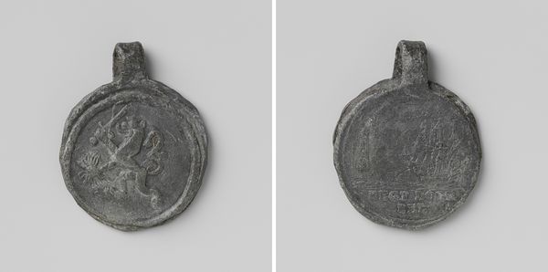
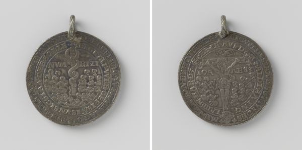
Schippersgilde te 's-Hertogenbosch, gildepenning door het gilde geschonken aan opperdeken Willem Cornelis Ackerdyck 1750
0:00
0:00
metal, relief, engraving
#
baroque
#
metal
#
relief
#
engraving
Dimensions: height 8.4 cm, diameter 7.1 cm, weight 129.63 gr
Copyright: Rijks Museum: Open Domain
Editor: Here we have a fascinating object: a metal guild badge from 1750 given to Willem Cornelis Ackerdyck by the Schippersgilde, or Boatmen's Guild, of 's-Hertogenbosch. It’s fascinating that we can see two sides in this image! On one side is an engraved depiction of a sailing vessel, while the other shows an elaborate coat of arms. What structural elements jump out to you in this artwork? Curator: Notice how the circular form dominates the entire composition. The artist strategically uses the tondo shape to enclose the imagery. Furthermore, both sides, though distinct in iconography, are unified by the circular border text and ornamental elements, creating visual harmony. Have you also observed the shallow relief, typical of engraving, and how that impacts the piece's tactile quality? Editor: I did. It's amazing how much detail they were able to achieve despite the limited depth of field! How does the Baroque style influence the medal's overall presence? Curator: The Baroque influence is evident in the dynamic composition on the coat-of-arms side: notice the two figures framing it and how their bodies curve around it. Moreover, there's a tension created between the flat, planar surface and the attempt to render three-dimensional forms. It evokes depth despite its technical limitations. Doesn't it strike you that way? Editor: Definitely, I can appreciate it more now. I’m curious: Does the symmetry contribute to a sense of formal balance, considering the Baroque aesthetic often favored dynamism? Curator: An astute observation. Yes, it presents a controlled Baroque style. The symmetry on the coat-of-arms side definitely tempers any overwhelming dynamism, offering a composed, dignified representation appropriate for a token of honor within the guild. The placement of lettering around the perimeter reinforces the idea of completeness and cyclical recognition. Editor: Thank you. It is fascinating how looking at its structure reveals a new level of detail and intention. Curator: Indeed, art offers much when viewed with an eye toward its inherent structure and qualities.
Comments
No comments
Be the first to comment and join the conversation on the ultimate creative platform.
More like this