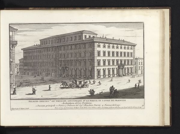
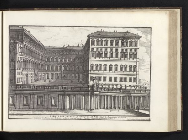
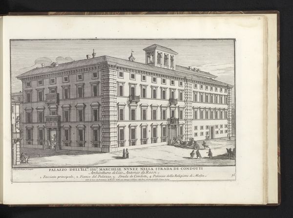
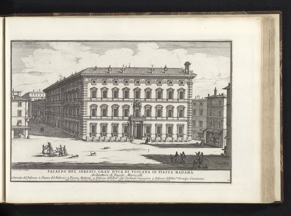
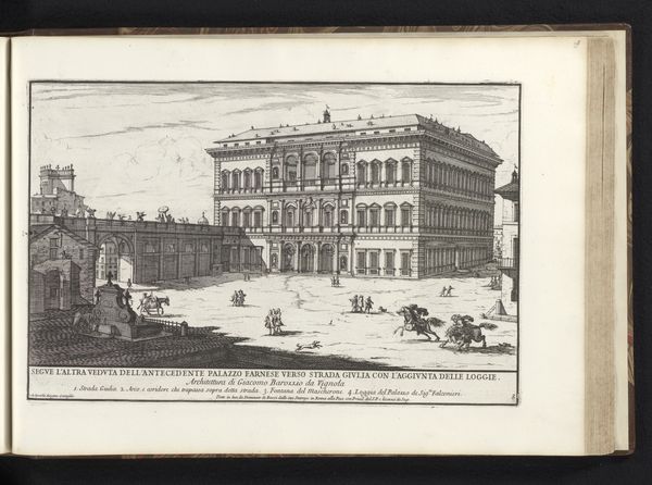
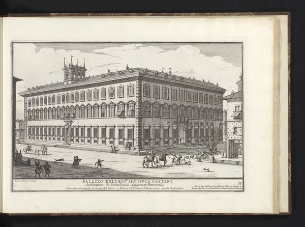
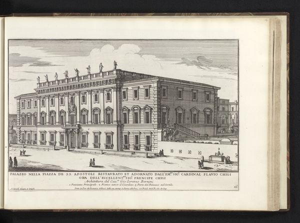
drawing, print, ink, engraving, architecture
#
drawing
#
baroque
# print
#
landscape
#
ink
#
cityscape
#
engraving
#
architecture
Dimensions: height 217 mm, width 325 mm
Copyright: Rijks Museum: Open Domain
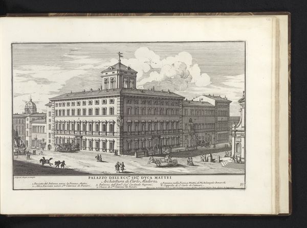
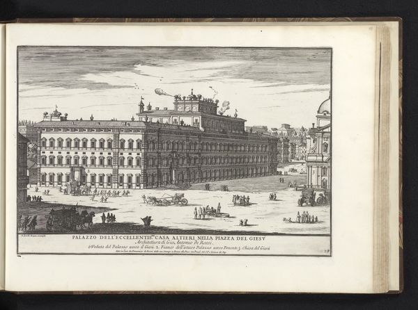
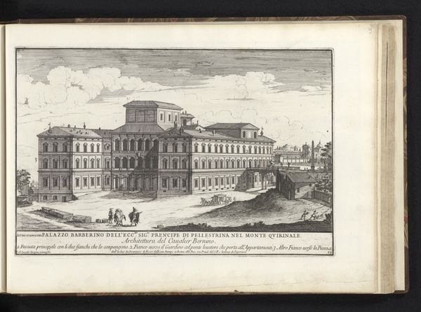
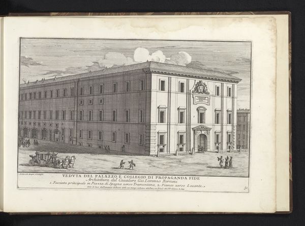
Editor: This is Alessandro Specchi’s “Palazzo Farnese te Rome,” created in 1699 using ink and engraving techniques. The print illustrates an urban scene, but the architectural detail really grabs my attention. What strikes you about the composition? Curator: The composition reveals a strong emphasis on linear perspective and the geometric precision in the architectural rendering. The artist uses carefully etched lines to define forms, creating depth and conveying the sheer scale of the Palazzo Farnese. Notice how the facade's grid-like arrangement of windows and the precise detailing of the fountains contribute to an overall sense of structured elegance. Editor: It almost feels too perfect, a bit sterile. I guess that comes with the focus on accuracy. Curator: Indeed. The cool, precise lines and careful execution are prioritized over expressiveness, highlighting the artist’s technical skill and objectivity. What role do you think that precision plays in communicating meaning? Editor: It seems that it aims at an almost scientific-like representation of reality. It could reflect an appreciation for reason and order. I initially missed all of that; now I see there's more than just architectural documentation happening here. Curator: Exactly. It demonstrates the prevailing attitudes towards rationalism and perhaps also hints at an aesthetic valuing clarity. We can interpret the image as not just a portrayal, but also a study in form and technique. Editor: Thank you! Now, when I see it, it's as if the Palazzo reveals its structural bones, its very essence of shape.
Comments
No comments
Be the first to comment and join the conversation on the ultimate creative platform.
More like this