drawing, print, ceramic
#
drawing
#
neoclacissism
# print
#
ceramic
#
vase
#
ceramic
#
decorative-art
#
watercolor
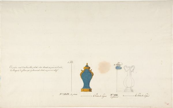
Dimensions: 14 7/8 x 9 3/16 in. (37.8 x 23.3 cm)
Copyright: Public Domain
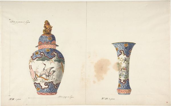
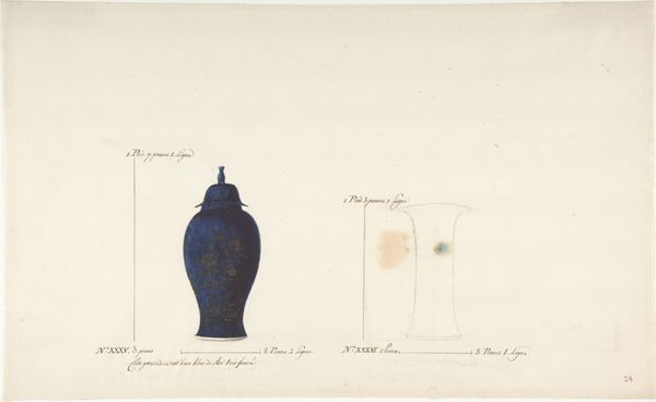
Editor: Here we have "Design for Two Vases," created anonymously between 1765 and 1790. It appears to be a drawing with watercolor, depicting ceramic vase designs. They’re both rendered in this striking blue, with golden ornamentation. What strikes me is how different the shapes are despite being presented as a pair. How do you interpret this work from a formal perspective? Curator: Immediately, the contrasting geometries arrest my attention. On the left, we see a rigid cylinder, unwavering in its verticality, terminated by precise decorative borders. Conversely, the vase on the right boasts curvilinear forms. Notice the repetition of the spherical motif: base, body, upper chamber, cap. A delightful counterpoint, is it not? Editor: Yes, absolutely. It’s interesting how the severe, almost industrial shape on the left is juxtaposed with the almost organic, rounded form on the right. Does the color choice itself inform your reading of the work? Curator: Indubitably. The uniform application of blue across both forms offers a sense of visual cohesion. However, observe the *variations* within the blue itself: the subtle gradations suggest volume, a delicate play of light that prevents the image from becoming merely diagrammatic. Consider also, if the ground were not so white, would the same level of contrast arise? Editor: So, the visual weight relies not just on the objects themselves but the calculated balance with the negative space? Curator: Precisely. Each element contributes to a structural harmony, inviting deeper contemplation. Furthermore, is the watercolor handling similar or disparate across each work? How might that inform your interpretation? Editor: Thinking about how form dictates function helps appreciate them, even in design. It really highlights the different possible directions, especially given that cohesive blue. Curator: I agree entirely; the image displays how each object works to build a cohesive, yet contrasting image, thus reinforcing the importance of considering elements and color choice in any given composition.
Comments
No comments
Be the first to comment and join the conversation on the ultimate creative platform.
More like this