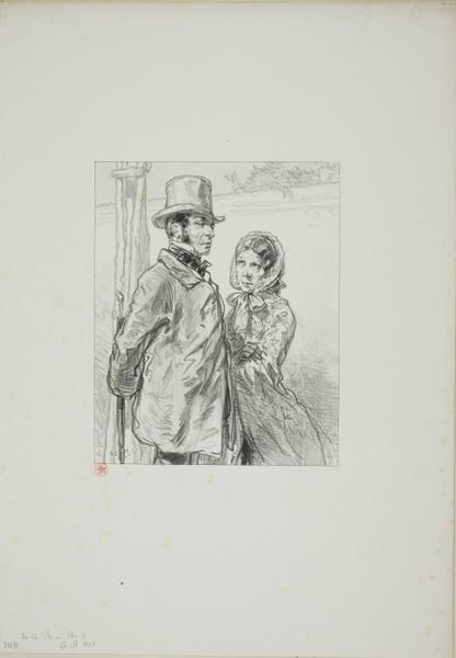
drawing, print, pen
portrait
pencil drawn
drawing
amateur sketch
light pencil work
pencil sketch
charcoal drawing
pencil drawing
limited contrast and shading
pen
pencil work
genre-painting
tonal art
remaining negative space
Dimensions: 255 mm (height) x 212 mm (width) (bladmaal)
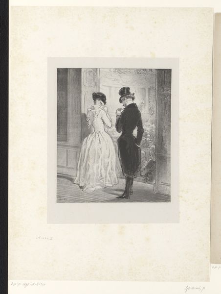
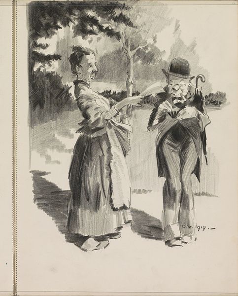
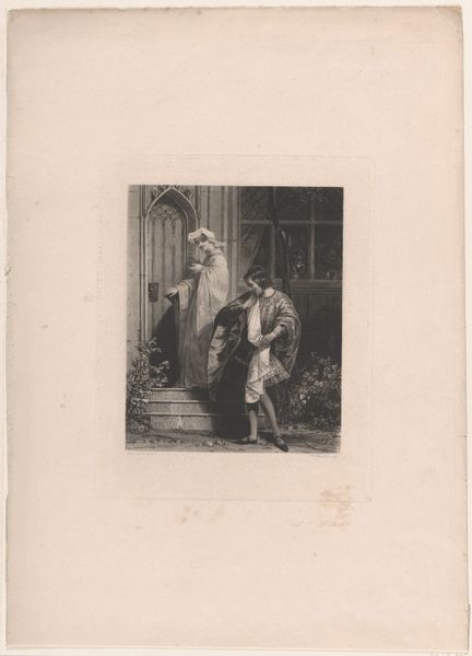
Editor: So, here we have "Illustration til H. Hertz, Spadsereturen" created sometime between 1889 and 1894. It appears to be a pen and ink drawing. I’m struck by how this simple scene has a sense of melancholic distance between the figures, a narrative conveyed solely through their poses. How do you interpret the composition? Curator: I focus on the intrinsic visual elements, you see. Observe how the stark contrast and varying densities of line define forms within a flattened plane. The foreground directs the gaze, while the solid structure in the background plays a vital role in framing the subjects. Do you see how the interplay of positive and negative space contributes to the dynamic tension within the image? Editor: I see what you mean. The empty space on the right does create tension. Is there anything about the use of line that stands out? Curator: Note the use of hatching and cross-hatching; through strategic juxtapositions the artist constructs the visual depth and shading of his piece. The texture is especially interesting against the negative space. Editor: Right, the linear texture contrasts against that block of white on the right, it almost feels intentional to reinforce this sentiment of unease, and loneliness within the illustration. Curator: Precisely! Such deliberate manipulation of visual language transcends simple representation, instead fostering profound contemplation on the human condition and our existence in constructed worlds. We may not discern with certainty what the illustration attempts to suggest, yet its internal visual components imbue significance that must not go unnoticed. Editor: I’m definitely seeing more layers now that you pointed out those relationships, and it's interesting to view this piece and understand it beyond face value. Thanks!
Comments
No comments
Be the first to comment and join the conversation on the ultimate creative platform.