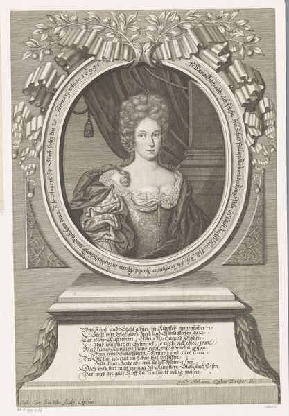
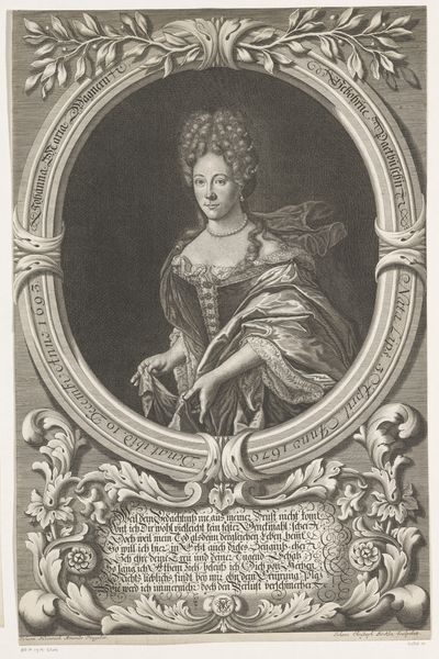
print, engraving
portrait
baroque
line
history-painting
engraving
Dimensions: height 405 mm, width 277 mm
Copyright: Rijks Museum: Open Domain
Curator: Gazing at this, the overwhelming impression is of ornate layering, like ruffles upon ruffles of societal expectations. Editor: Exactly. The Rijksmuseum holds this piece, a portrait called "Portret van Lodewijk van Frankrijk," created by Jean Daullé, sometime before 1744. What strikes you as particularly excessive? Curator: Well, start with the subject, who’s meant to be the Dauphin, heir to the French throne—but here appears almost childlike. And look at all those layers! It's almost like hiding him, swaddling him in status and…lace. The ornate oval frame practically shouts, "Royalty!" Editor: The engraving style itself adds to that feeling. Those precise, deliberate lines, carefully building up the shadows, speak to the calculated nature of royal image-making. Every detail, down to the baroque embellishments and dedicatory inscription below, is meticulously planned. Curator: I suppose it’s designed to impress and solidify power. Do you think it succeeds? I'm more inclined to sense vulnerability masked by that puff of elaborate hair and the weight of expectation literally circling his portrait in the oval frame. Those sad fish, too! They don't seem to reflect a proud statement, it seems like… burden. Editor: Perhaps it’s both, that’s certainly the intention here, the print acts as a vehicle for communicating ideals about French Royalty. The image is interesting as the print was made after a painting and became an affordable collectible that reified those statements about class and power. We’re seeing the intersection of art and the early modern state. It tells us that image circulation mattered immensely to perceptions of leadership. Curator: It reminds me that beneath all the pomp and ceremony, you are sometimes looking at what a kid would look like pretending to be important while never asked if they were comfortable pretending in the first place. And I think maybe that little melancholy breaks through even across centuries of societal shaping. Editor: So even an image steeped in historical authority can still speak to human emotion beyond its original intent. Interesting... Curator: Always! It reminds you what’s important to see when experiencing art and in artmaking too. That sometimes the best images contain what’s really essential, a certain tenderness mixed into every material intention.
Comments
No comments
Be the first to comment and join the conversation on the ultimate creative platform.