drawing, print, paper, ink, engraving
#
portrait
#
drawing
#
baroque
# print
#
paper
#
ink
#
engraving
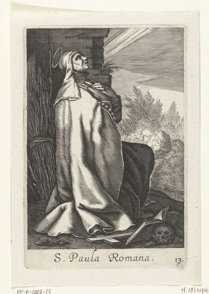
Dimensions: height 152 mm, width 102 mm
Copyright: Rijks Museum: Open Domain
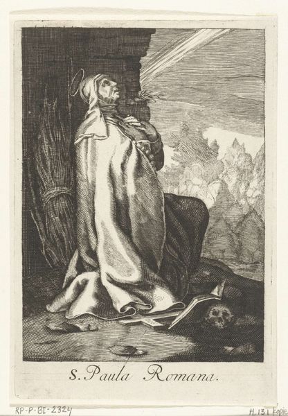
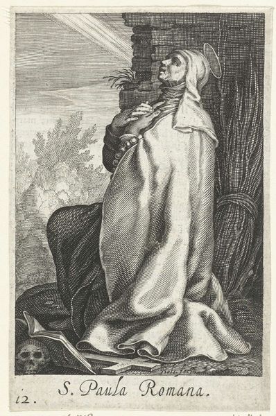
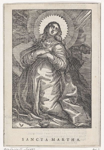
Editor: Here we have "Heilige Paula van Rome als kluizenares" or "Saint Paula of Rome as a Hermit", a 1644 engraving in ink on paper by Christoffel van Sichem the second, currently at the Rijksmuseum. There's a somber quality to the print; it feels quite stark with all of the cross-hatching used to build up the tones. What stands out to you formally in this work? Curator: The use of line is certainly the dominant feature. Notice how the density of the lines and the varied angles are what define form, create depth, and, as you say, establish tone. Consider the way Sichem directs our eye with this technique. Where does your gaze naturally settle first? Editor: Probably on Saint Paula herself because she is central, but the vertical lines defining the reeds behind her also strongly draw the eye. I suppose then that the network of lines and textures all compete for the viewer's attention in the piece. Curator: Precisely. It’s this interplay of contrasting textures—the rough reeds versus the smoother drapery—that creates a visual tension. Look closely at the way the light seems to emanate from above, hitting her face. This is accomplished almost entirely through the strategic removal, or at least the lightening, of lines in the engraving process. The engraver thus builds highlights to illuminate a saint seemingly enraptured by some unseen force, her gaze fixed at the heaven above. Editor: So, even without color, the artist is manipulating light and shadow using the presence and absence of line. I can also see how Saint Paula's flowing robe is designed to show the heavy but rhythmic lines. That gives me a better understanding of the power of such engravings and how the linear form is not a limitation but an artistic device. Curator: Indeed. One might further consider how this commitment to form and surface – these very material concerns of line, tone, and contrast – generate, or rather become, the meaning of the print.
Comments
No comments
Be the first to comment and join the conversation on the ultimate creative platform.
More like this