drawing, watercolor, architecture
#
beige
#
drawing
#
neoclacissism
#
aged paper
#
toned paper
#
homemade paper
#
muted colour palette
#
light coloured
#
white palette
#
watercolor
#
geometric
#
light colour tone
#
cardboard
#
decorative-art
#
watercolor
#
architecture
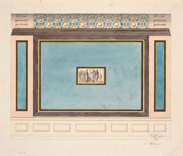
Dimensions: height 347 mm, width 423 mm
Copyright: Rijks Museum: Open Domain
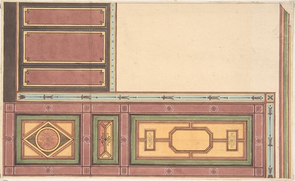
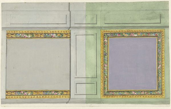
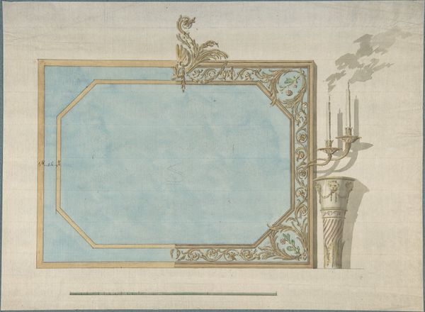
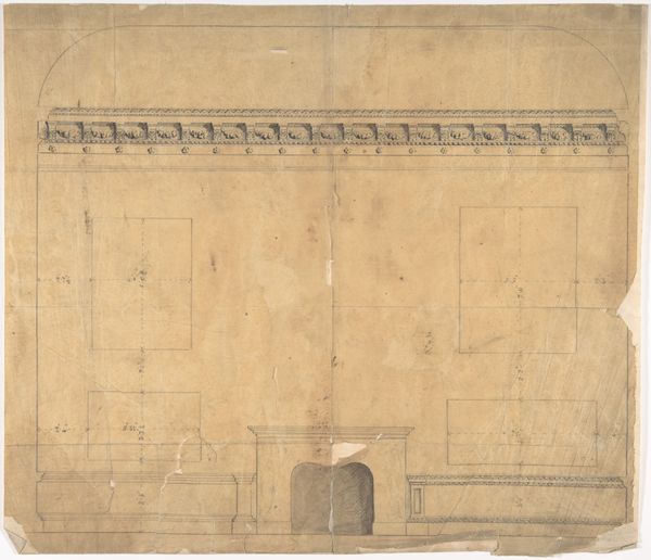
Editor: Here we have "Ontwerp voor een commode," a design for a commode dating from around 1785 by Giuseppe Valadier, rendered in watercolor and drawing on toned paper. What strikes me most is the paper itself. You can almost feel its age and handmade quality. It has an austere elegance. What do you see in this piece? Curator: Immediately, I'm drawn to the visual vocabulary Valadier employs. Look at how the geometric forms evoke a sense of classical order and proportion. These aren't merely decorative flourishes, they are signifiers. The circle, for instance, is a potent symbol found across cultures, often representing totality, eternity, or even the divine. Editor: So the design itself is referencing something beyond just aesthetics? Curator: Precisely. The neoclassical style is a deliberate return to the visual language of ancient Greece and Rome. What did those forms represent to that culture? Balance, reason, and a celebration of the human intellect. This design isn't simply about making a beautiful piece of furniture. It is meant to remind its owner of these valued ideals, a return to classical virtues. Editor: I hadn't considered the cultural weight these geometric shapes carried. It really elevates the design, making it more than just decorative. Curator: And note the muted color palette. Why choose these tones? Consider the materials valued in antiquity - marble, stone - and how the effect the watercolor achieves feels reminiscent of frescoes found on aged, sun-drenched walls. A color could also be used to set a specific tone, even to remind an individual of their psychological health. Editor: That’s fascinating. Now I am seeing this commode as less of an object and more as an entire philosophy manifested. Thanks for helping me look deeper! Curator: My pleasure! Examining design through the lens of cultural memory really does allow us to uncover these richer, resonant meanings, it challenges our present context and broadens our worldview.
Comments
No comments
Be the first to comment and join the conversation on the ultimate creative platform.
More like this