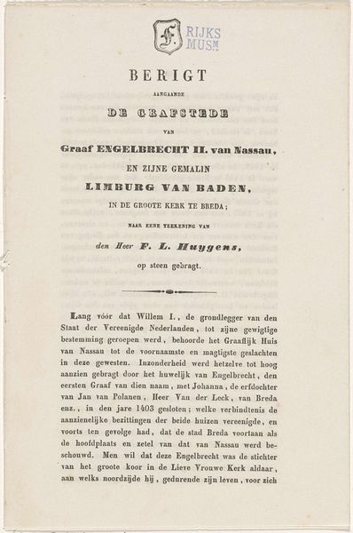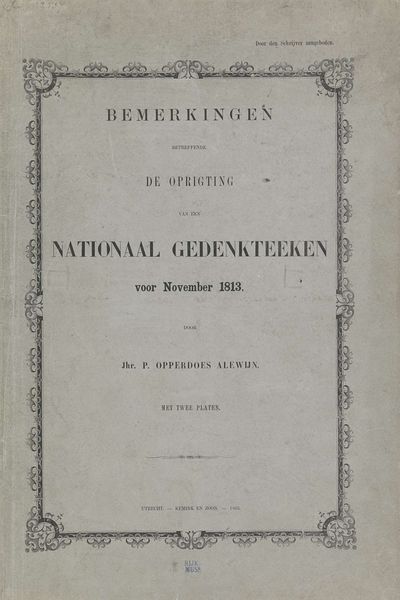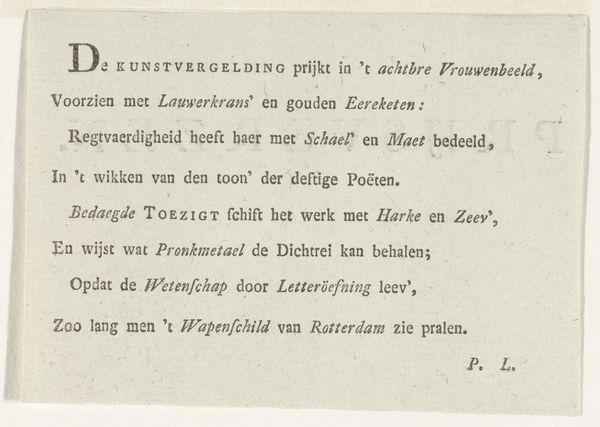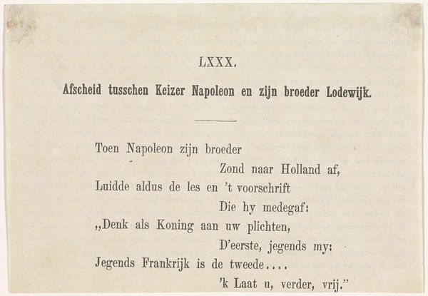
Verklaring der Gedenkplaat bij het 3e Eeuwfeest van Leidens verlossing, 3 October 1874 1874
0:00
0:00
Dimensions: height 190 mm, width 121 mm
Copyright: Rijks Museum: Open Domain
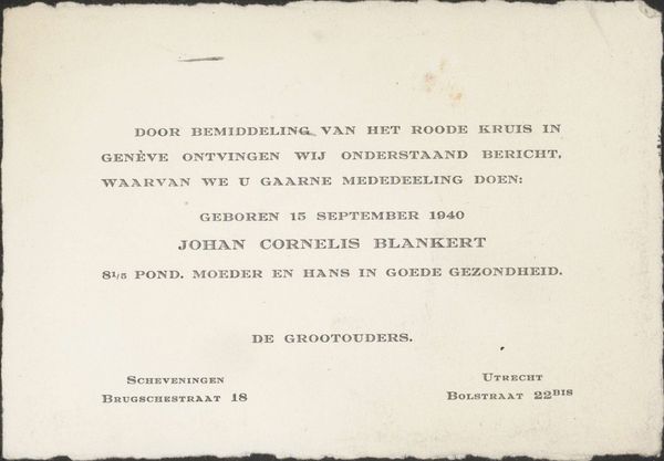
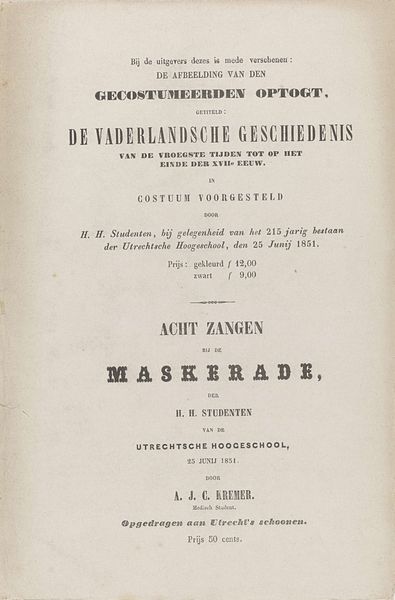
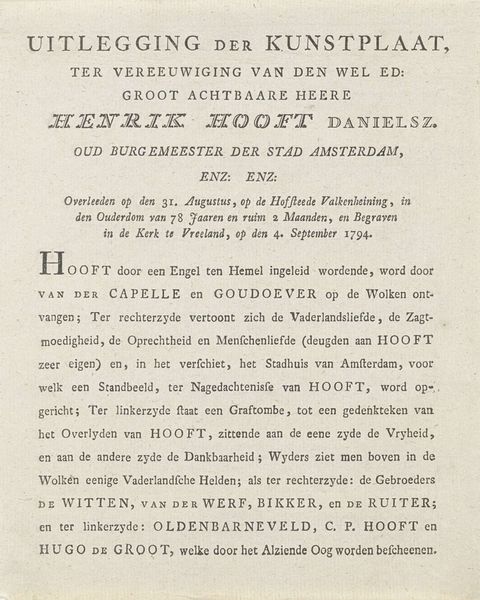
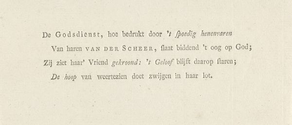
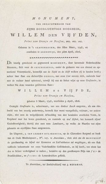
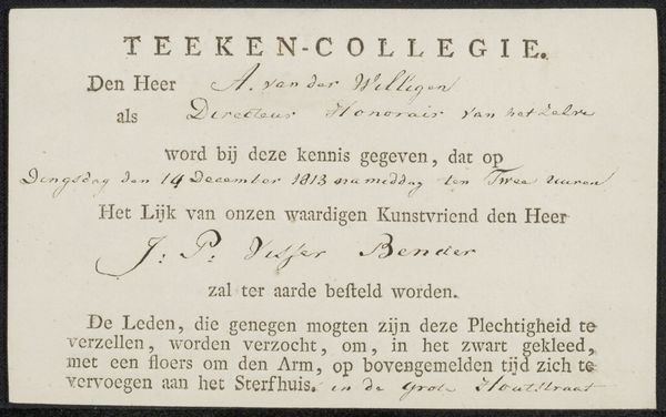
Editor: This is "Verklaring der Gedenkplaat bij het 3e Eeuwfeest van Leidens verlossing, 3 October 1874," a lithograph print from 1874, created by Höveker & Zoon. It's quite text-heavy. The typography feels very intentional. What strikes you first about its formal qualities? Curator: The overall structure immediately asserts itself. Note how the artist balances the textual and visual elements. The hierarchy is established through size and font variations, directing the eye. Semiotics is an angle we can study through the encoding and decoding of meaning here. Editor: So, it's less about what it depicts, and more about *how* it depicts it? Curator: Precisely. Consider the negative space; it’s not merely empty, but functions to articulate distinct zones, creating a rhythm for the reading eye. The contrast between heavier and lighter fonts generates a dynamic interplay. A balance is struck that could reflect rational design thinking of the era. Editor: I see, like a grid system but before it was fully codified. Is it significant that it is a lithograph and not another form of print? Curator: Absolutely. Lithography, unlike etching or engraving, allowed for a greater range of tonal values and textures, notice how the image becomes almost "painterly" using subtle gradations in tone and how that would impact readability. Consider that carefully. How does that material choice affect your reading experience? Editor: I think it does bring it together and allows different elements to almost speak the same language formally...so I would be inclined to look at lithography more in other similar works. Curator: Precisely. So the study of materials can influence how we view this too. Thank you for highlighting that key point, editor.
Comments
No comments
Be the first to comment and join the conversation on the ultimate creative platform.
