Copyright: Andre Lanskoy,Fair Use
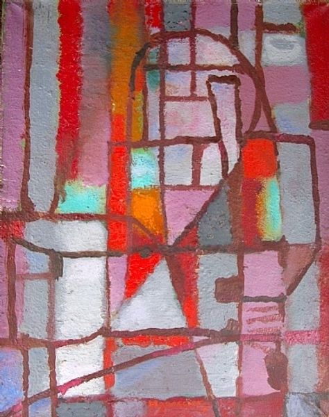
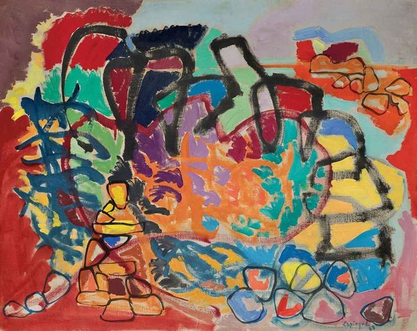
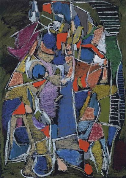
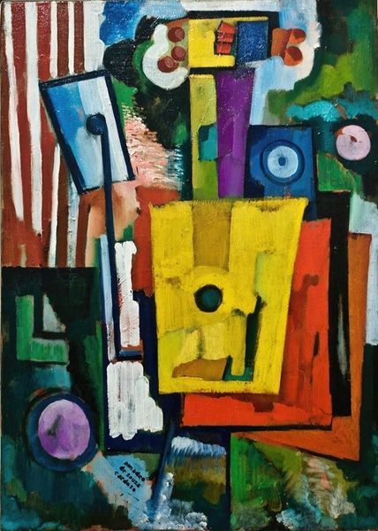
This is Andre Lanskoy’s “Composition,” made in 1973 using what looks like pastel or maybe oil stick. See how the strokes are laid down flat, not blended? It's all about the gesture, the making. Up close, the surface has a gritty texture, like the pigment was pushed into the paper. The colours are bold—red, blue, green—bouncing off each other. There is a certain lack of depth or perspective that flattens the image, which makes the colours really pop. Take that thick white line snaking through the centre, for instance: it doesn't describe a form, but it creates a bright energy that holds the whole thing together. Lanskoy’s work reminds me of the Russian avant-garde, maybe someone like Kandinsky. It’s about feeling, not seeing, a total commitment to the possibilities of abstract form. I feel like his paintings are an invitation to dive into the unexpected.
Comments
No comments
Be the first to comment and join the conversation on the ultimate creative platform.