Curatorial notes
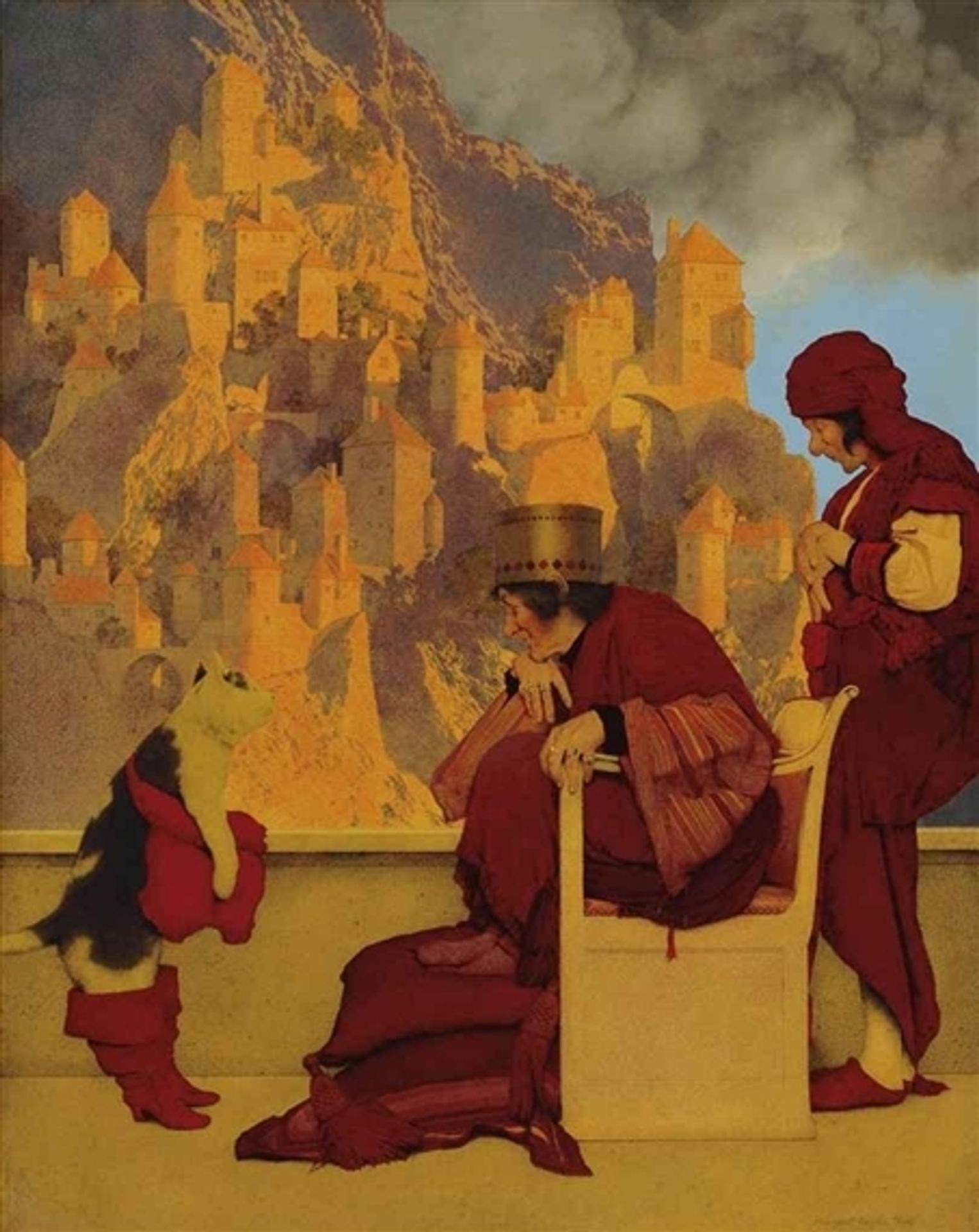
Curator: Maxfield Parrish completed "Puss in Boots" in 1913, a captivating work painted with oil paint that transports us into the whimsical realm of fairy tales. What are your initial thoughts? Editor: Immediately striking is the interplay of warm tones, dominated by reds and golds, creating a sense of otherworldly opulence. The composition, with its verticality and almost theatrical staging, invites a slow, deliberate viewing. Curator: Parrish’s use of oil paint, almost like a glazing technique, resulted in the luminescence of those tones, doesn’t it? It makes me wonder about the source of Parrish's pigment supply and how color choices reflect market access at the time. Were certain colors easier or cheaper to get and thus, more common? Editor: You bring up an interesting point about the socioeconomic dynamics influencing his work, but formally, his layering creates depth and light that is, arguably, part of the meaning. The precision with which Parrish delineates form invites the viewer to interpret how it relates to his world of inspiration. Curator: Absolutely, that luminosity is integral. I'm also thinking about the social function of such fairy-tale depictions. Given the period—just before the First World War—did the prevalence of fairy-tale subjects point to a longing for escapism amidst growing global tensions? The artist was able to sell his products to mass culture consumers through popular books and advertising work. The fairy tales would represent this cultural context of a complex interaction of fine arts and industrial design. Editor: True, but his focus on visual elements is intriguing: notice the geometric castle and how it contrasts with the softness of the characters' robes, the dynamic tension between architectural precision and fluid form is powerful. This focus shapes our understanding. Curator: Undoubtedly. It is important to note that the materials he used were influenced by commercial accessibility. Parrish blurred the line between high art and commercial illustration. And, by looking at who purchased these images, what class and gender, this shapes meaning, too. Editor: I concede that these questions help situate Parrish, but the work continues to fascinate because of its internal, formal qualities, as you highlighted initially with the discussion on colors. Ultimately, a full understanding has to bring in external realities and how he shaped the composition. Curator: A wonderful convergence that makes appreciating "Puss in Boots" that much richer. Editor: Precisely. The layered formal analysis and attention to production really complement each other.