drawing, paper, ink, pen
#
drawing
#
hand lettering
#
paper
#
personal sketchbook
#
ink
#
ink drawing experimentation
#
pen-ink sketch
#
pen work
#
sketchbook drawing
#
pen
#
sketchbook art
Copyright: Rijks Museum: Open Domain
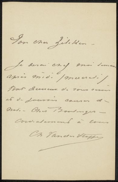
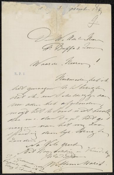
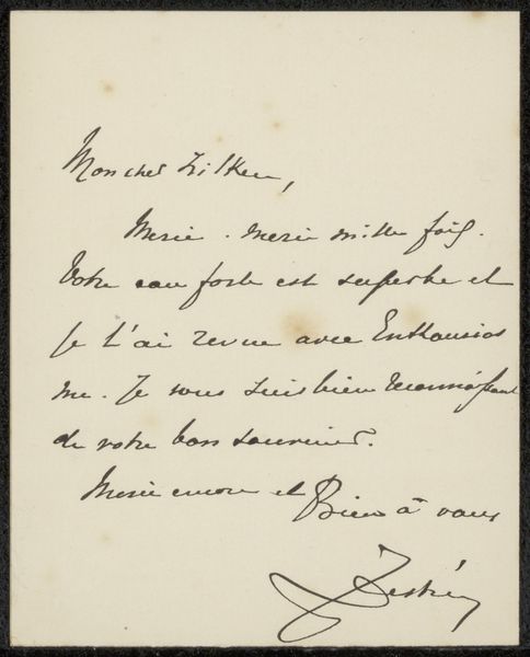
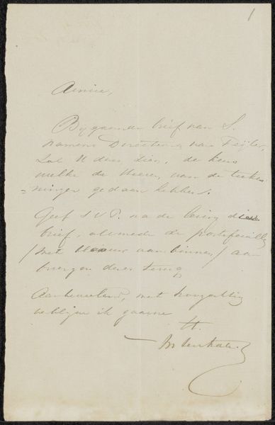
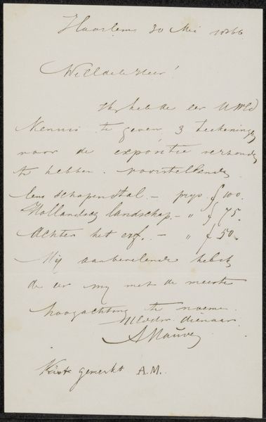
Curator: This delicate pen and ink sketch is "Brief aan Philip Zilcken," a letter by Charles van der Stappen dating between 1867 and 1910. It’s rendered on paper. What springs to mind for you when you see it? Editor: The letter has a slightly hurried, anxious feel, almost secretive—likely only due to the style, it is almost like looking into another time... Does that make sense? Curator: Absolutely. The flowing script certainly lends it an air of intimacy, like a stolen glimpse into a private moment. Handwriting itself is incredibly telling, carrying subconscious emotional traces. Think of the weight each carefully-formed loop would carry! The "J" with it's exaggerated down stroke, for instance. Editor: It’s so funny how handwriting has become this lost art. Everyone now expects pixel-perfect perfection in all caps from Times New Roman or Helvetica or one of the san serifs we have now; nobody gets to play around with flourishes of the personality or is even encouraged to learn calligraphy. Now its considered "inefficient." Curator: Indeed. Now we are estranged from these forms, despite our ancestors using similar shapes across continents to convey meaning through pictograms and calligraphy. There is so much intent held in the loops, angles, and connections. A lost visual language, really. Editor: Right, it makes me wonder what we lose when we forgo those handmade expressive symbols for mass-produced ones. Perhaps part of our ability to externalize and understand certain things. And I will also never forget the feel of that pen scratching on the rough paper... it seems to amplify all this emotion and intensity, eh? Curator: The textures we feel, the tools that help to mold us... well put! And the absence of any flourishes outside of the language, any embellishments to distract the eye. It points all the more to what is really there— the direct sharing of intention. Editor: Like holding a piece of the artist’s thought itself, you know? Kind of changes the way I think about letter writing entirely! Curator: It really does, doesn't it? Each letter is not just ink on paper, it is a portal to an inner world!
Comments
No comments
Be the first to comment and join the conversation on the ultimate creative platform.
More like this