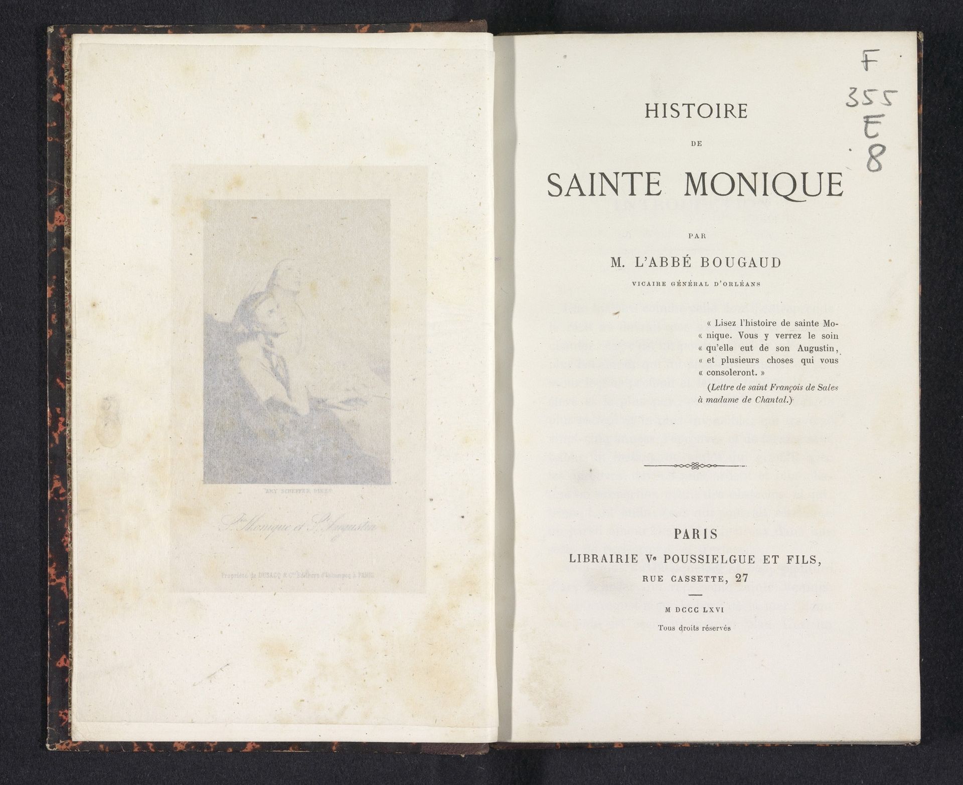
1866
Histoire de Sainte Monique
Listen to curator's interpretation
Curatorial notes
Editor: This is "Histoire de Sainte Monique," a print from 1866 by Louis-Émile Bougaud. The typography really stands out. What strikes you when you look at this work? Curator: For me, this piece speaks to the power of narrative in shaping historical and religious figures, especially women. Bougaud's work isn’t just a biography; it’s a construction of Saint Monica as a maternal ideal. Editor: How so? Curator: Think about the period: mid-19th century France. The Church was grappling with secularization, and figures like Saint Monica were held up as models of piety and domestic virtue to reinforce traditional gender roles and familial structures. Do you notice how the typography itself evokes a sense of historical authority and established dogma? Editor: Yes, it definitely feels like it’s trying to project a sense of timelessness. It's interesting to consider how the physical form of the book – the aged paper, the script – contributes to this narrative. So, you're saying it is not just about Saint Monica's actual life, but how she's been deployed to support certain ideologies? Curator: Exactly. The visual and textual elements coalesce to present a specific, carefully crafted image of womanhood within a particular social and political context. This image would uphold specific values related to gender and religious life at the time of publication. Editor: That makes me think about the power dynamics at play. Who gets to tell these stories, and what purposes do they serve? Thank you, I see this book very differently now. Curator: Indeed, recognizing those dynamics is crucial to understanding art's role in shaping our perceptions of the past.