painting, oil-paint
#
portrait
#
painting
#
oil-paint
#
symbolism
#
academic-art
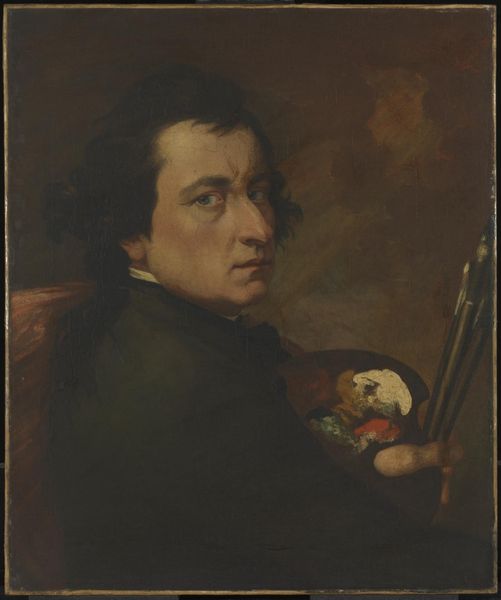
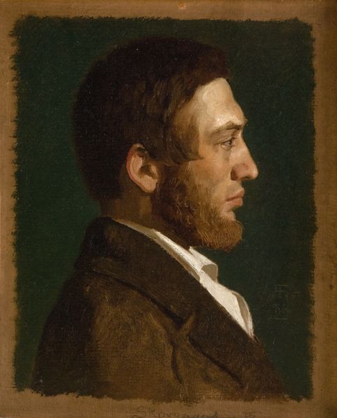
Dimensions: 55.5 cm (height) x 41 cm (width) (Netto)
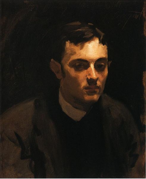
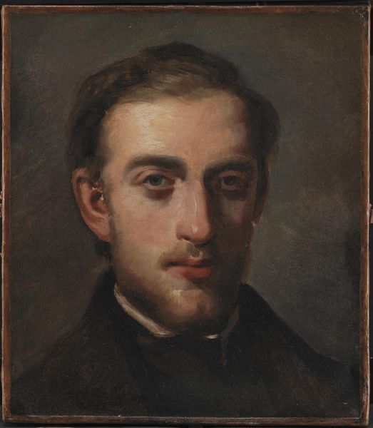
Editor: Here we have Vilhelm Hammershoi's oil on canvas portrait, "The Composer Fini Henriques", painted between 1894 and 1898. It has such a subdued and intimate feel. What draws your attention in this piece? Curator: The first thing that strikes me is Hammershøi's use of muted tones. The limited palette – mostly blacks, greys, and browns – it speaks volumes about the materials he chose. These choices weren't accidental. How do you think the subdued tones would affect the perceived value or the place this work could hold in culture? Editor: I hadn't thought about the value in those terms, so it being less 'colorful', I guess one could see that as potentially…less appealing? Curator: Precisely, but let’s dig deeper. Consider the pigment production of the late 19th century. Bright, vibrant colors were becoming more accessible through industrial processes, so, was this a practical, aesthetic, or perhaps even political decision for Hammershøi? What statement do you think he could be making by deliberately restricting his palette and embracing those earth tones? Editor: Perhaps it was a kind of resistance? A rebellion against mass-produced colour in favour of…sincerity, maybe? The artist consciously avoiding those bright materials to enhance or reveal the authentic persona of the portrayed artist? Curator: Good thinking. Or it may point toward the work and labour necessary to make his muted pigments. Think of it as imbuing the portrait with his own manual effort and his subject with sincerity by highlighting the labor-intensive artistic choices in it's construction. These 'darker' artistic and social statements make the portrait more profound, don't they? Editor: Definitely! It highlights the artist's intentionality behind his choice of materials and colours. It definitely gives me something to consider with this work. Thanks for the material perspective!
Comments
No comments
Be the first to comment and join the conversation on the ultimate creative platform.
More like this