Dimensions: support: 2972 x 2020 x 673 mm
Copyright: © Richard Smith | CC-BY-NC-ND 4.0 DEED, Photo: Tate
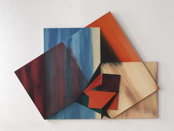
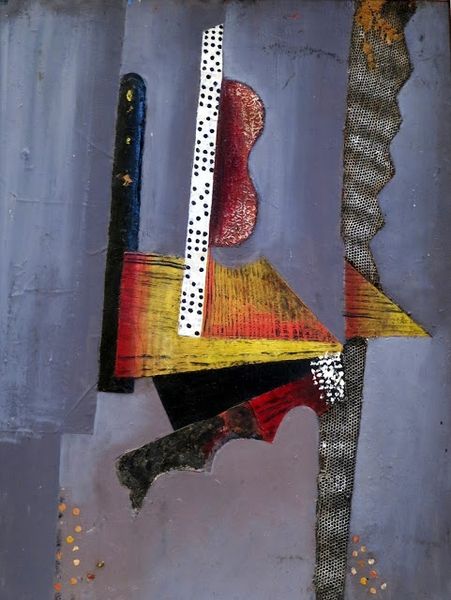
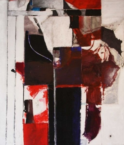
Curator: Richard Smith's large-scale construction, "The Typographer," presents a fascinating interplay of form and space. Editor: My initial impression is one of playful chaos – shapes burst forth, the bold colors feel almost performative against the architectural structure. Curator: Smith's work often engaged with the visual language of advertising and consumer culture. Notice how the fragmented geometric shapes and vibrant palette evoke the visual noise of urban life. Editor: Indeed, the materiality enhances this sensation. The tension of the canvas stretched over the wooden structure creates a dynamic surface, a literal pushing and pulling of pictorial space. Curator: It's worth considering how Smith challenged conventional painting. By extending the canvas into three dimensions, he blurred the boundaries between painting and sculpture, inviting viewers to reconsider the role of art in a rapidly changing world. Editor: Absolutely, and this disruption of boundaries extends to the semiotic level – the recognizable shapes hint at letters or logos, yet remain fragmented and ambiguous, refusing to resolve into clear meaning. Curator: A fitting reflection, given Smith's engagement with the pop art movement and its commentary on mass media's influence. It asks us to consider how advertising reshapes our visual landscape. Editor: It leaves one pondering the fluid interplay between order and disorder and the dynamism of perception within a constructed environment.
Comments
Join the conversation
Join millions of artists and users on Artera today and experience the ultimate creative platform.
tate 11 months ago
⋮
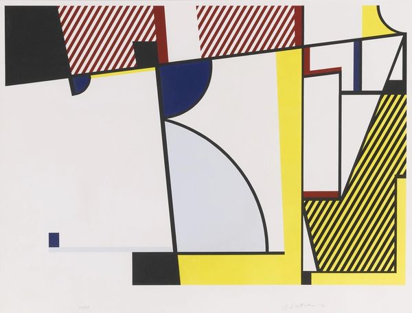
The Typographer consists of seven, irregularly shaped sections of cotton canvas which hang in front of the wall, the individual sections overlapping to create a shallow relief. Each section is stretched between painted aluminium tubing which is attached diagonally to the canvas with lengths of coloured string that hang down towards the floor. The tubing at the back of each shape is stained red, and that at the front dark green. The canvas panels are thinly painted on the front with hard-edged abstract shapes, and Smith's initials have been stencilled onto one of the central panels. The predominant colours are bright acid green, scarlet, dark blue and black. The backs of the panels are painted matt red or green, and each is suspended from its uppermost corner by a length of red string. The work is suspended at a height of ten feet and the lower panels almost touch the floor. Because the brightly coloured panels hang from above, rather than being firmly attached to the wall, they sway as the spectator walks past, evoking the flutter of sails or washing hung out to dry. The Typographer thus employs techniques that Smith had used since the early 1970s. Described as making 'kites' Smith tied separate pieces of canvas together, stretching them over rods, or hanging them on wires. The work also develops Smith's exploration of the relation between a two-dimensional, kite-like painted surface and real space. In works such as Mandarino 1973 (Tate T01807) or Cartouche 1-10 1979 (Tate T03060), flat brightly coloured panels were suspended on stings in front of the wall. In spite of their experimental character, such works relate to the wall and therefore evoke the traditional conventions of painting. In other works such as the 1973 environmental installation for the Mr. Chow restaurant in Los Angeles, a series of painted discs were hung from the ceiling. Relating to the space of the room, they were simultaneously abstract paintings and also resembled thin, sail-like sculptures. The Typographer is an equally playful work, where two-dimensional elements are used to create a shallow three-dimensional construction, the resulting frieze-like space relating to both painting and sculpture. Unlike most of Smith's work produced since the mid 1960s, The Typographer has a figurative subject, and is based upon another image, Fernand Léger's (1881-1955) Typographer of 1919. Léger's painting features a stylised image of a man whose body parts have been flattened and simplified into basic machine-like forms. The man wears a schematised beret and smokes a cigarette, elements that Smith incorporates into his image, along with the bold stencilled lettering. Like the Léger, Smith employs brightly coloured panels to suggest the human figure. The suspended, overlapping panels also evoke Léger's Cubist layering of flat colours on top of one another. In an unpublished Tate interview, Smith explained that he intended the panels to replicate as closely as possible the positions of the painted planes in the Léger. The bold harsh colours and simplified abstract patterning also relate to the Léger. Smith made The Typographer in his Warren Street studio in New York over a period of a few weeks. He did not create a maquette. In an unpublished Tate interview he stated that he found it liberating to make something which had its roots outside his own aesthetic. He was initially drawn to Léger's figurative painting because of its subject matter. Smith's father, who had recently died, had been a printer. The Typographer was created in his memory. Further Reading:David Mellor, The Sixties Art Scene in London, exhibition catalogue, Barbican Art Gallery, London 1993, pp.124-131Marco Livingstone, Pop Art: A Continuing History, London 1990, pp.109-111Bryan Robertson, Richard Smith Paintings 1958-1966, exhibition catalogue, Whitechapel Art Gallery, London 1966 Imogen Cornwall-Jones November 2001
More like this