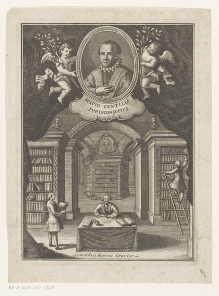
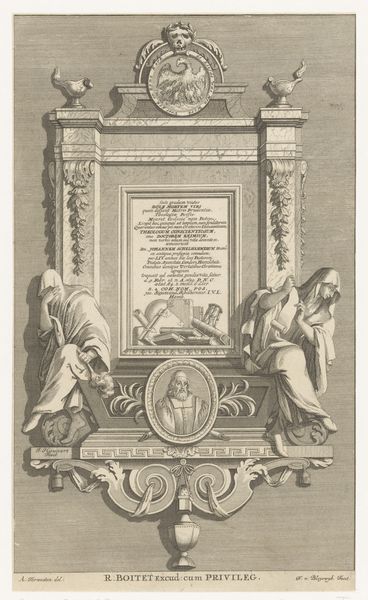
Portretten van Barnabé Brisson en Johann Gottlieb Heineccius 1743
0:00
0:00
johannchristophsysang
Rijksmuseum
drawing, print, paper, ink, engraving
#
portrait
#
drawing
#
baroque
#
pen drawing
# print
#
paper
#
ink
#
genre-painting
#
history-painting
#
academic-art
#
engraving
#
pencil art
Dimensions: height 305 mm, width 190 mm
Copyright: Rijks Museum: Open Domain
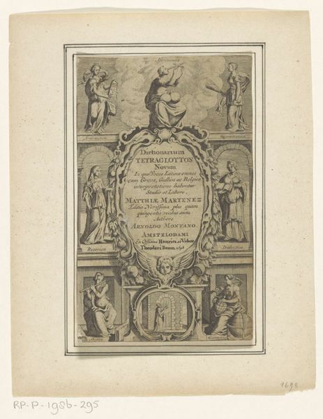
Editor: This artwork, titled "Portretten van Barnabé Brisson en Johann Gottlieb Heineccius," dates back to 1743. It is the work of Johann Christoph Sysang and the piece utilizes drawing, print, engraving, ink, and paper. Looking at this work, I find the contrast between the portraits and the books quite fascinating. What draws your eye to it? Curator: The engraving presents a hierarchy achieved through careful formal arrangements. Note the symmetrical framing: portraits enclosed in ovals are enthroned atop an architectural scene. The cherubic figures act as brackets, literally and figuratively supporting the portraits and lending a sense of elevation. Editor: It almost feels like two distinct compositions merged into one. Why this emphasis on structure and composition, and how does the Baroque style enhance that? Curator: Baroque aesthetics typically favor ornamentation and a sense of movement, yet here we see the detail largely confined to the frame around the portraits and the textures of the library. Ask yourself, what does that tension between control and exuberance do for the reading of the work? Editor: The ornate framework contrasted with the relatively sparse depiction of the lower portion does create a noticeable push and pull for the eye, almost a competition between knowledge and personality. Curator: Precisely. The artist has created an interesting dichotomy. Editor: I hadn't considered the deliberate structuring that creates those competing elements, really interesting, thanks! Curator: My pleasure; structure dictates function, always.
Comments
No comments
Be the first to comment and join the conversation on the ultimate creative platform.
More like this