Copyright: Public Domain: Artvee
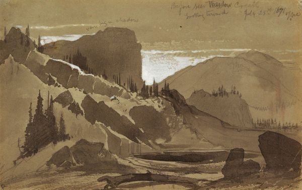
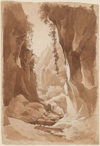
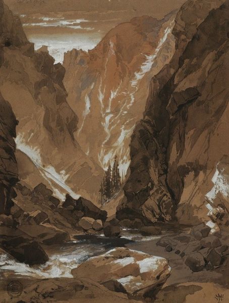
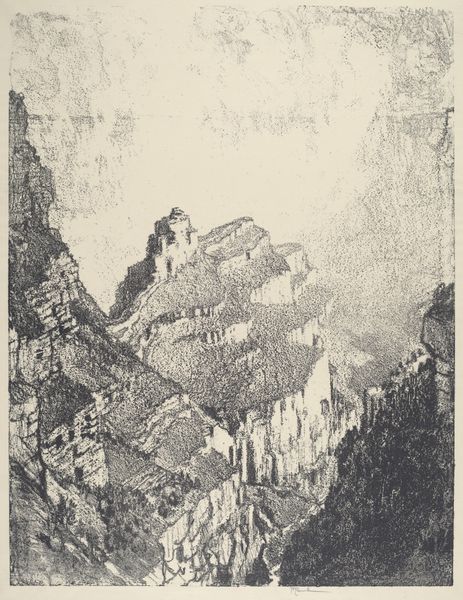
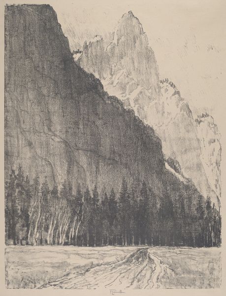
Editor: So, this is Thomas Moran’s "Yellowstone," a watercolor and charcoal drawing from 1871. It’s a rather moody piece. The monochromatic tones and the stark composition make it feel very dramatic. What stands out to you? Curator: Indeed. The effectiveness of "Yellowstone" lies in its sophisticated manipulation of form. Consider how Moran employs the verticality of the rock formations. How does that inform your understanding? Editor: I suppose they draw the eye upward, emphasizing the grandeur, almost a divine presence. But, the values are so close, does that flattening of the values emphasize something about the materiality of the artwork itself rather than just representing the scene? Curator: Precisely. Note how the limited palette concentrates attention on texture and tonal gradations. The restricted color scheme also allows us to focus on the interplay between the organic shapes of nature and the rigid geometry of the central rock. The eye isn't distracted by hues and saturation. It’s a strategic simplification, wouldn't you agree? Editor: I do. So, the impact isn't necessarily about realism. It's more about how those formal choices generate a particular sensation. A sort of awe but through simplification. Curator: A carefully constructed affect. The "real" Yellowstone is less significant here than the aesthetic experience produced by the work. It makes me consider how modern artworks have developed. What’s your take? Editor: That’s a totally fresh perspective for me; thinking about how form enables feeling is great. Curator: It is through such careful analysis that art reveals its true potential.
Comments
No comments
Be the first to comment and join the conversation on the ultimate creative platform.
More like this