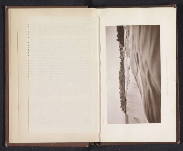
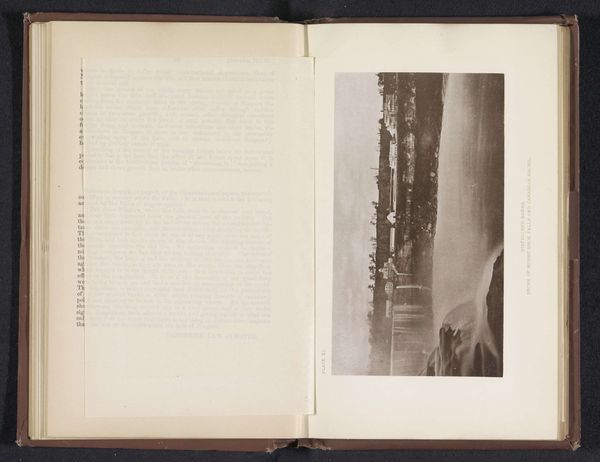
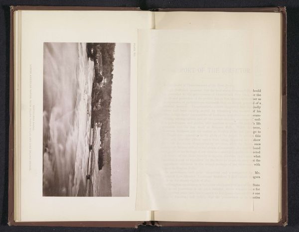
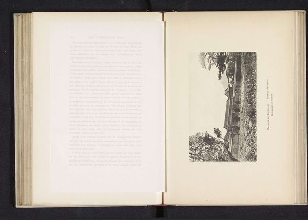
Gezicht op het landschap met huizen langs de Niagara in de buurt van de brug naar Goat Island before 1880
0:00
0:00
print, photography, albumen-print
#
aged paper
#
16_19th-century
# print
#
hand drawn type
#
landscape
#
photography
#
hand-drawn typeface
#
fading type
#
thick font
#
handwritten font
#
delicate typography
#
thin font
#
albumen-print
#
realism
#
historical font
#
small font
Dimensions: height 97 mm, width 174 mm
Copyright: Rijks Museum: Open Domain
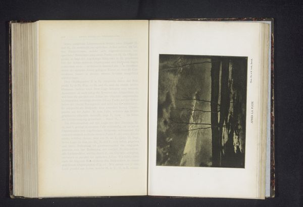
Editor: This is a photograph entitled "Gezicht op het landschap met huizen langs de Niagara in de buurt van de brug naar Goat Island," taken before 1880 by George Barker. It’s an albumen print. It seems stark and barren to me. What do you see in this piece? Curator: Immediately, I observe the contrasting textures. The smooth surface of the albumen print emphasizes the granular details within the landscape itself. Note the compositional strategy: the strong horizontal of the land is bisected by the bare trees, drawing our eye upwards. It creates a dynamic tension, wouldn't you agree? Editor: Yes, I see that now. It feels almost like two separate planes intersecting. How does the typography on the facing page interact with the photograph itself? Curator: Precisely! The textual plane becomes another layer of contrasting textures and tones within the bound volume. Consider the photographer's framing: it’s quite deliberate, setting up relationships between light and shadow and, consequently, between different areas in the scene. Notice the limited tonal range achievable with early photographic processes; how does this affect your perception? Editor: I hadn't considered the limitations. The subdued palette seems to intensify the feeling of starkness I felt initially. The details of the house in the photograph now feel clearer, set against the bare ground. Curator: It is also critical to understand how the bookbinder chose to juxtapose different types of paper, the thin India-like paper filled with delicate font. Together they allow one to focus not only on the representation but the presentation of the image, as an artifact. Now how might our observations impact a future study about bookbinding, printmaking, or the cultural milieu? Editor: That makes me think about the artistry of the presentation and not only the photograph, as material objects with significant purpose. Thank you. Curator: Indeed, there are worlds within worlds, once one appreciates how an artwork presents itself structurally and materially.
Comments
No comments
Be the first to comment and join the conversation on the ultimate creative platform.
More like this