#
neo-pop
Copyright: Modern Artists: Artvee
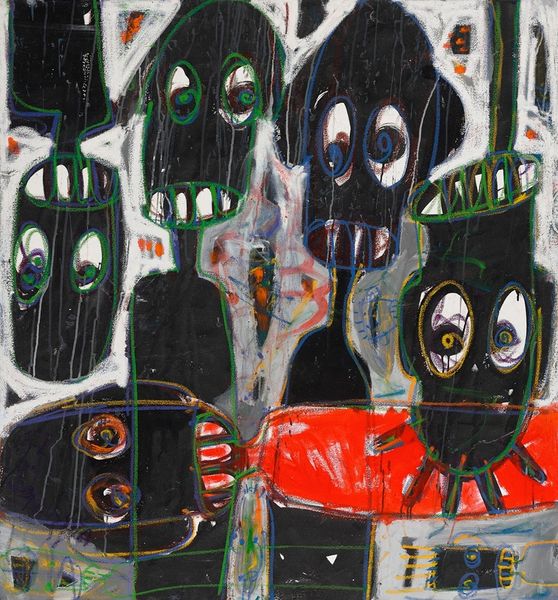
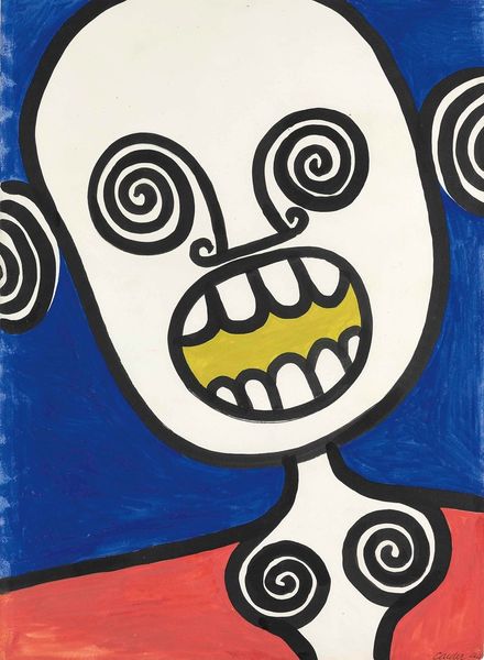
Keith Haring made this untitled painting sometime between the early and late eighties. It’s an explosion of color and raw energy; you can feel the urgency in those thick, black outlines that define the figures. Look at the blue monster, all jagged lines and sharp angles, spitting a toxic green cloud. Haring's hand is visible in every stroke; the paint is laid down with an immediacy that screams street art. And then, there's that red sun, just a flat disc of color, adding a touch of playful absurdity to the whole scene. The texture is smooth, almost like it's been printed, but you can see the slight imperfections, the little bumps and inconsistencies that give it a human touch. Haring’s work shares some DNA with Jean-Michel Basquiat's—both were part of that vibrant New York art scene, and they both channeled a kind of raw, unfiltered expression. And like Basquiat, Haring reminds us that art isn't about perfection; it's about capturing a moment, a feeling, a raw, messy slice of life.
Comments
No comments
Be the first to comment and join the conversation on the ultimate creative platform.
More like this